Plus

 Menu


Established
September 10, 2020
Mindsparkle Mag


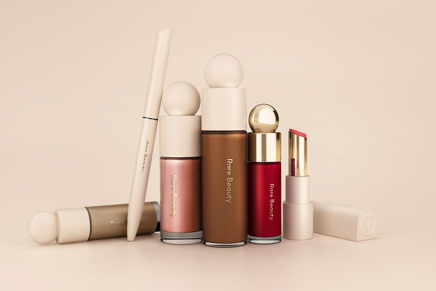
Rare Beauty introduces a softer perspective to modern beauty. Created for Selena Gomez, the brand identity focuses on warmth, tactility and simplicity — a contrast to the high-gloss, ultra-perfect aesthetic typical in the category.
The Rare Beauty logo is a minimal wordmark created by Established, the New York branding agency, for the makeup brand Selena Gomez launched in September 2020. Where prestige cosmetics usually reach for high-contrast, high-gloss lettering, the Rare Beauty logotype stays quiet and is paired with a circular monogram that echoes the spherical caps and round compacts of the packaging. An editorial serif carries the supporting typography and softens the overall voice of the brand. Matte peach tones, warm neutrals and understated gold detailing give the mark its warmth, so it reads as personal rather than aspirational. Together these choices make the logo the anchor of a system built around the brand's idea of beauty as something honest and effortless.
The visual world is shaped around gentle curves, matte peach tones and understated gold detailing, creating a system that feels personal and grounded. The minimal logotype and circular monogram anchor the brand with quiet confidence, supported by an editorial serif that softens the overall tone.
Working closely with Established, Selena Gomez shaped a brand that communicates acceptance rather than aspiration. Each component — from the rounded applicator to the soft-touch finishes — reinforces Rare Beauty’s guiding idea: beauty that feels effortless and honest, not performative.
Inspired by sculptural forms, the packaging uses subtle geometry as a recurring theme. Soft cylindrical bottles, spherical caps and blush compacts sit within a cohesive design language that’s instantly recognisable. This approach also gives Rare Beauty a more collectible presence, allowing the products to behave almost like personal objects rather than cosmetic tools.
Within the broader landscape of beauty branding, Rare Beauty sits alongside a new generation of warm, character-driven identities. For more in this space, see our curated Top 10 Beauty Brand Identities — a look at how colour, proportion and photography shape contemporary beauty narratives.
For a more sun-washed, Californian take on beauty, explore the identity of Playa Beauty, where natural texture and minimal typography build a different kind of softness.
Rare Beauty’s identity champions individuality — not through maximal colour or loud messaging, but through a considered balance of form, palette and calm editorial structure. It’s a system built for everyday life: warm, playful and inherently human.
To dive deeper into related projects, explore our full archive of Beauty Branding


Credits: Established
Branding Agency: Established
More in Beauty Branding
Stay on top of this week's design. Insights, top picks & more.