Plus
Plus

 Menu
Menu


Lotta Nieminen
November 09, 2017
Mindsparkle Mag


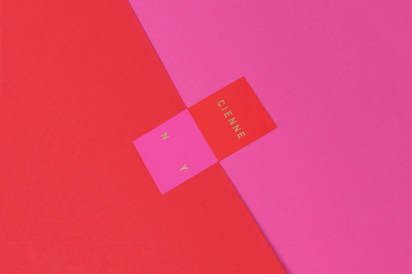
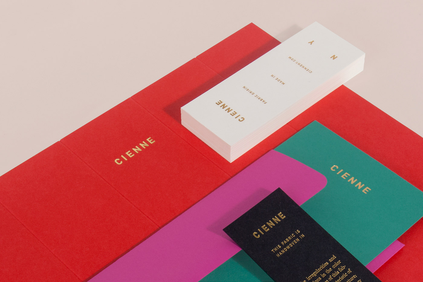
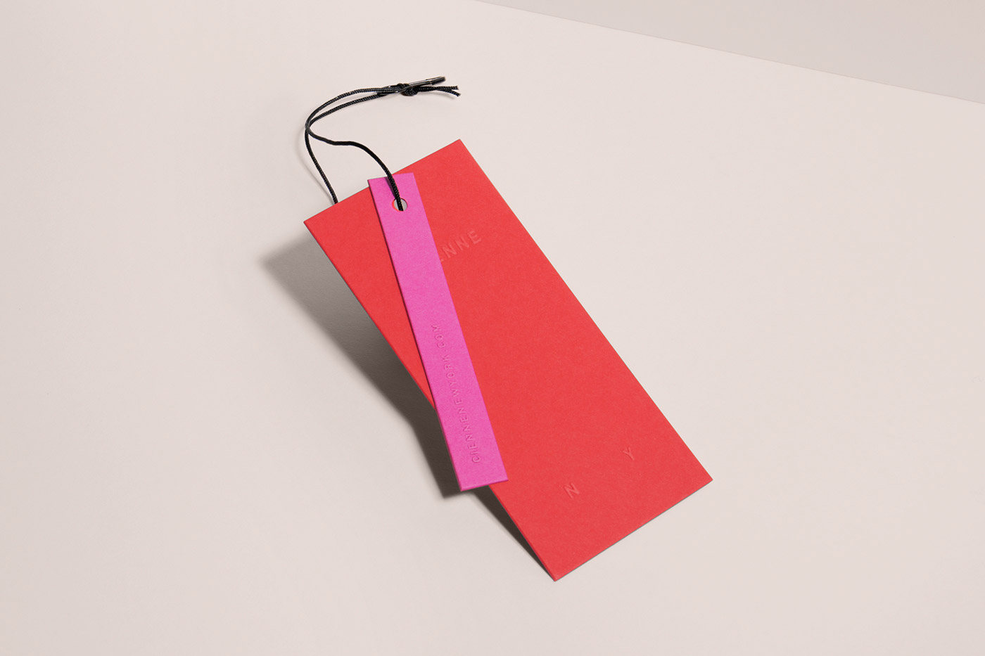
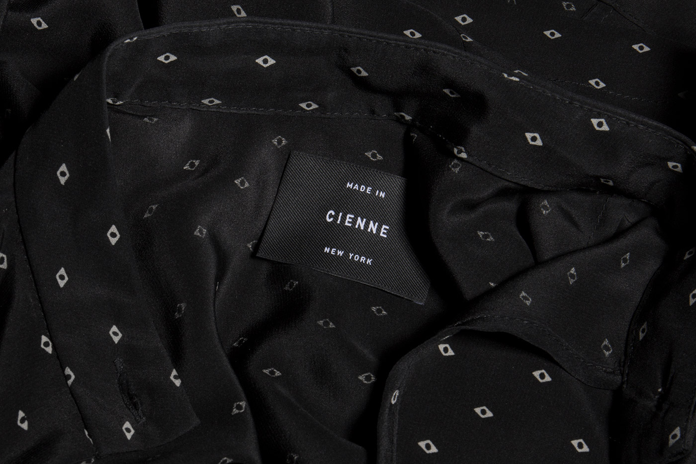
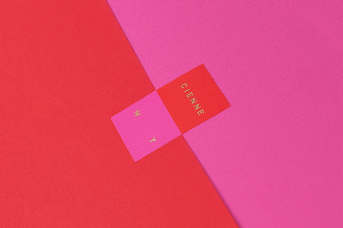
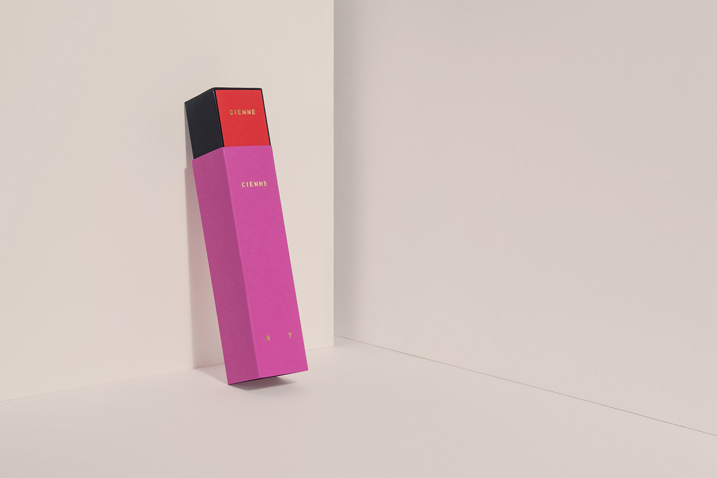
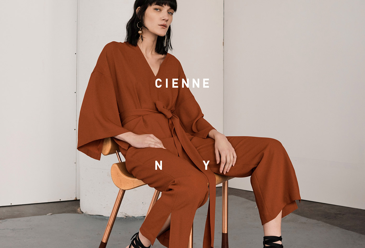
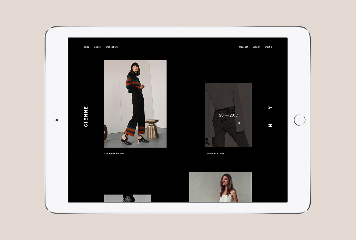
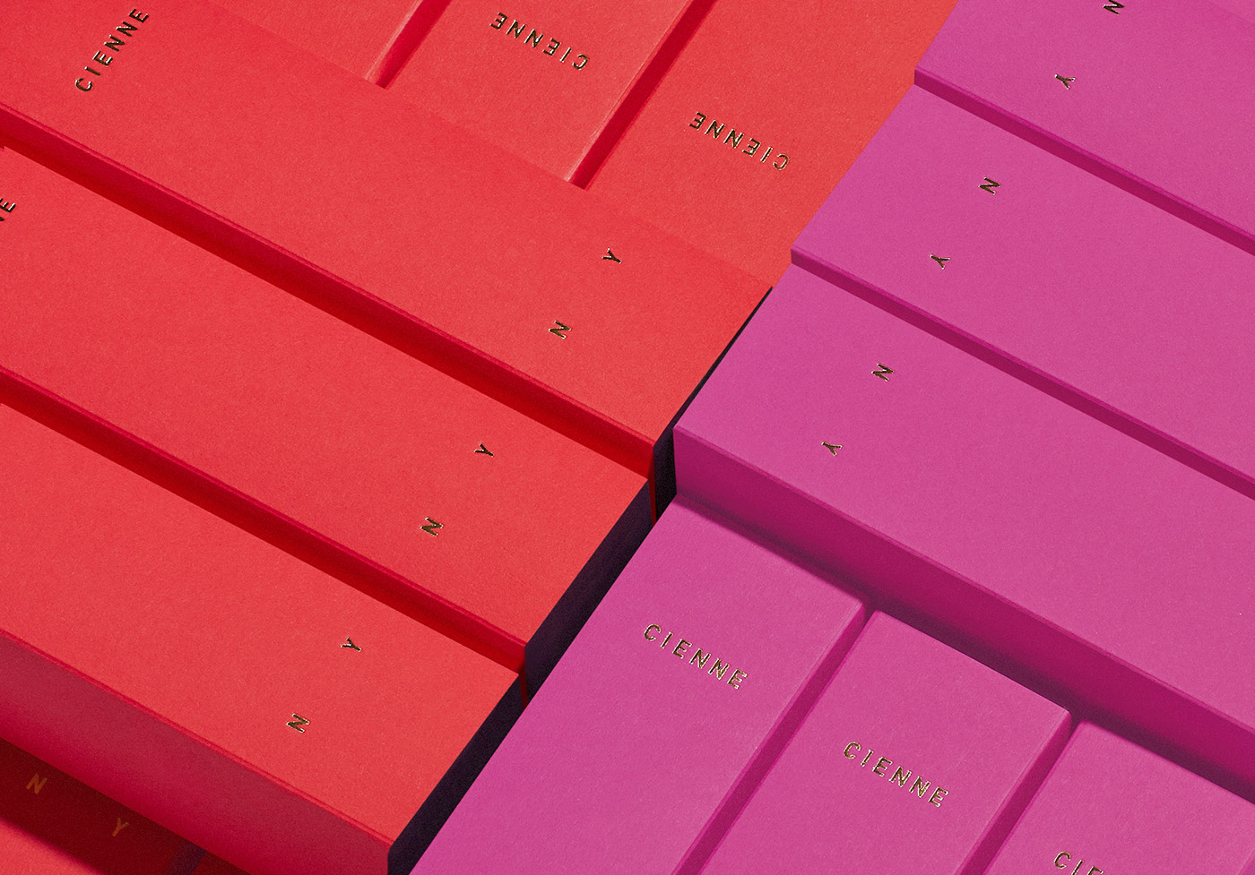
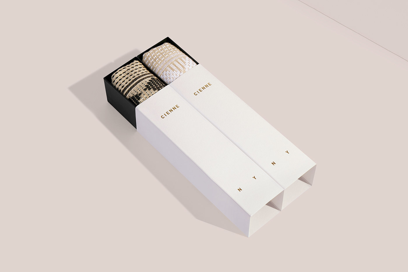
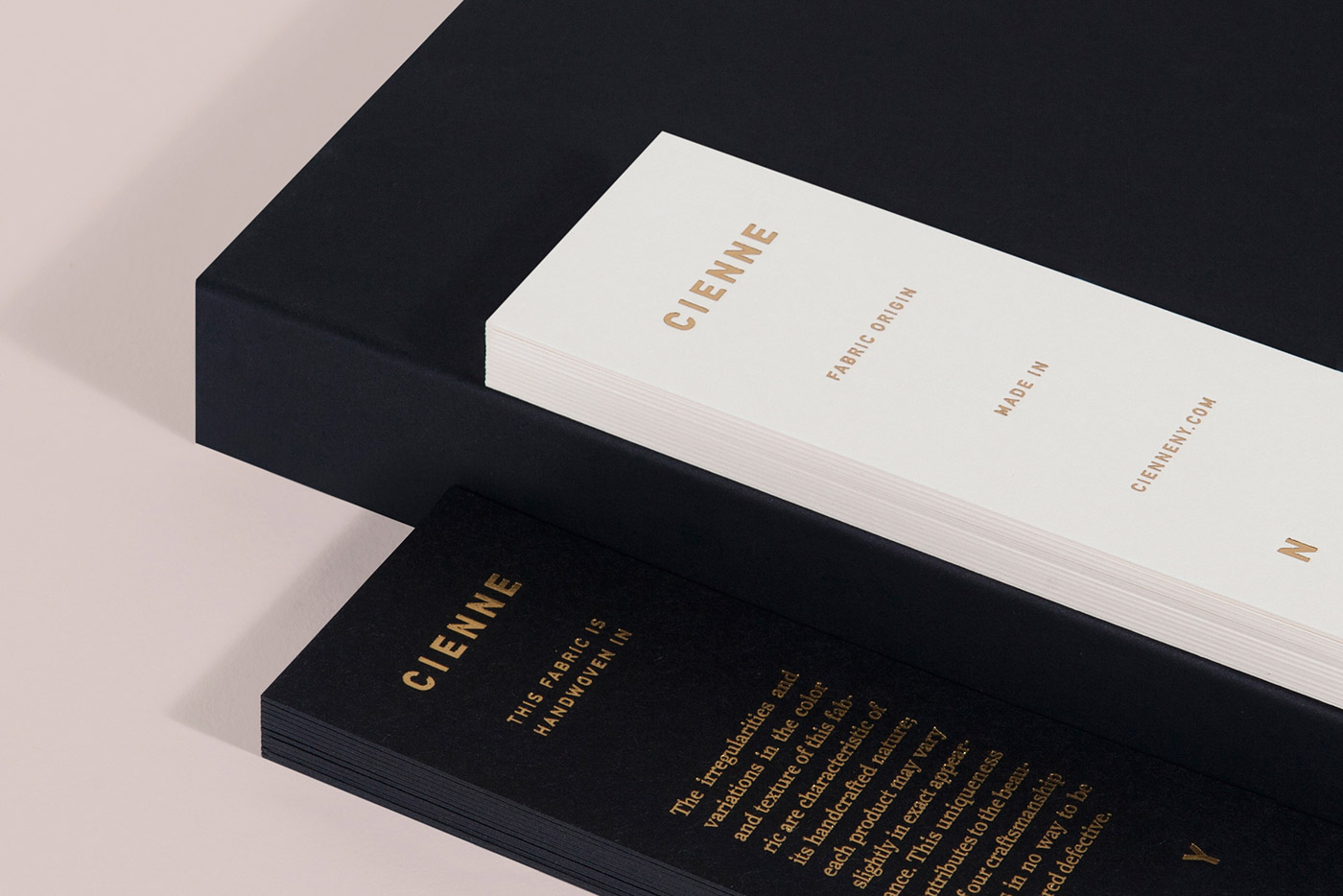
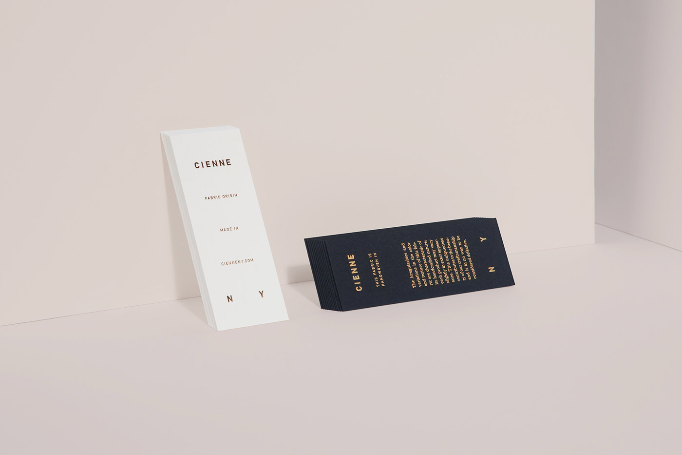
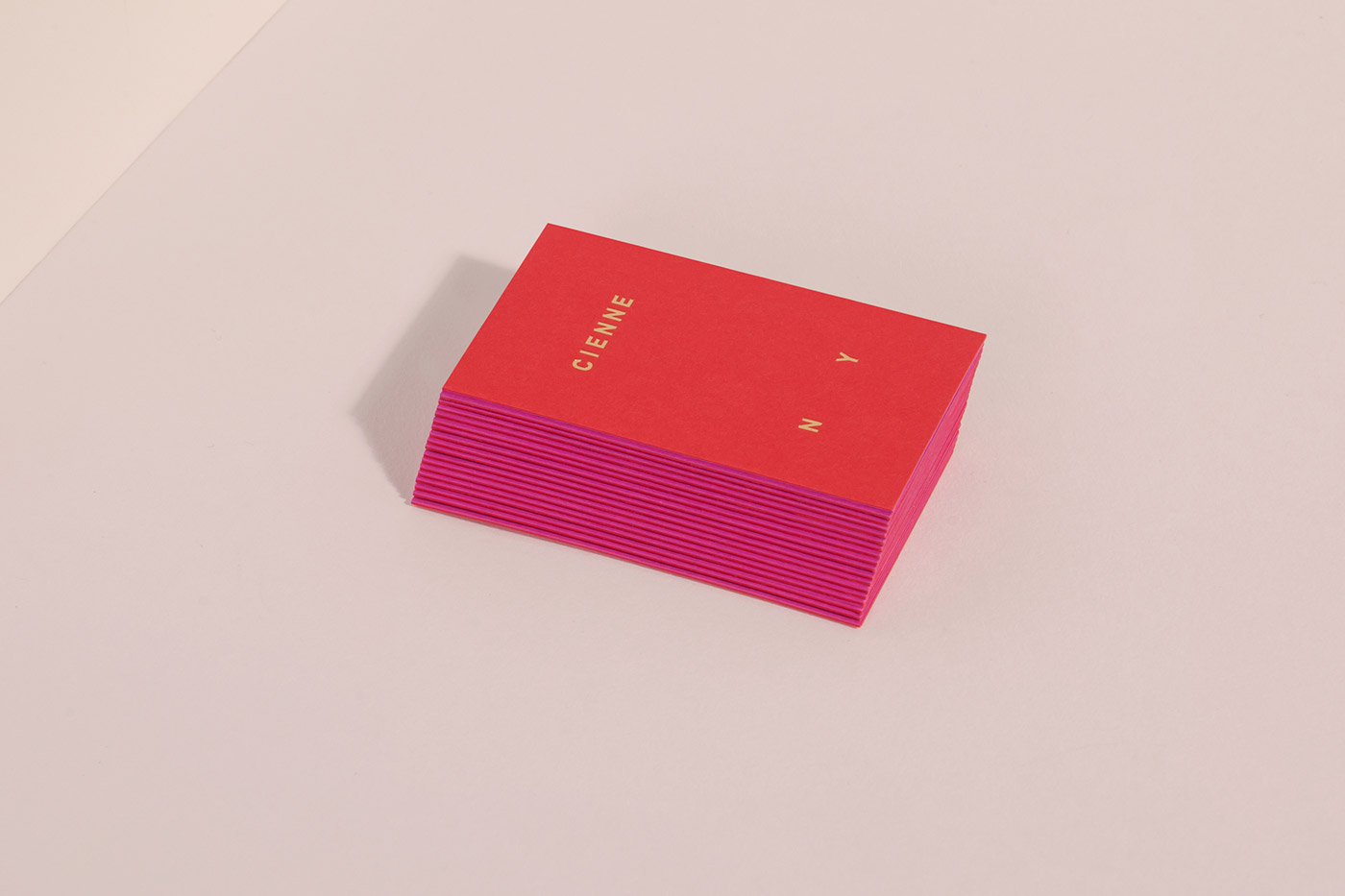
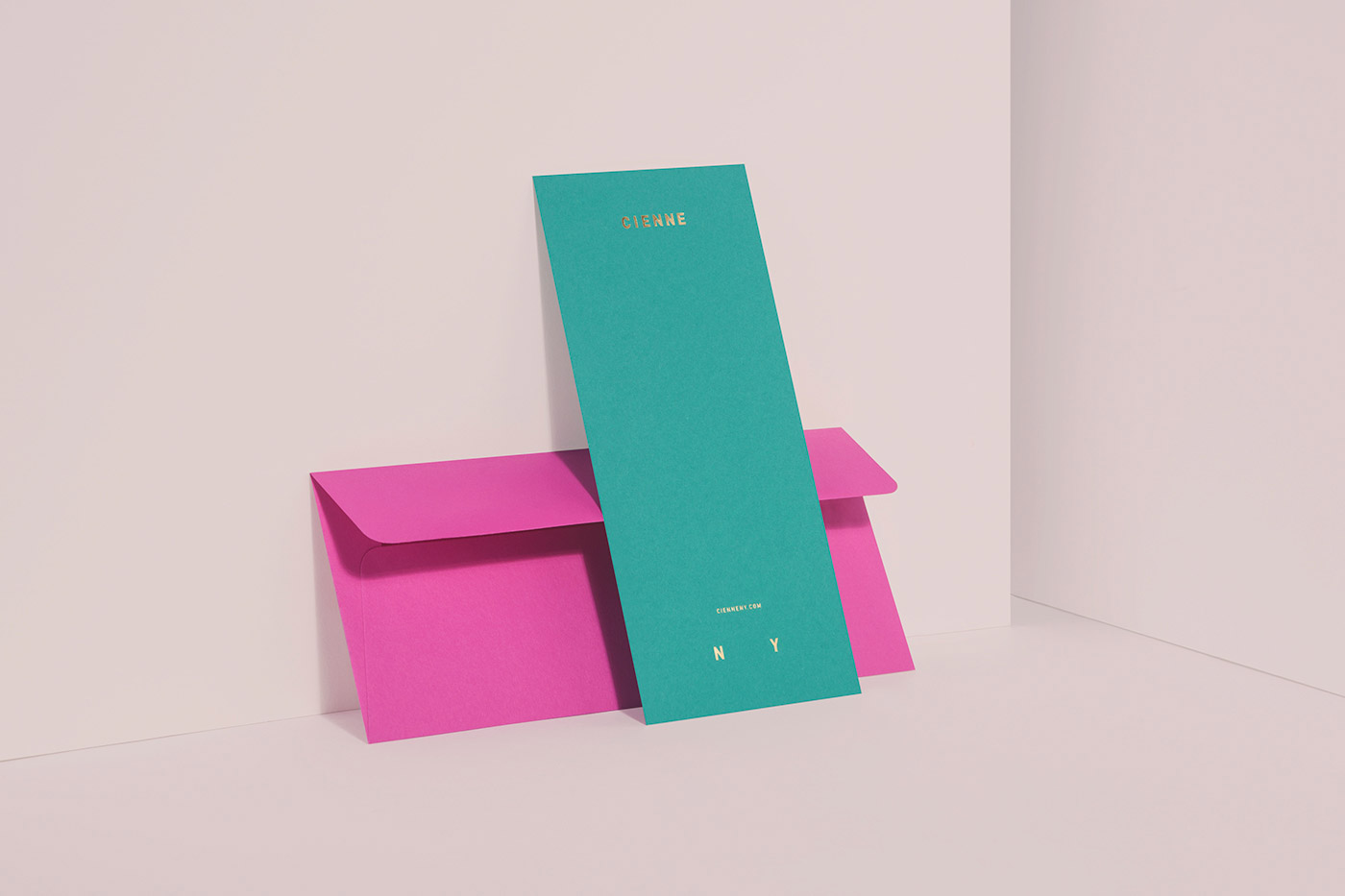
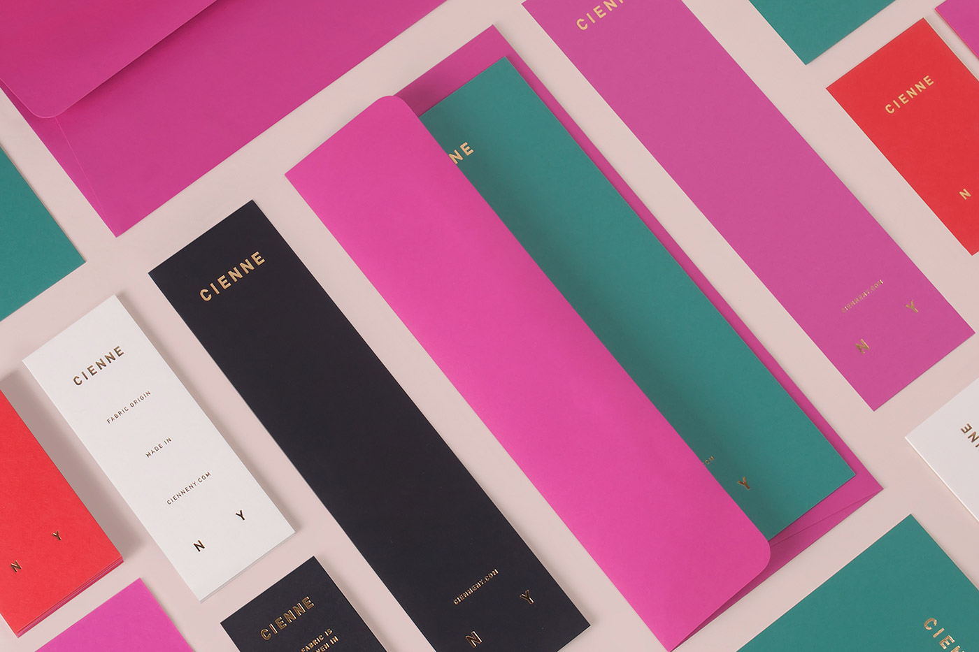
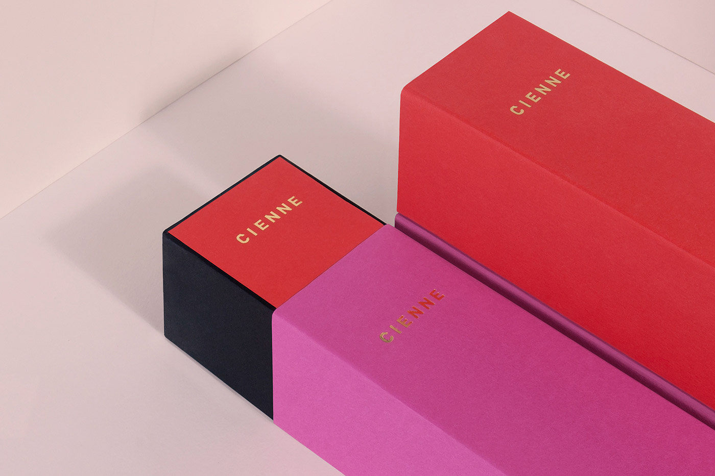
Lotta Nieminen designed the vibrantly coloured minimalist identity and packaging for Cienne, a New York-based women’s ready-to-wear collection. 'The brand is socially and environmentally conscious, with an elevated aesthetic. The high quality materials are sourced from artisans around the world and produced in high-end factories in New York. A Cienne woman is strong and fun, sophisticated but adventurous. To embody these qualities, the identity relies heavily upon a vibrant, bold color palette, pulled from the stripes of a fabric used in the very first collection. As the brand’s versatile silhouettes, the brand colors are designed to be layered or stand alone, and last longer than just a season. While the red and magenta form the key colors of printed implementations, the website (<span class="italic">www.ciennenewyork.com</span>) relies heavily on black to give center stage to the imagery.'

Credits: Lotta Nieminen
More in Minimal Branding
Includes freebie bundle, unseen BTS insights and more.