Plus
Plus

 Menu
Menu


Bram Creates
January 13, 2018
Mindsparkle Mag


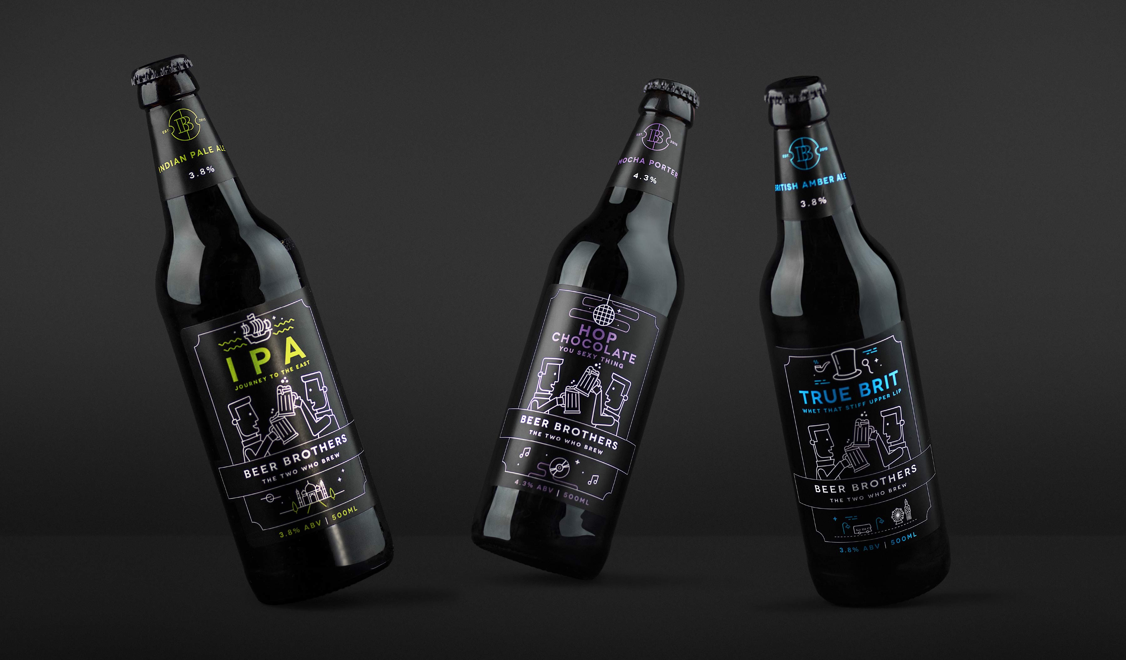
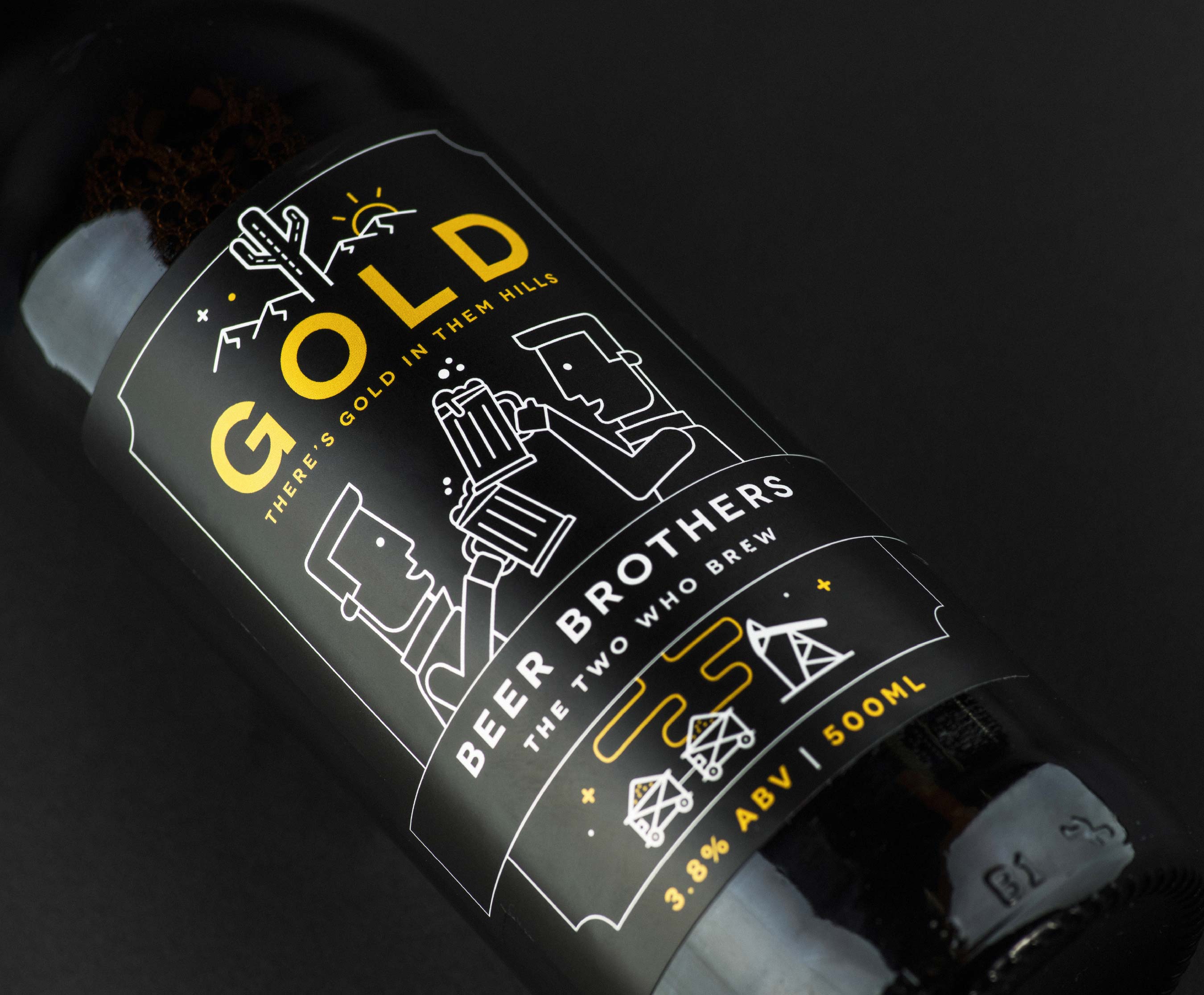
Bram Creates were approached by Beer Brothers to create a modern and accessible brand identity and packaging design that honours the traditional craft of brewing.
'We knew the guys needed a straight-talking brand reflecting their Preston roots. It needed to be a world away from the hipster beer brands in independent bottle shops, and it needed a more commercial feel, ready for a wider audience. We had to strip away any pretentious craft waffle and get back to who and what they were: engineers of taste.
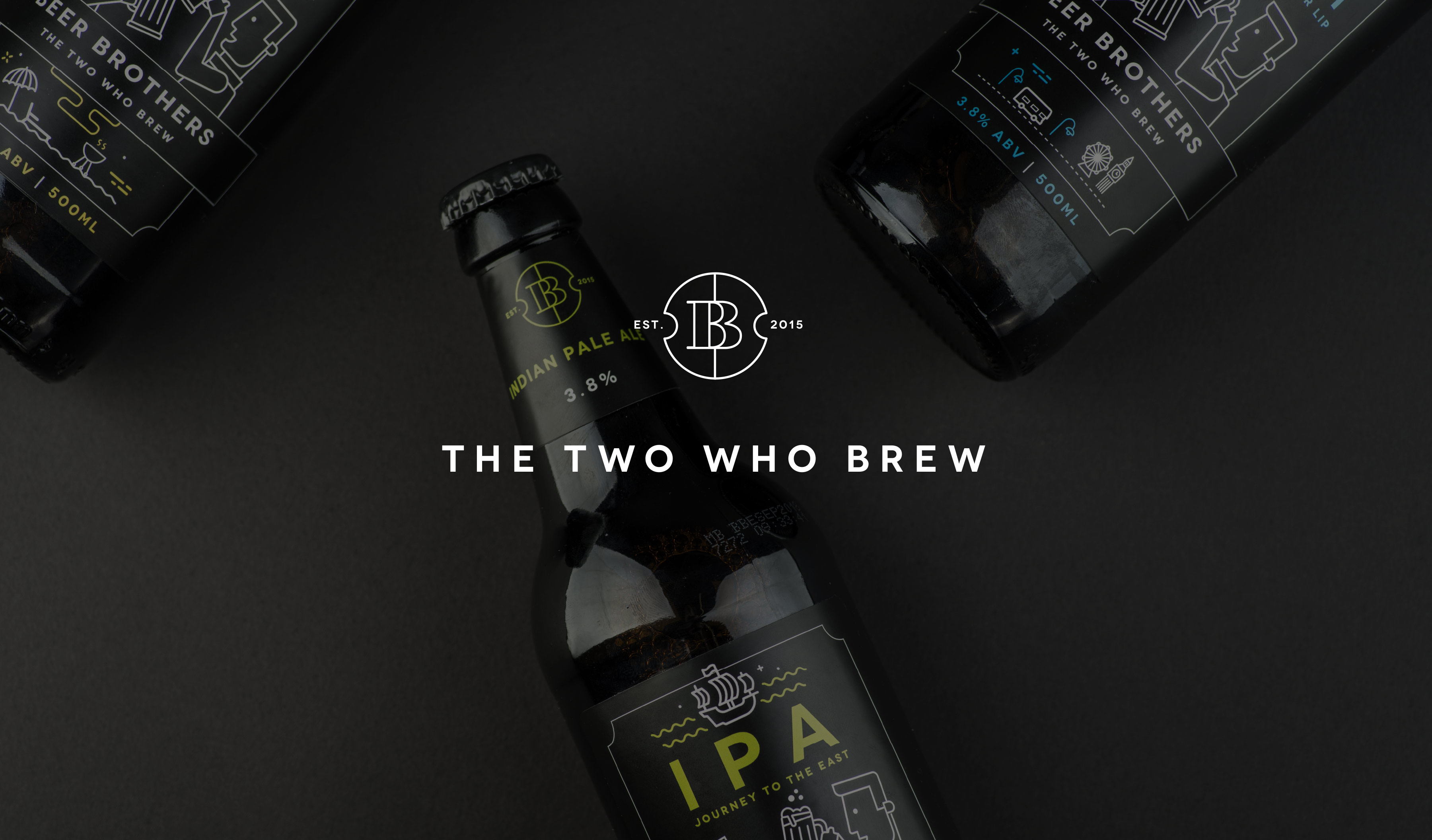
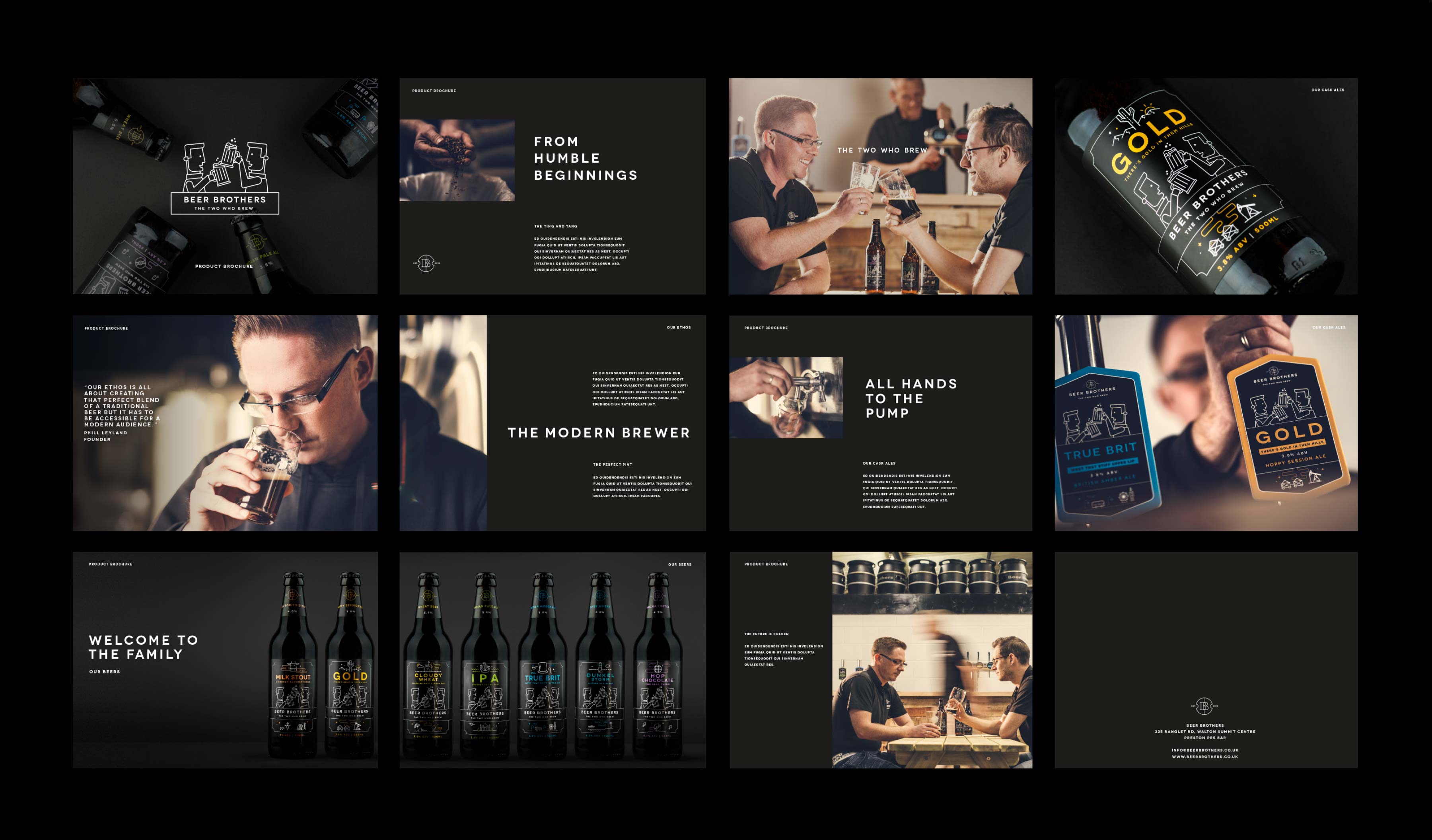
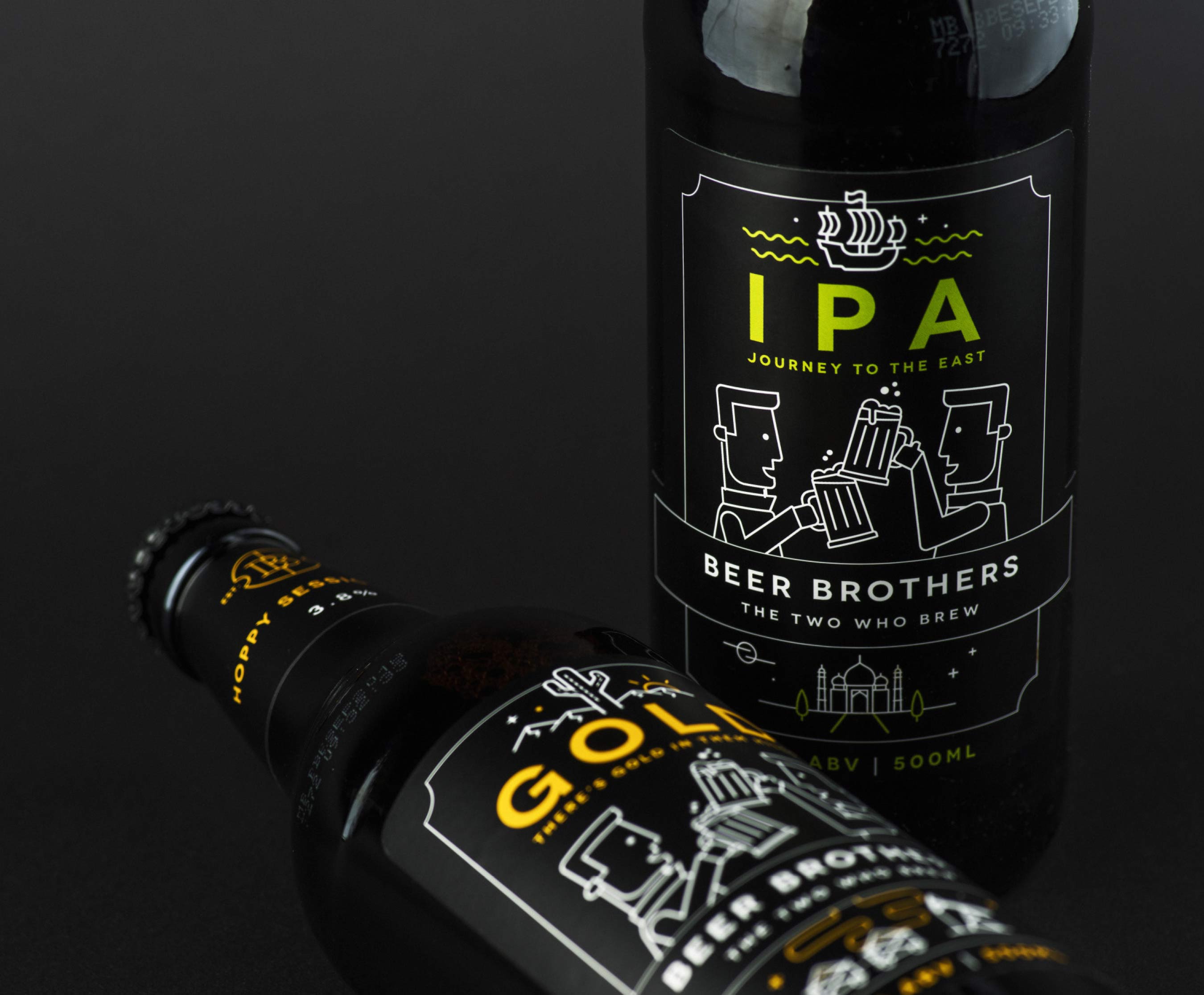
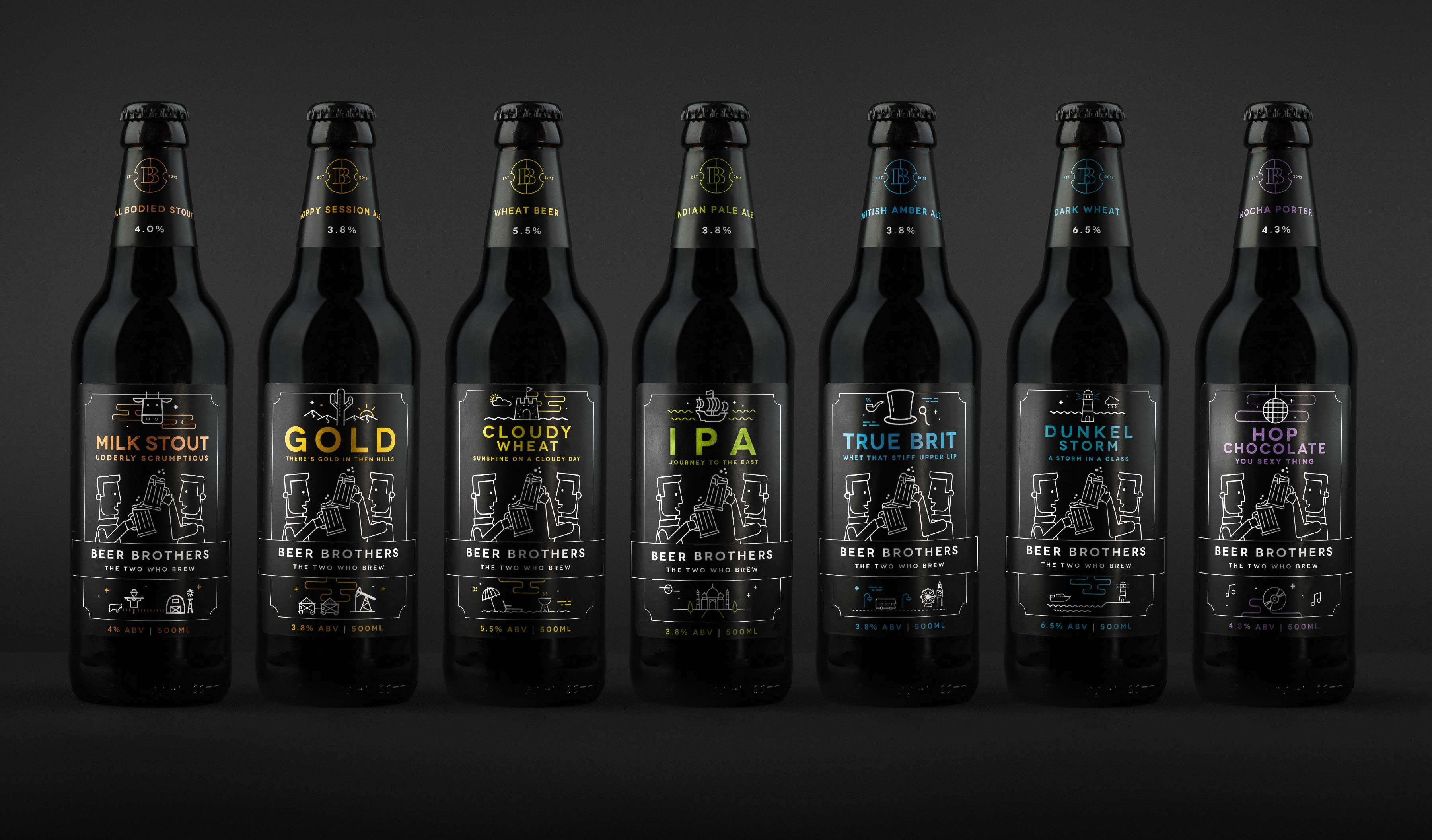
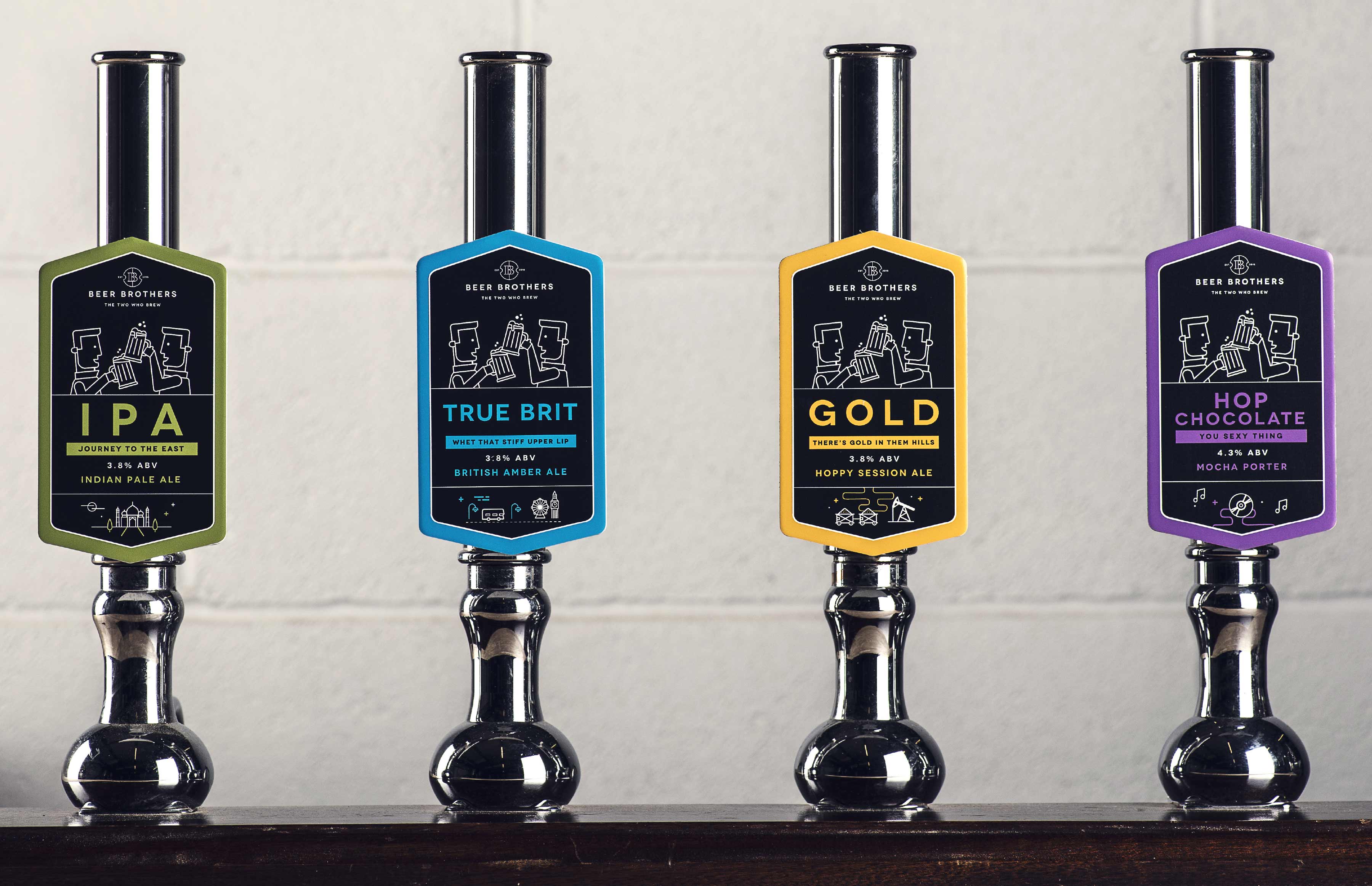
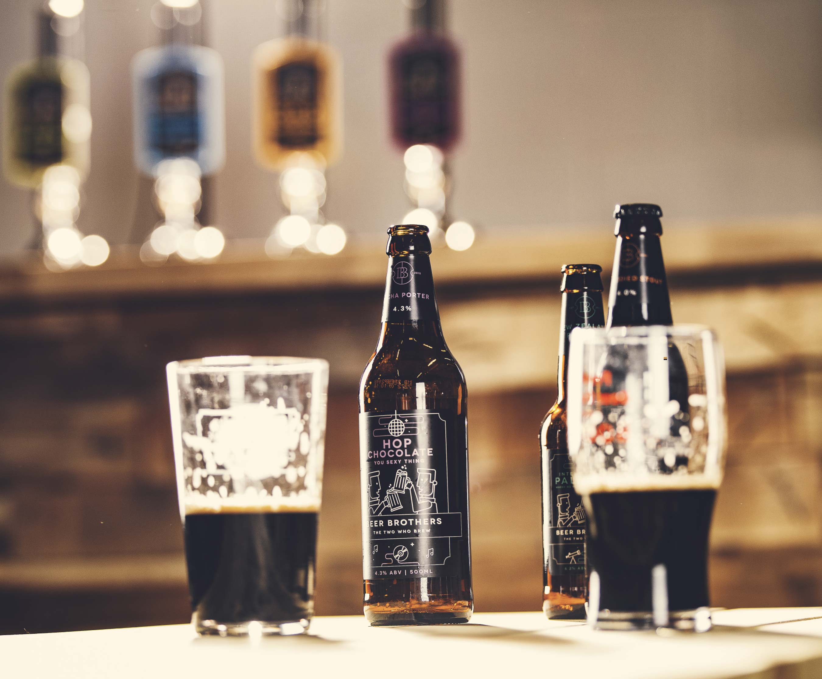
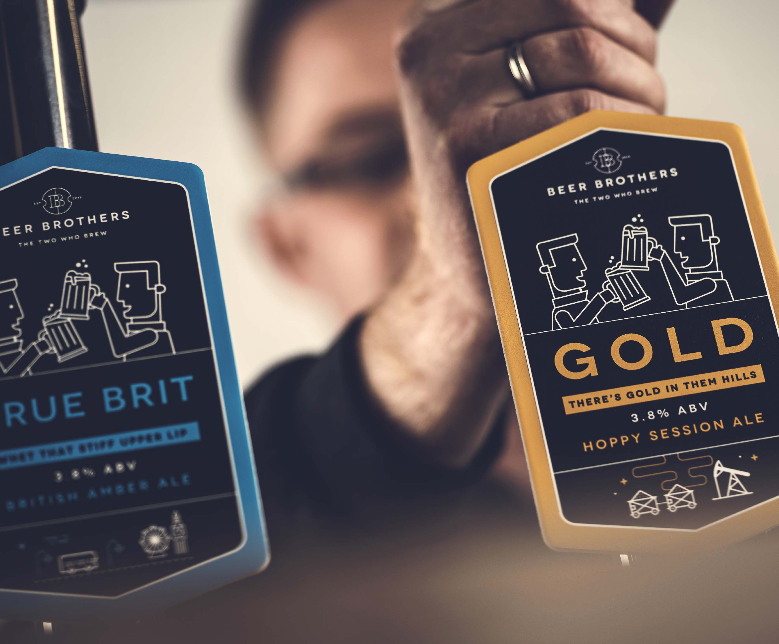
This 'stripped back' ideology informed our simple black and white logo design. We carried this monochrome feel across the brand, pairing it with a selection of accent colours to distinguish each flavour and gave each bottle had its own customised design based on its name (something else we lent a hand on). That done, we rolled out it all out across the brand, twelve beer labels and a bespoke product brochure.
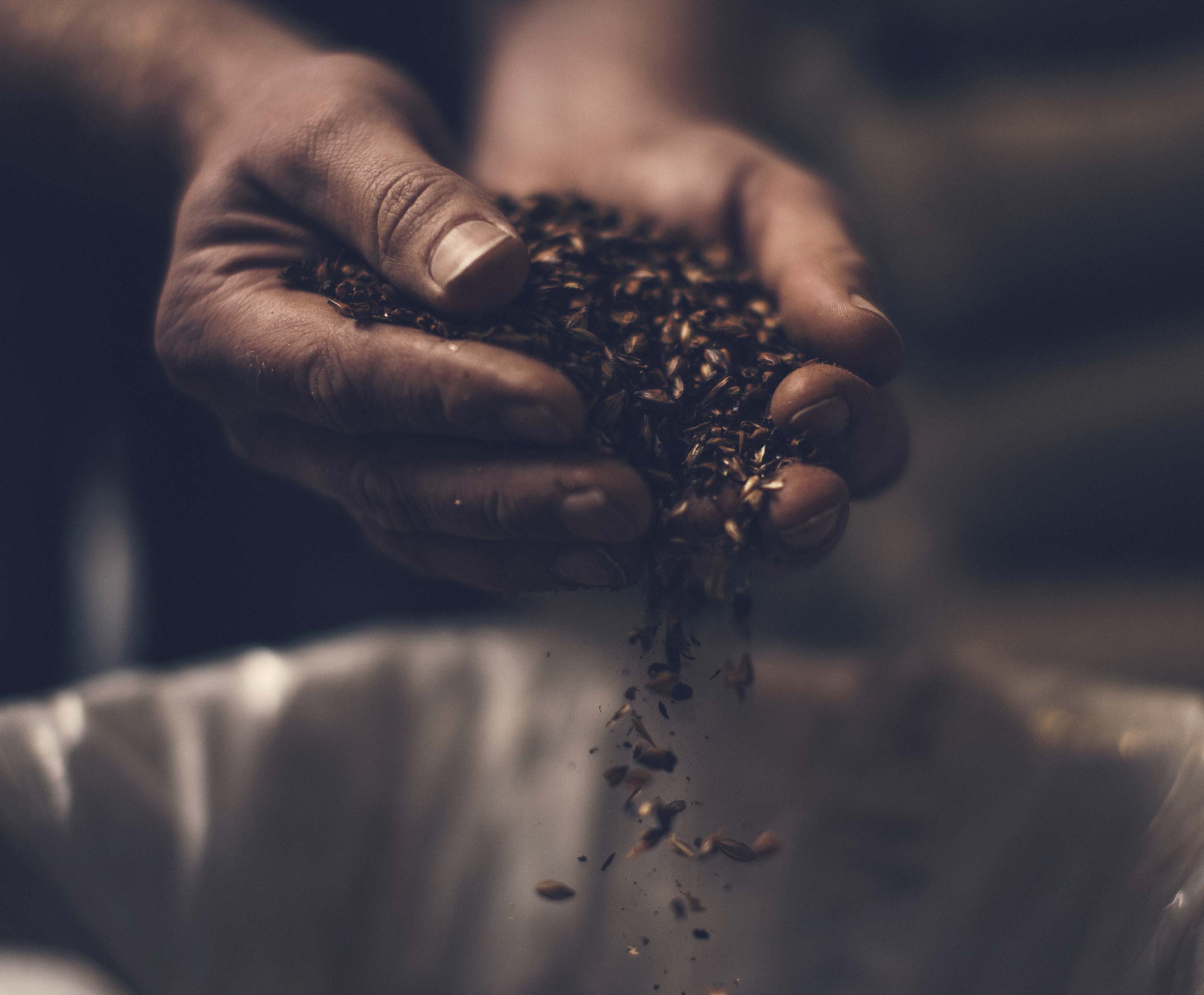
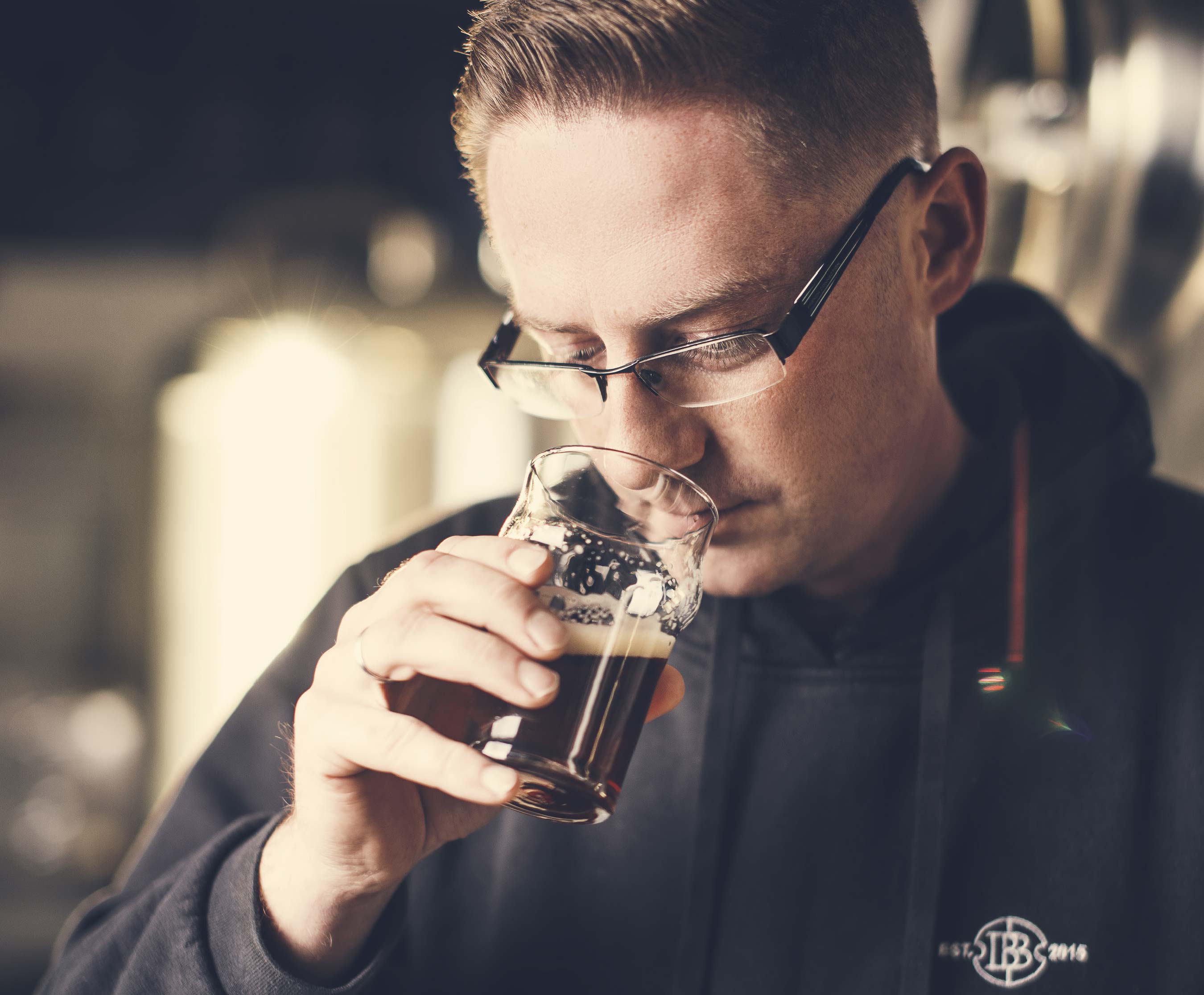
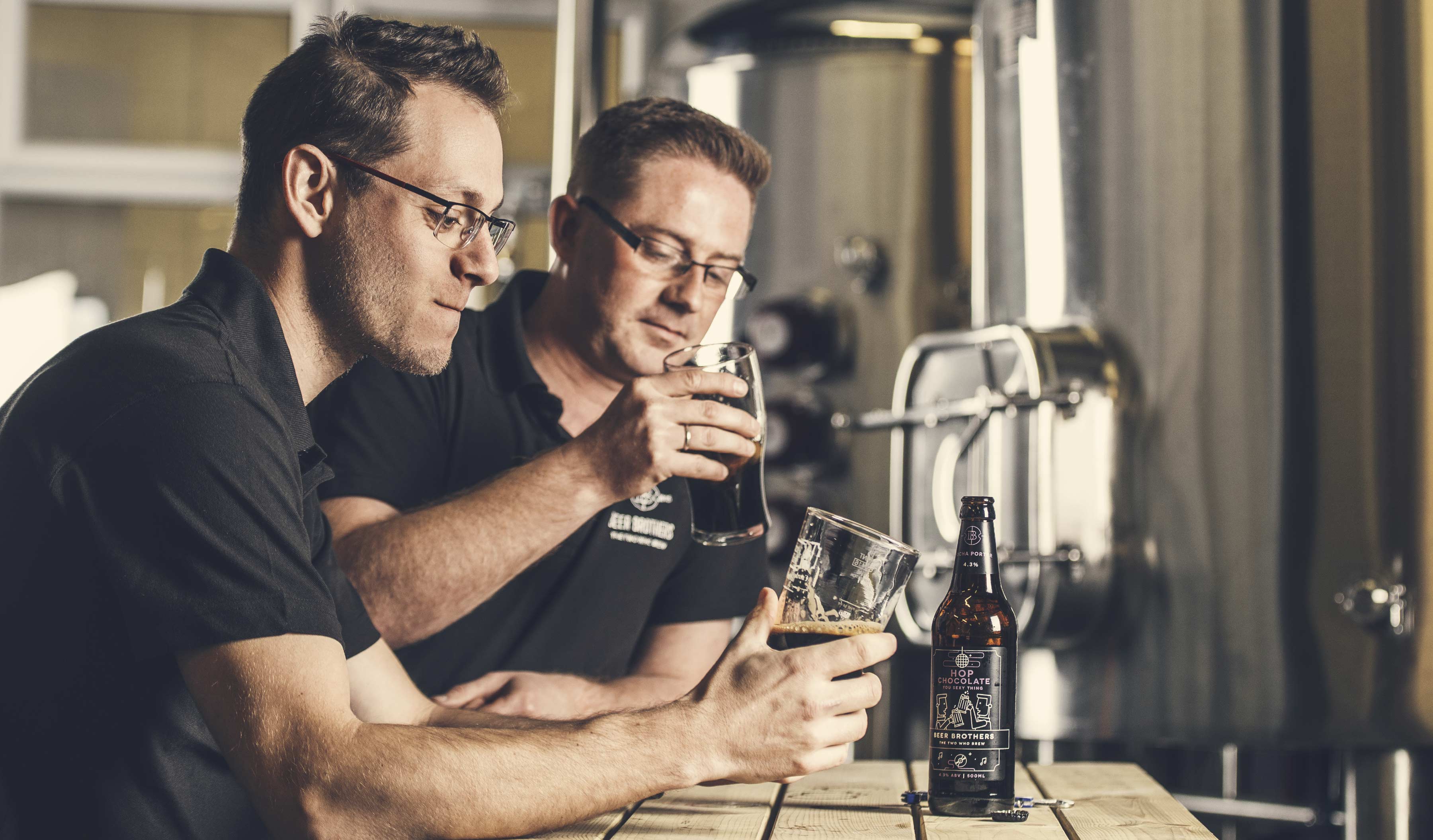
We also knew photography was going to be critical. We really wanted had to capture the care and attention-to-detail the guys embody, which is why we commissioned Little Mark for the branded photography. He was able to give the images a timeless feel, adding a warmth and humanity without compromising the minimalist branding.'

Credits: Bram Creates
More in Alcohol & Spirits Packaging
Includes freebie bundle, unseen BTS insights and more.