Plus
Plus

 Menu
Menu


Campbell Hay
November 11, 2025
Mindsparkle Mag


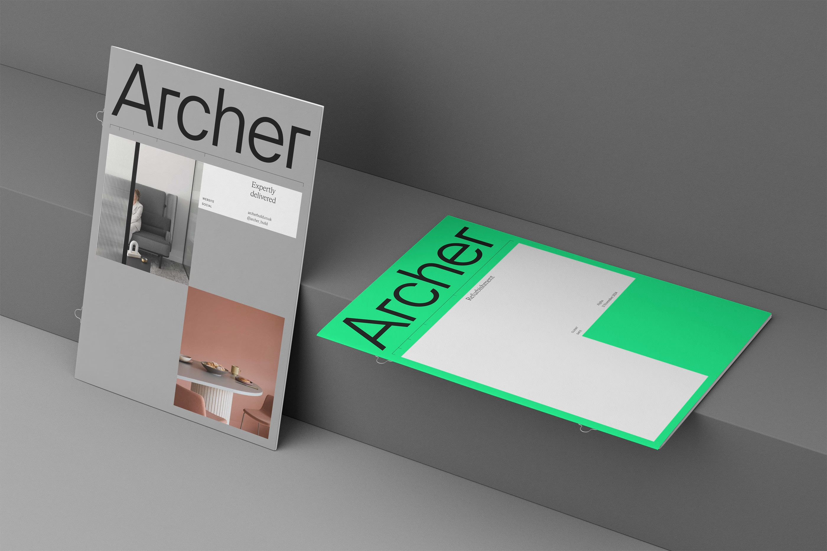
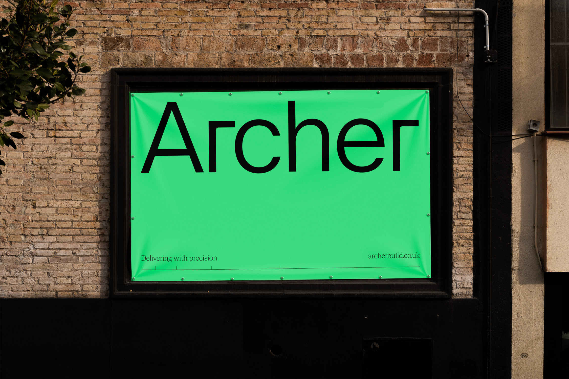
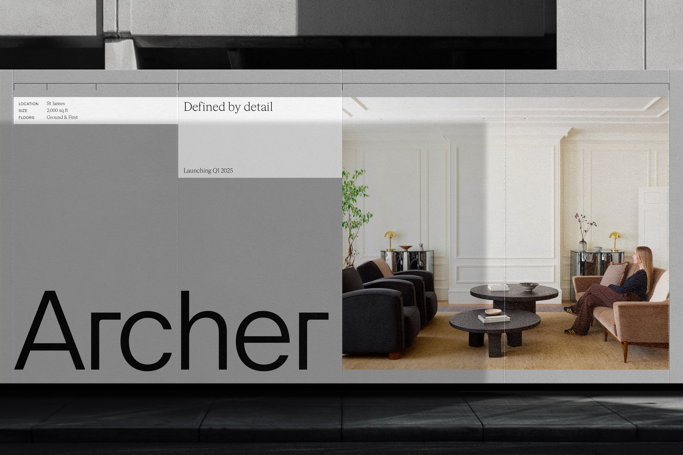
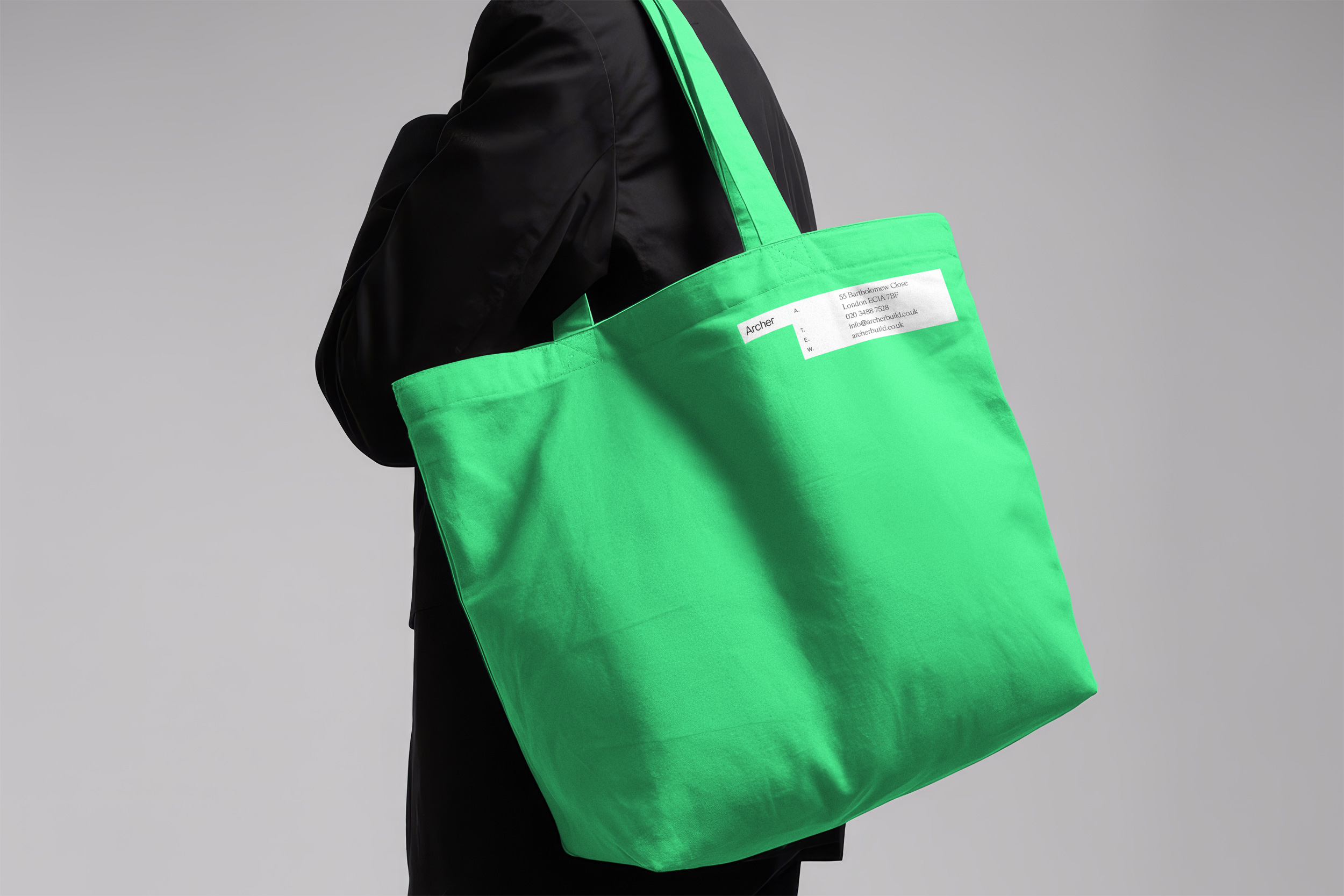
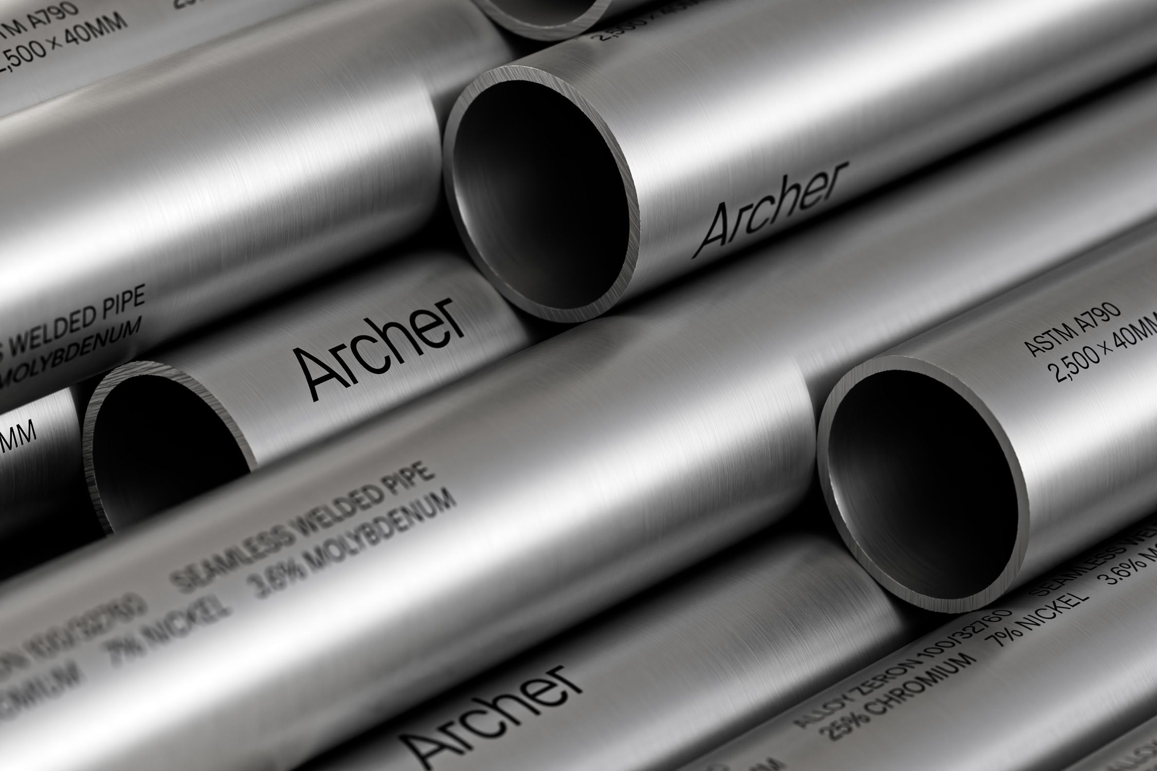
Reliable, precise, and built for purpose. Archer delivers CAT A & B commercial fit outs for landlords and occupiers. As a new player in the market, they needed an identity that would clearly communicate their technical expertise and set them apart in a competitive landscape.
THE BRIEF
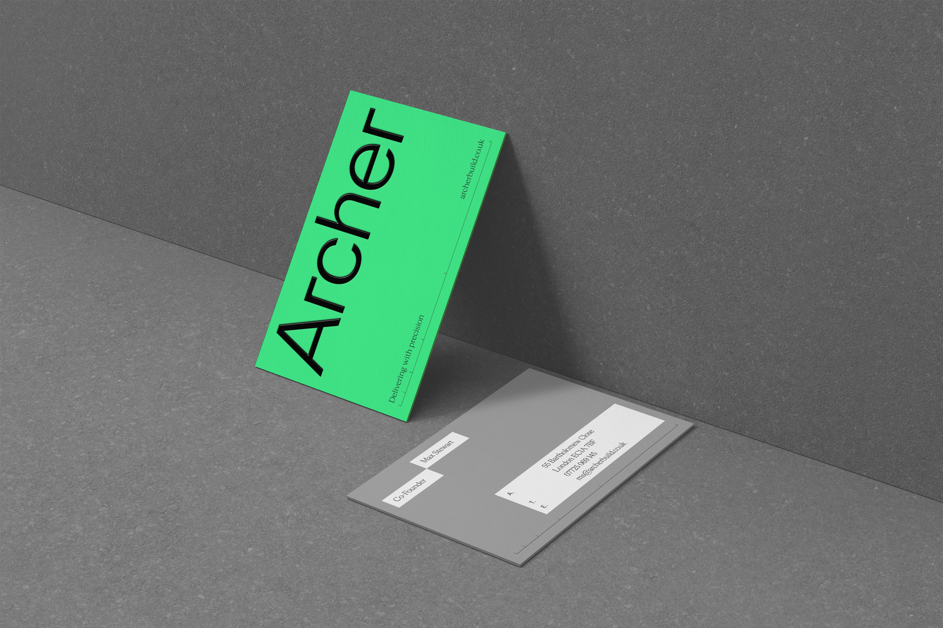
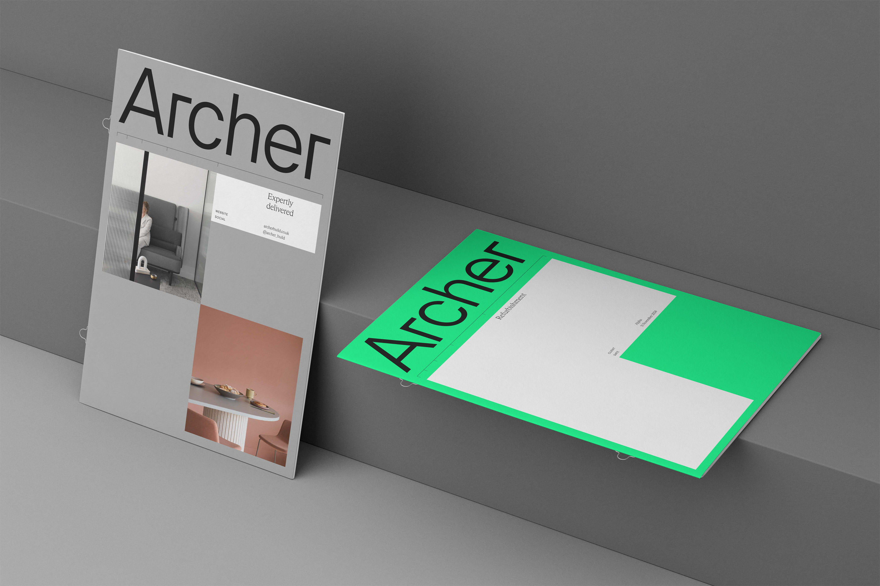
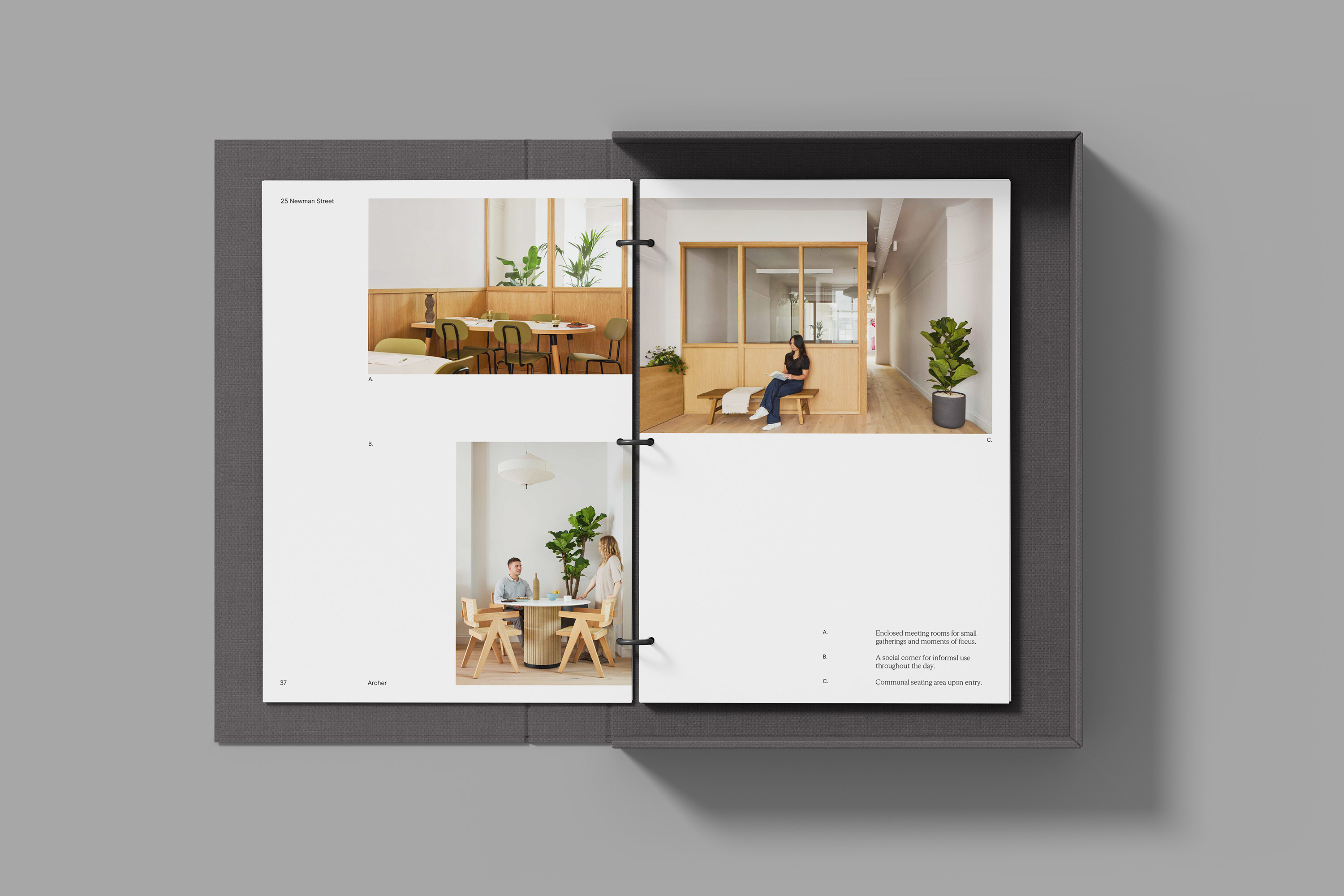
Archer approached Campbell Hay to create an identity that reflects their specialist expertise in CAT A & B commercial fit outs. Operating through both traditional and hybrid Detail & Build models, they needed a visual identity that would communicate precision, professionalism, and technical competence. The brief called for a name and identity that would resonate with landlords and occupiers alike — one that conveys structure, reliability, and attention to detail.
THE SOLUTION
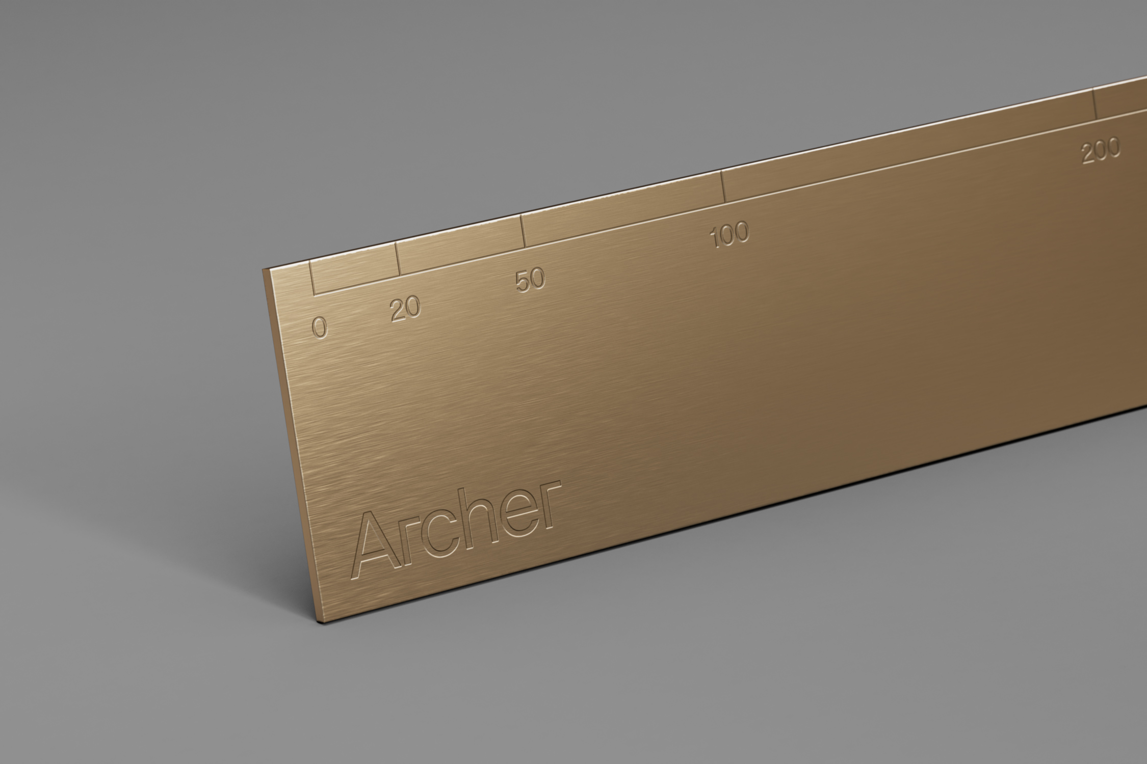
The name Archer was chosen to reflect accuracy and control — qualities at the core of the business. Visually, the identity draws from the structural world of architecture and construction: grid-based layouts, geometric forms, and a typographic style mirror the technical precision of Archer’s work. The result is a confident, architectural identity that embodies Archer’s ethos: clear thinking, precise execution, and total focus on detail.
Credits: Campbell Hay
More in Tech & Software Branding
Includes freebie bundle, unseen BTS insights and more.