Crown Creative
United States , New YorkNovember 20, 2025
Mindsparkle Mag


The Lyric Theatre is one of Northern Ireland's most important cultural institutions and their productions are epic in ambition and confidence. Crown Creative's challenge was to create a refreshed brand identity that would match that energy, reintroducing The Lyric in a dynamic and consistent way, while remaining flexible enough to support its vast range of programming.
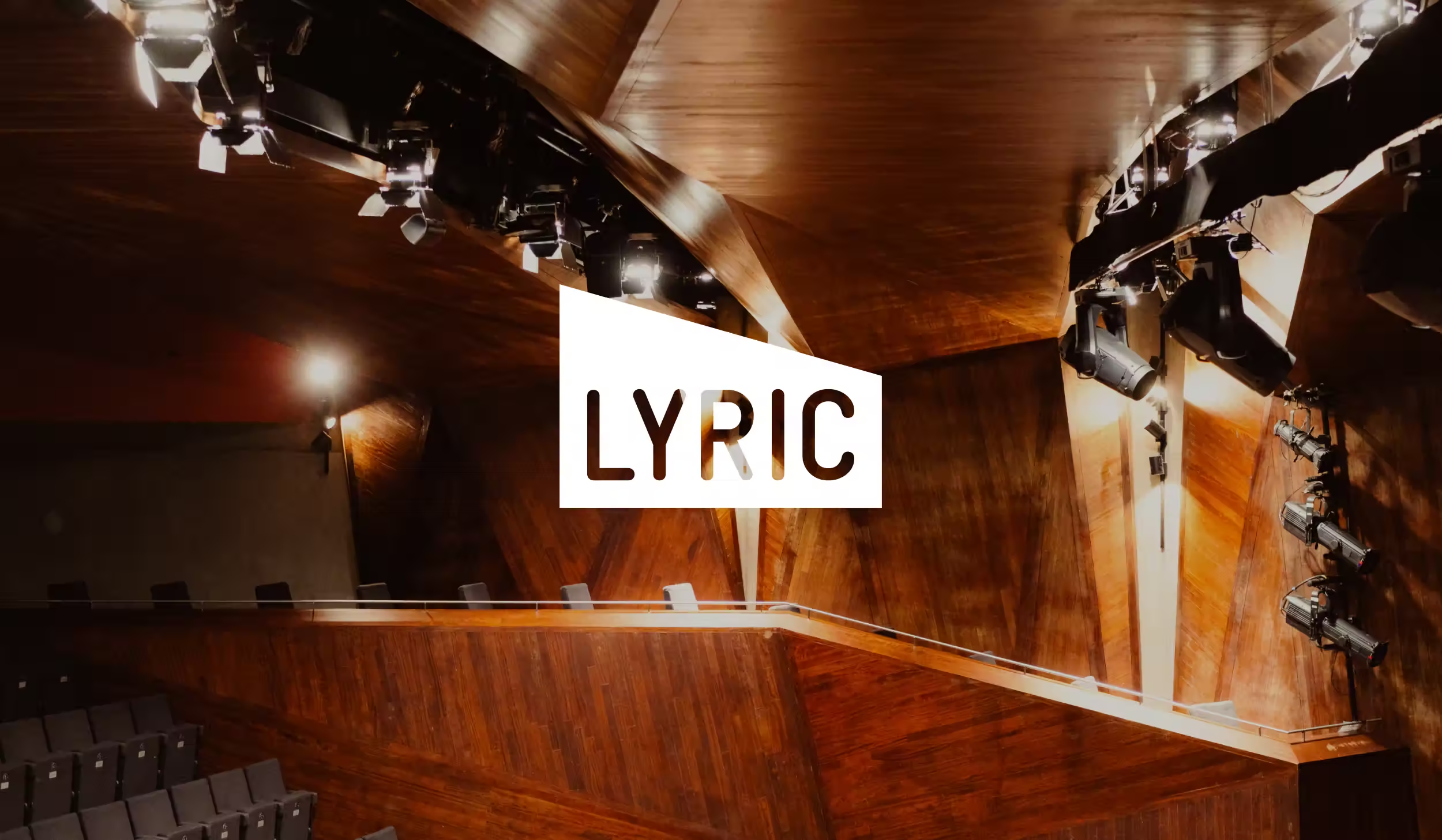
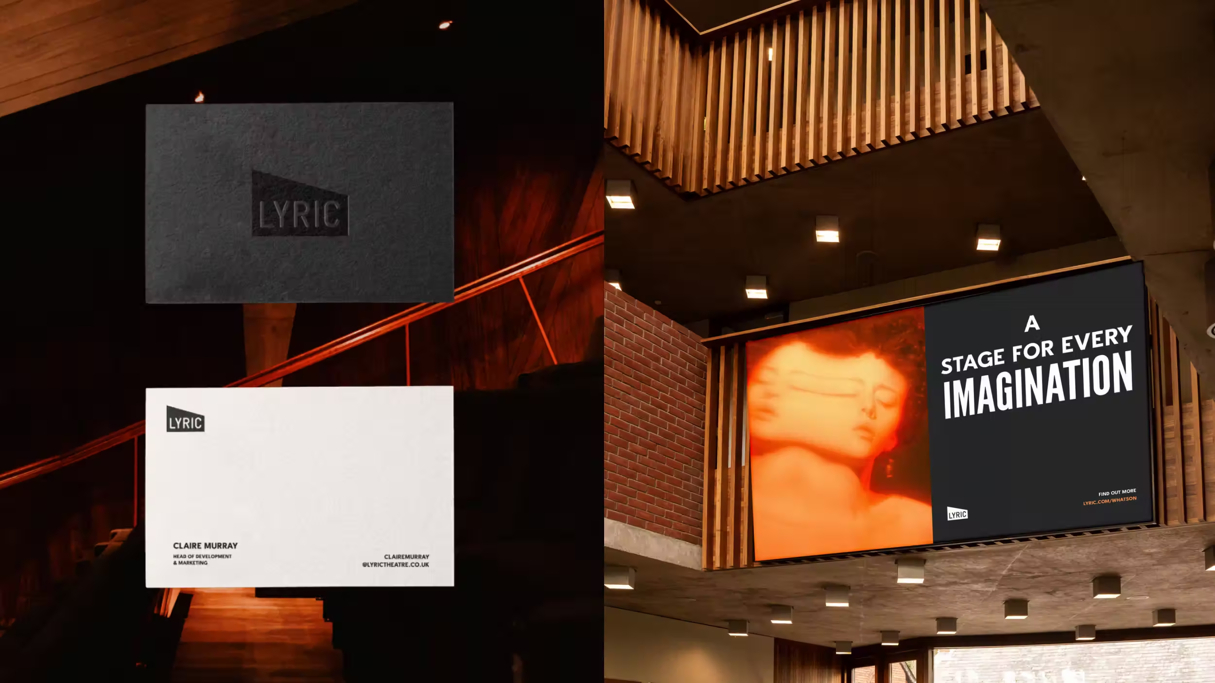
Crown Creative’s refresh reintroduces The Lyric with an identity rooted in place, story, and flexibility. At its centre sits the wedge – the most recognisable element of the theatre’s architecture – now elevated as the primary logo. Confident and instantly recognisable, it provides a strong sense of place and continuity. External lockups and wordmarks extend its use globally.
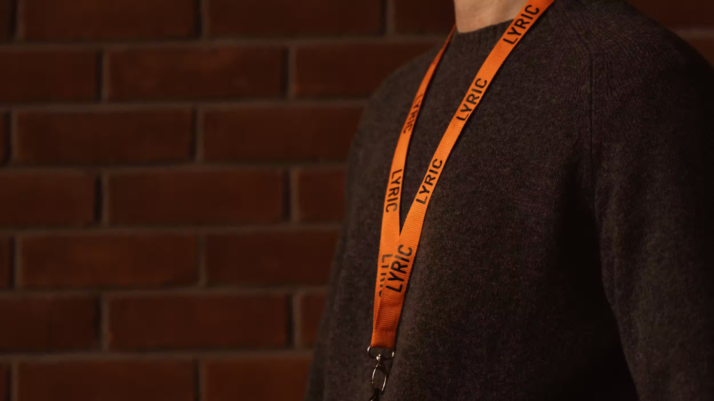
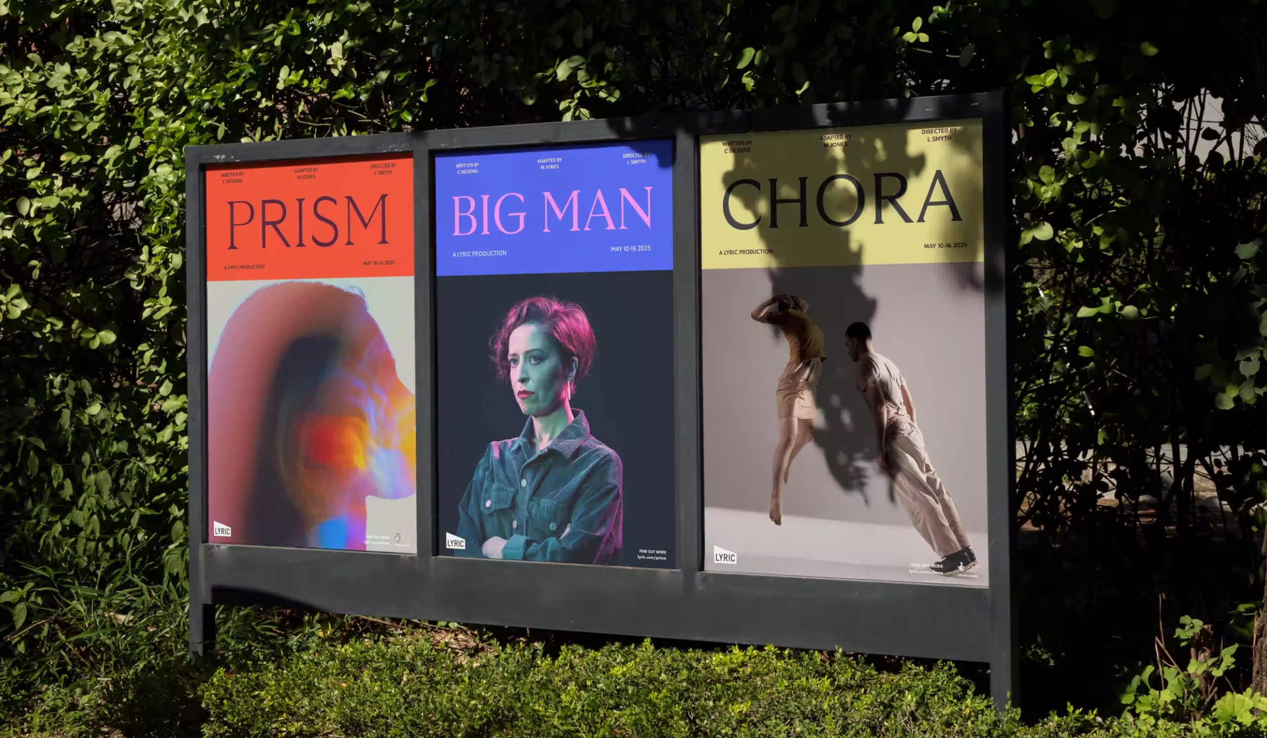
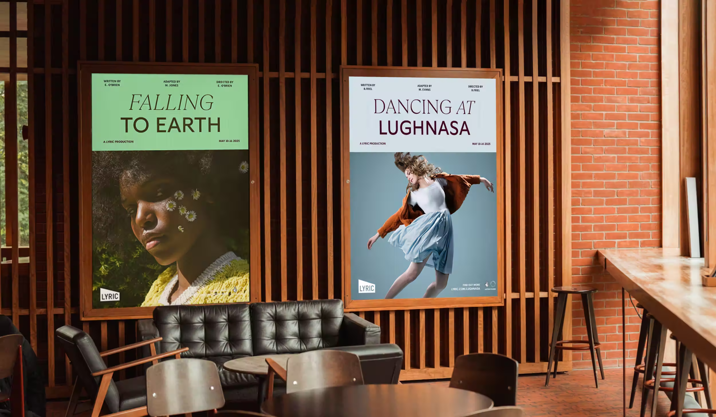
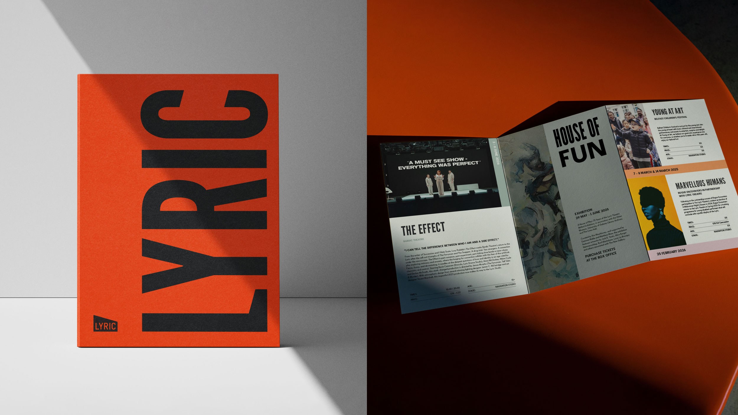
The colour palette was drawn from the building itself. Its slate, clay, graphite, and white forming a neutral foundation, supported by brighter secondary tones for Productions, Membership, Learning, and New Writing. This dual system allows communications to feel both coherent and expressive.
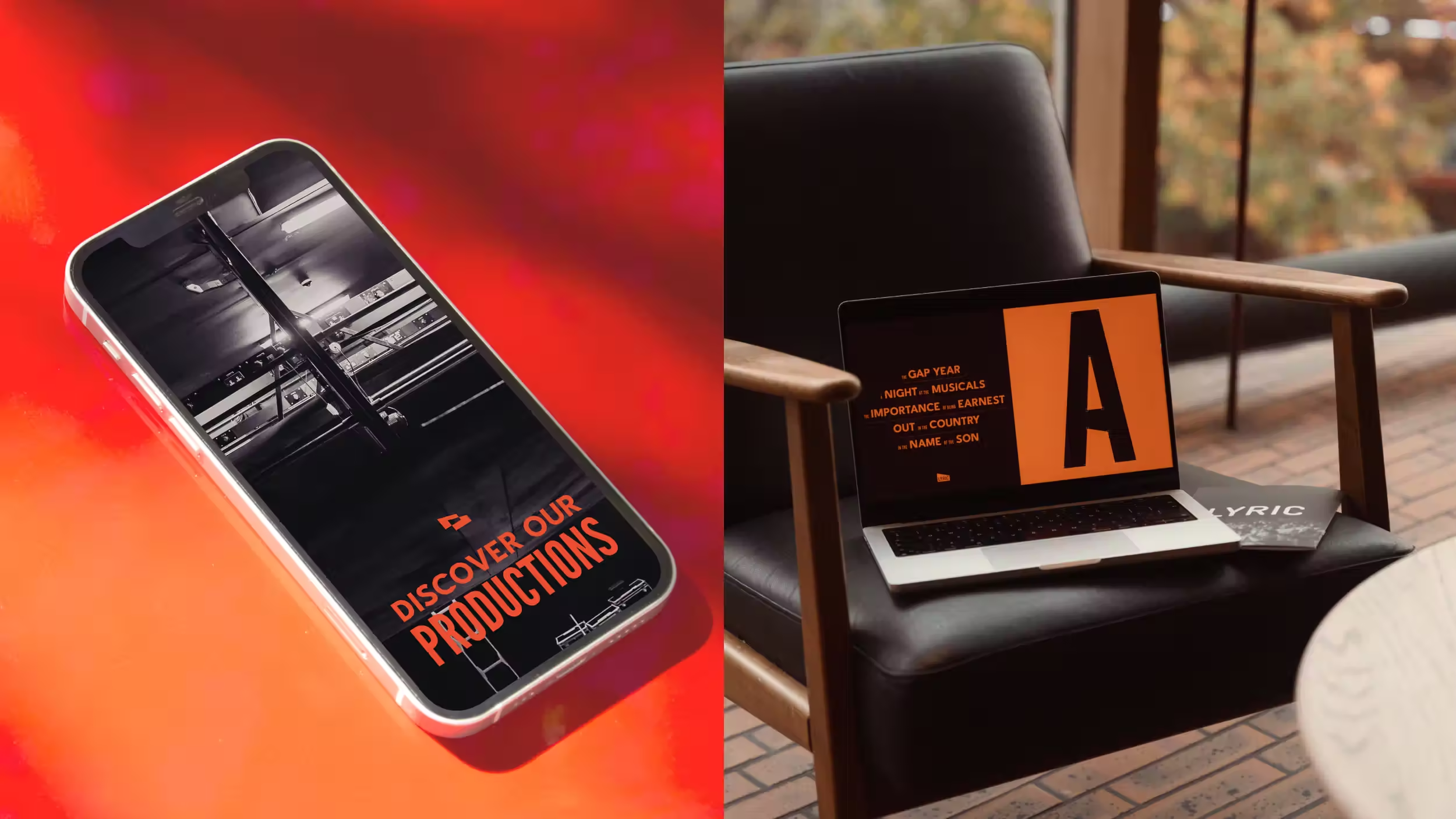
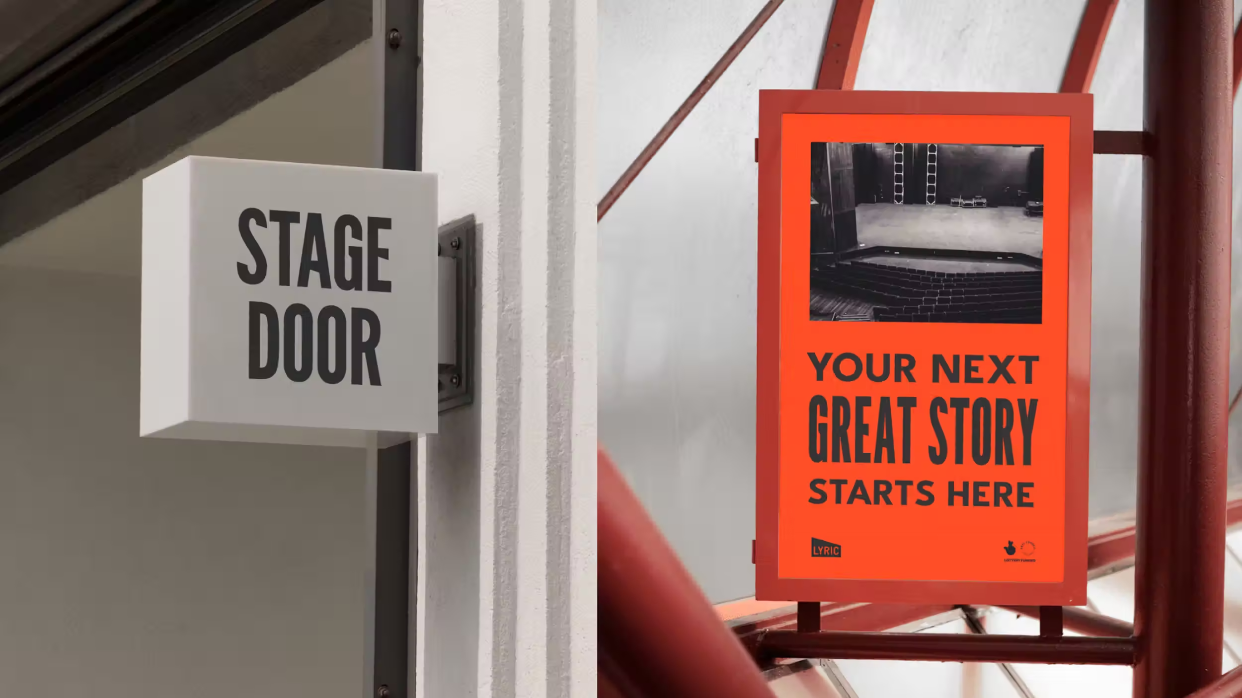
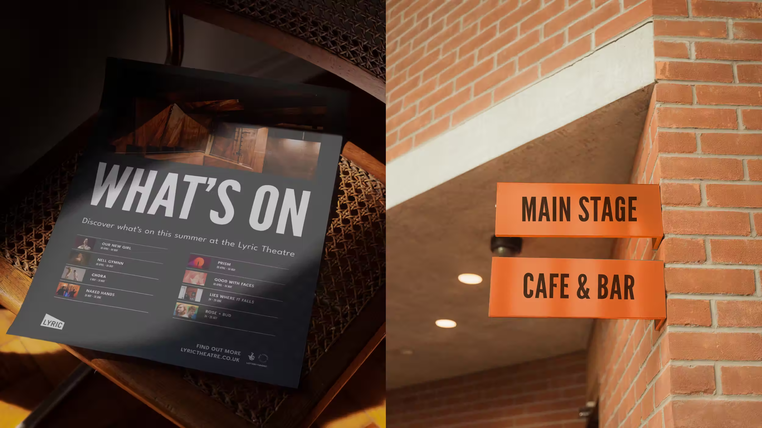
A new modular system was designed to simplify brand hierarchy, with wedge-inspired icons marking sub-brands and initiatives. This gives the Lyric team a clear but flexible way to present diverse offerings while staying visually connected. A grid system, inspired by Belfast’s red-brick streets, ensures consistency across posters, programmes, and digital platforms.
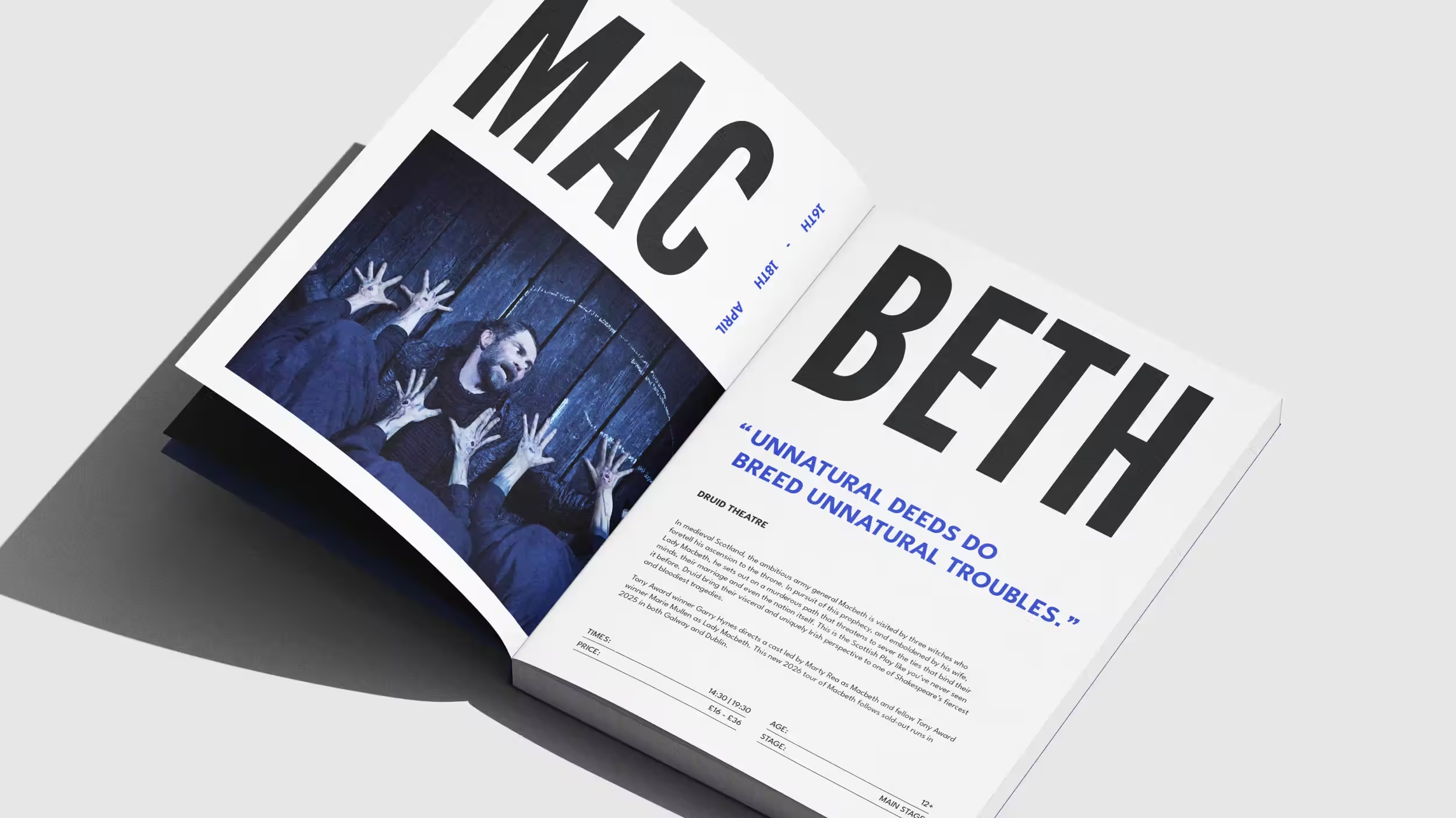
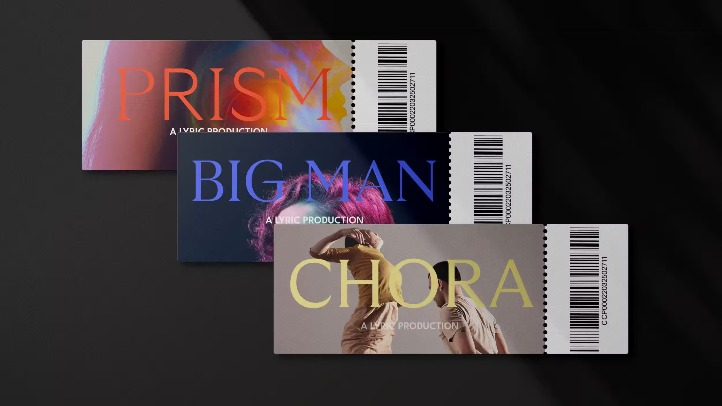
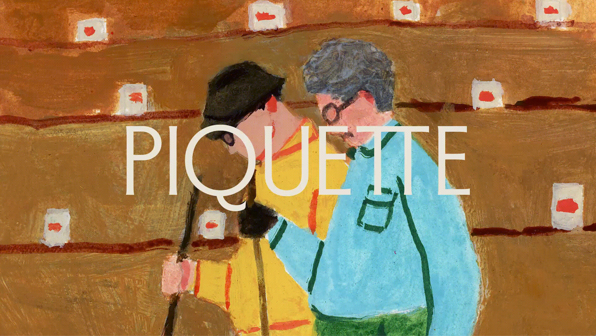
Typography further distinguishes the brand, especially the custom Lyric Display typeface. It has wedge-inspired details in each character, giving the theatre a unique typographic voice. For show posters, we introduced GT Ultra – a variable typeface that flexes between serif, sans, and mixed styles – echoing the eclectic energy of theatre.
Imagery and layouts were art directed to capture the spirit of The Lyric through dramatic lighting, architectural detail, and audience energy. Poster templates use bold colour blocking and strong type hierarchy to ensure every production feels fresh while remaining recognisable.
The result is a brand identity that balances discipline with freedom. It gives The Lyric Theatre the clarity and tools to speak with confidence, the flexibility to support its varied programmes, and a renewed sense of ownership of its cultural identity. The refresh ensures that the institution itself – not just its productions – has a voice equal to its impact on the cultural landscape.
Unlock everything with Mindsparkle Mag Plus.
Get exclusive access to Premium features:
Creative Director: Ryan Crown
Lead Designer: Kate Tracey
Senior Project Manager: Tasmin Bryden
Junior Designer: Adam Bell