SDCO Partners
September 30, 2021
Mindsparkle Mag


We're getting closer to the weekend, and who doesn't enjoy going out for lunch or dinner? On this occasion, we're presenting SDCO Partners branding design for The Prime Rib, a legendary, family-owned, 1940s-era Hollywood-inspired steakhouse. Get ready because we're going full fancy style with this project.
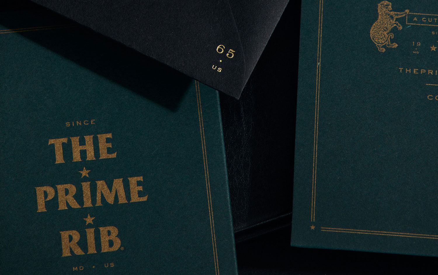
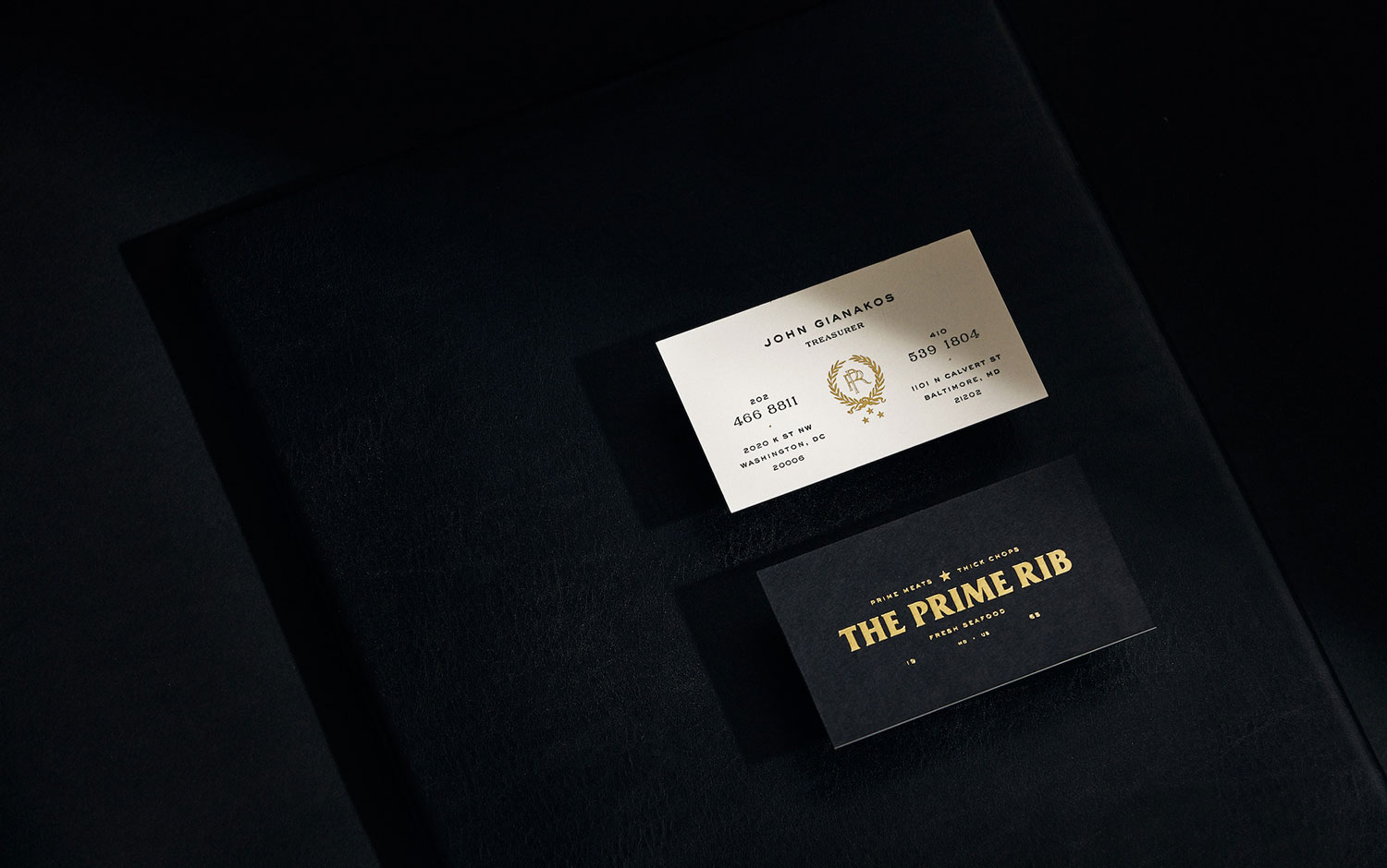
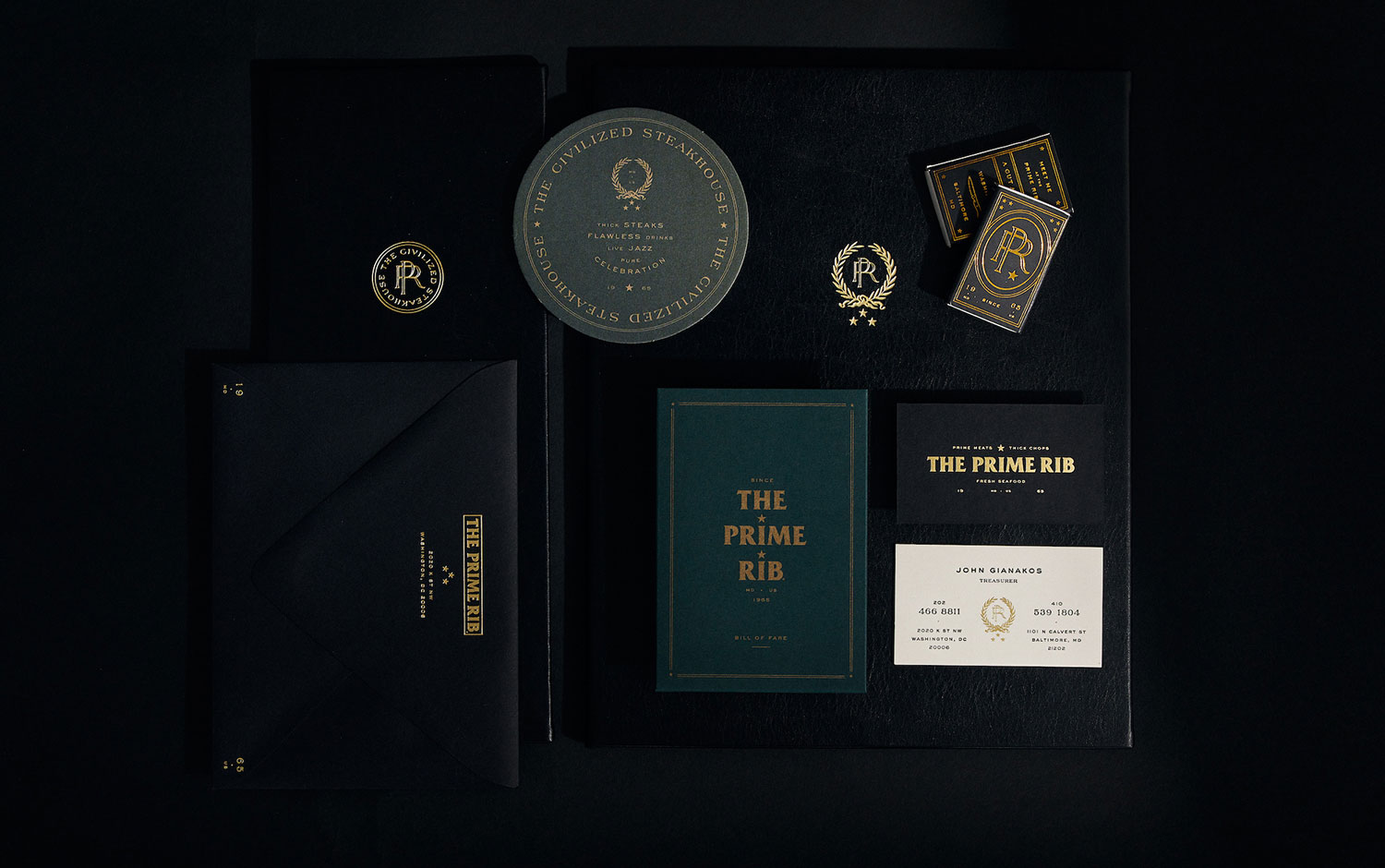
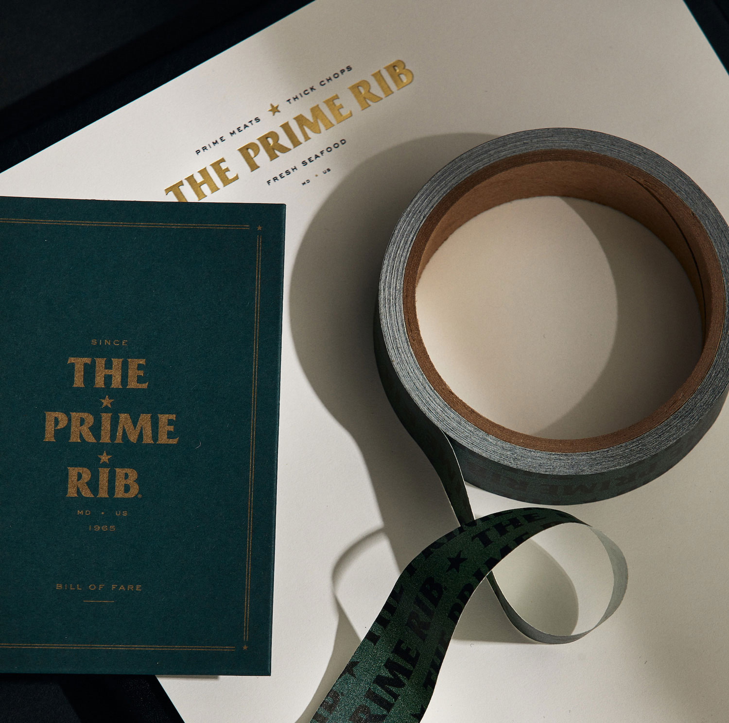
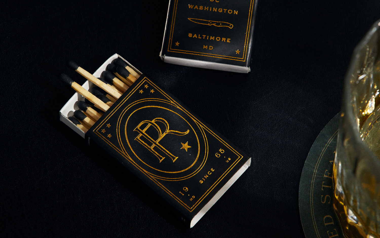
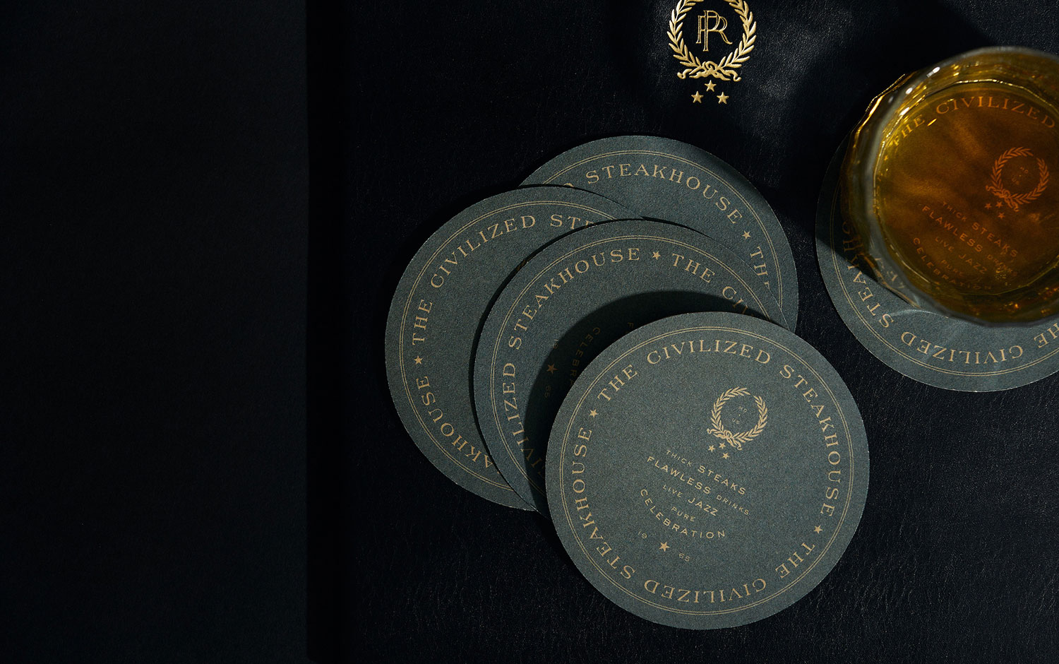
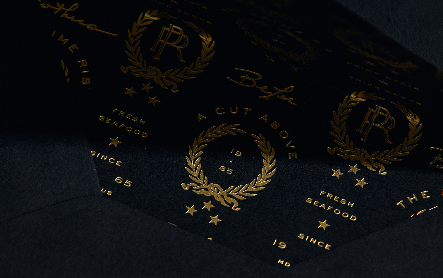
SDCO Partners team was creatively in charge of the brand's identity, design, and story. The Prime Rib's logo features letterforms that reflect its storied history and iconic personality. There are many symbols with a historical background along with the different stationery formats and products. For instance, a laurel wreath mark evokes the brand’s elevated, regal spirit. And it is paired with the established date, a vintage-inspired monogram, or restaurant location. And what makes all these elements stand out is the golden paper foil technique, which remarkably contrasts with the dark textured paper chosen. The Prime Rib's captivating visual and written language elegantly is present in environments and locations. Also, in everything from menus, interior and exterior signage, dishware, glassware, and cocktail napkins to stationery, gift cards, and team uniforms.
Astonished by the overall aesthetic of The Prime Rib and the stunning high-end detail work of SDCO Partners, we traveled back in time to an authentic atmosphere of the 40s. After finishing scrolling on this branding project, we have zero doubts about this weekend's plan: to look for the fanciest steakhouse in town ;)
Creator: SDCO Partners


.avif)