


Tiare Payano
August 04, 2024
Mindsparkle Mag


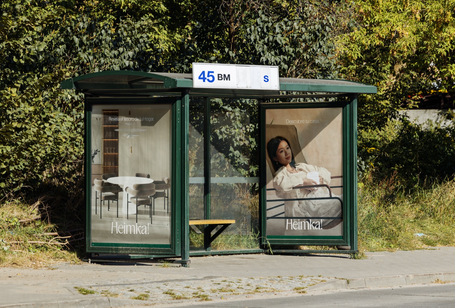
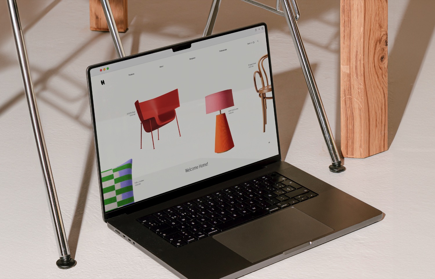
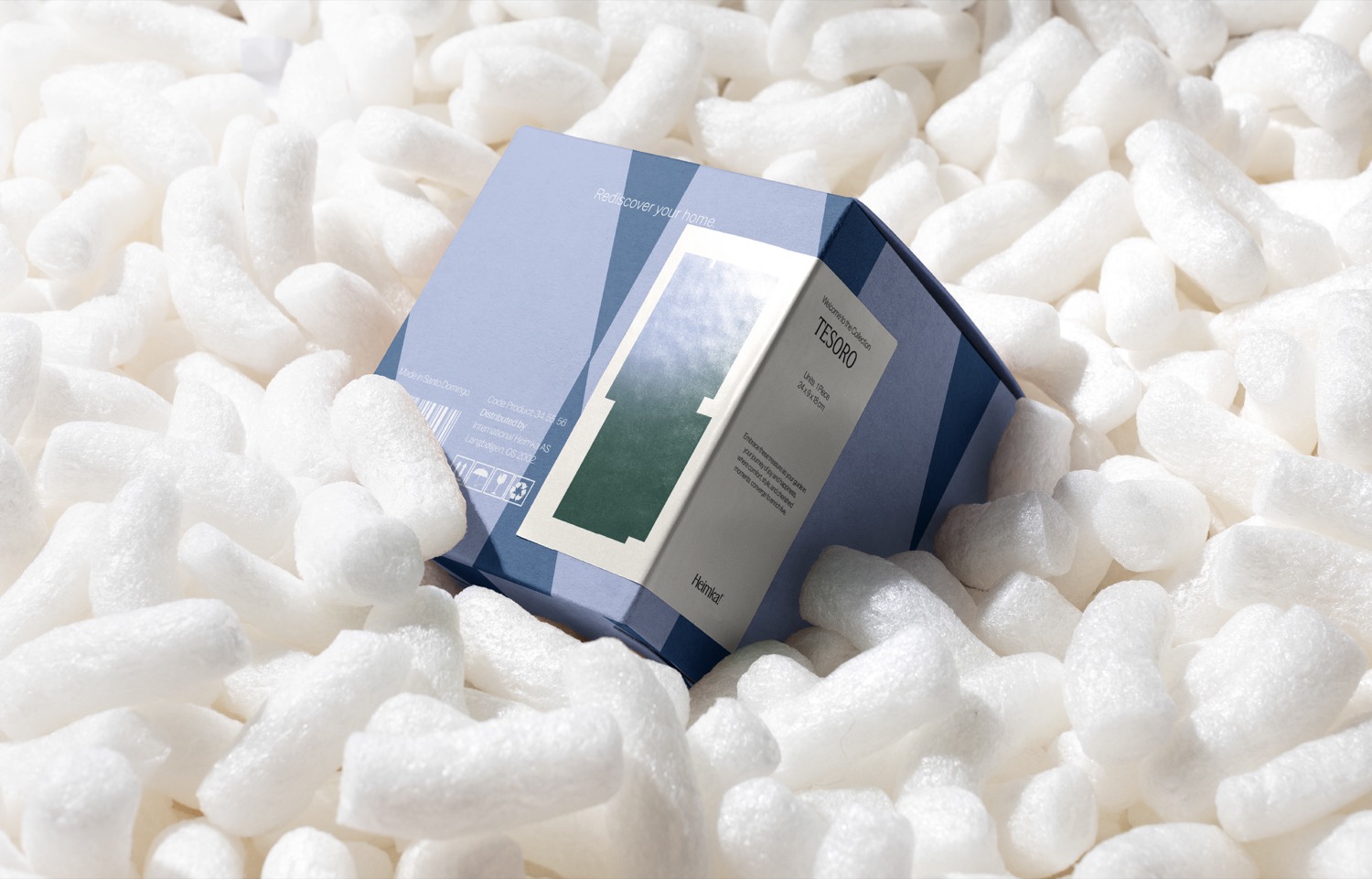
Rediscovering the Treasure of Home Decor. Heimka!/u00ae is the home of a furniture store where Nordic and Hispanic cultures meet to create a collection of timeless memories, ordinary moments, and meaningful lives based in Latam.
The brief was to conceive a visual identity system that resonates with people across all genders, lifestyles, and ages, evoking a profound sense of belonging full of authentic moments in their homes.
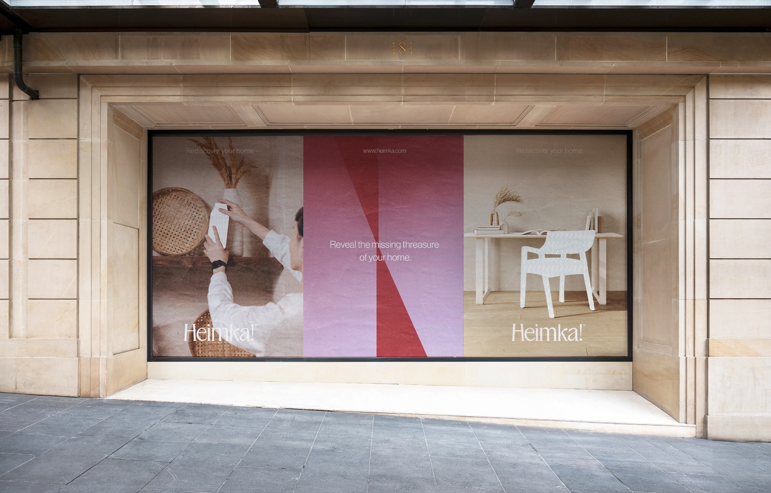
In order to create an unmistakable identity, Tiare Payano/u00a0created a concept where furniture is regarded as hidden treasures, and all the steps it takes to uncover them. In this way, the brand evolves into an adventure, inviting people to rediscover their homes as if embarking on a voyage.
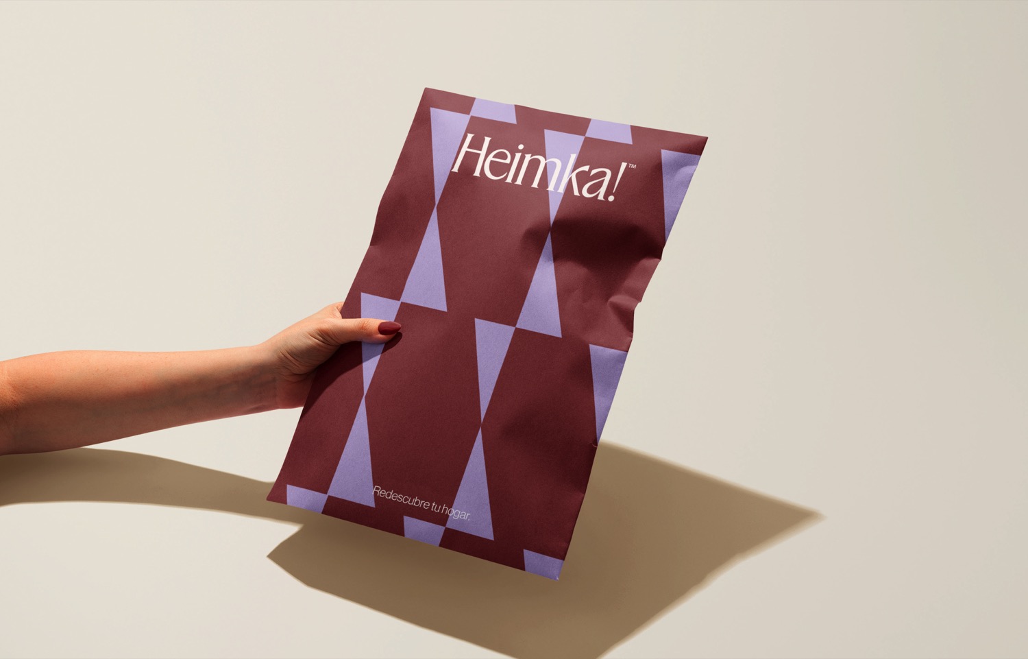
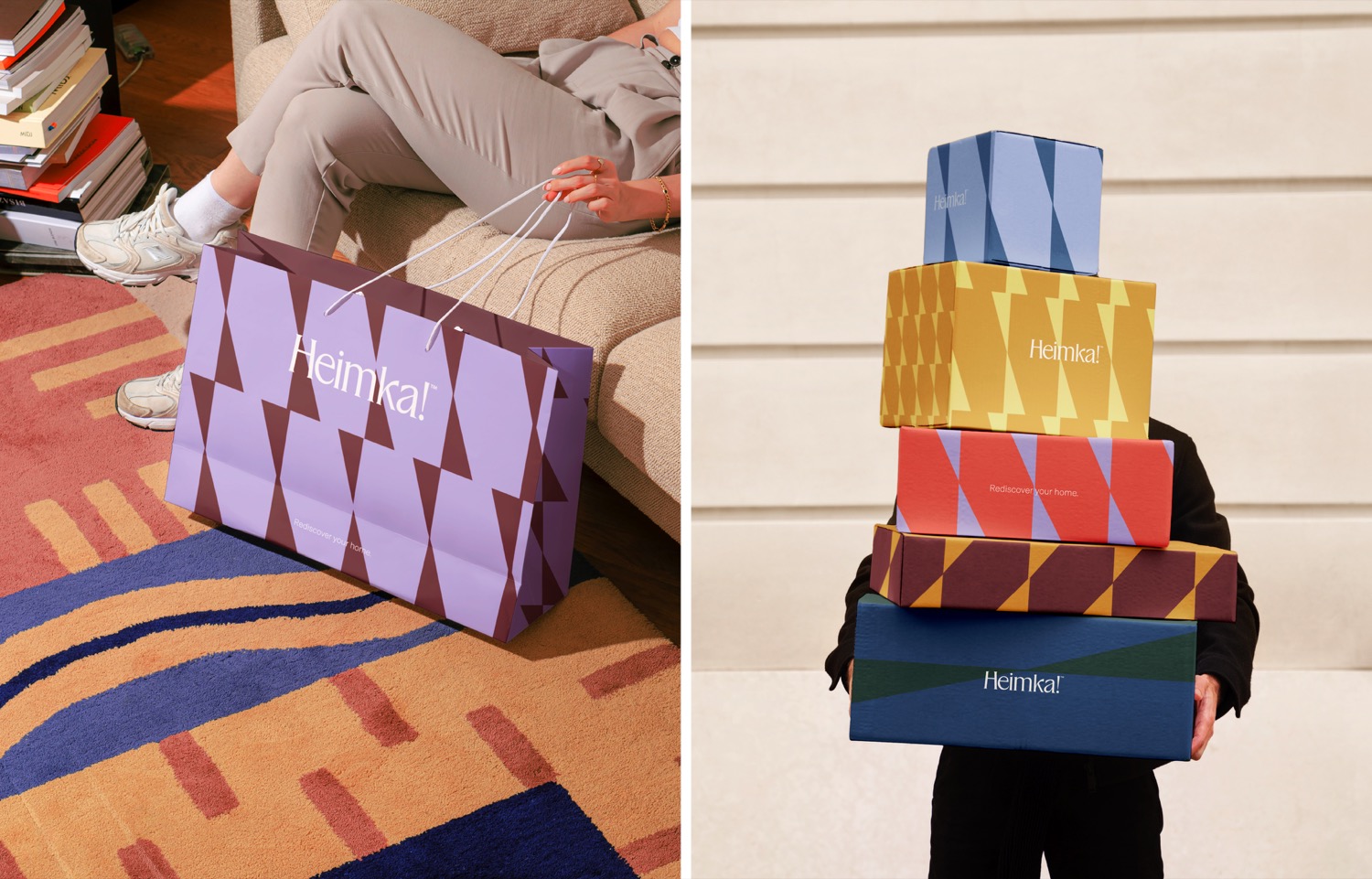
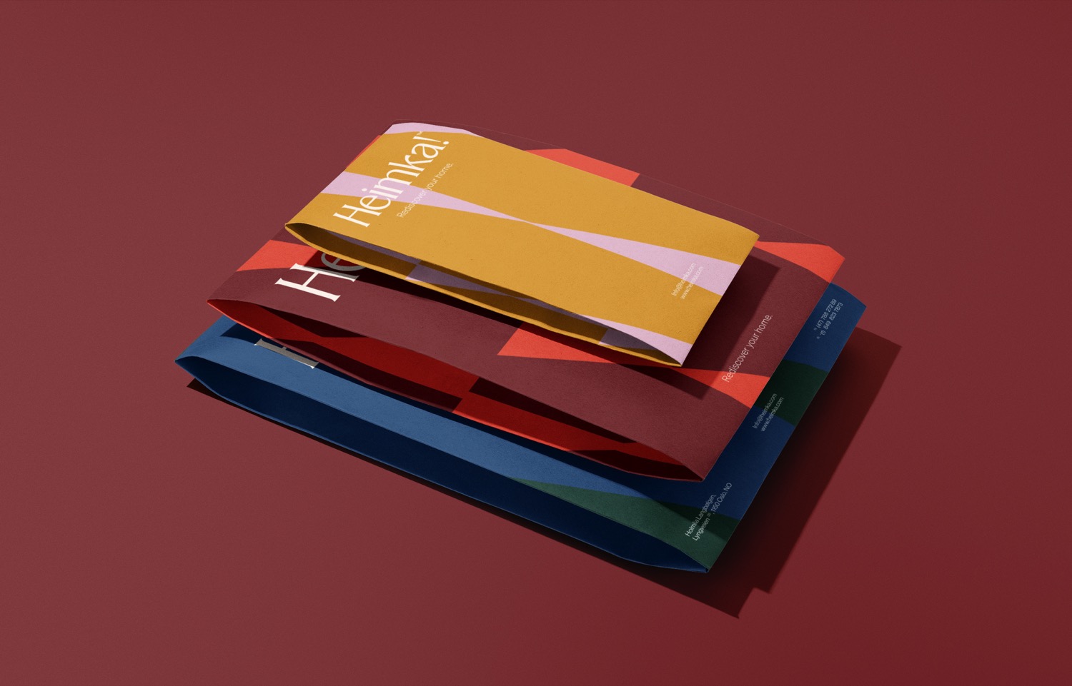
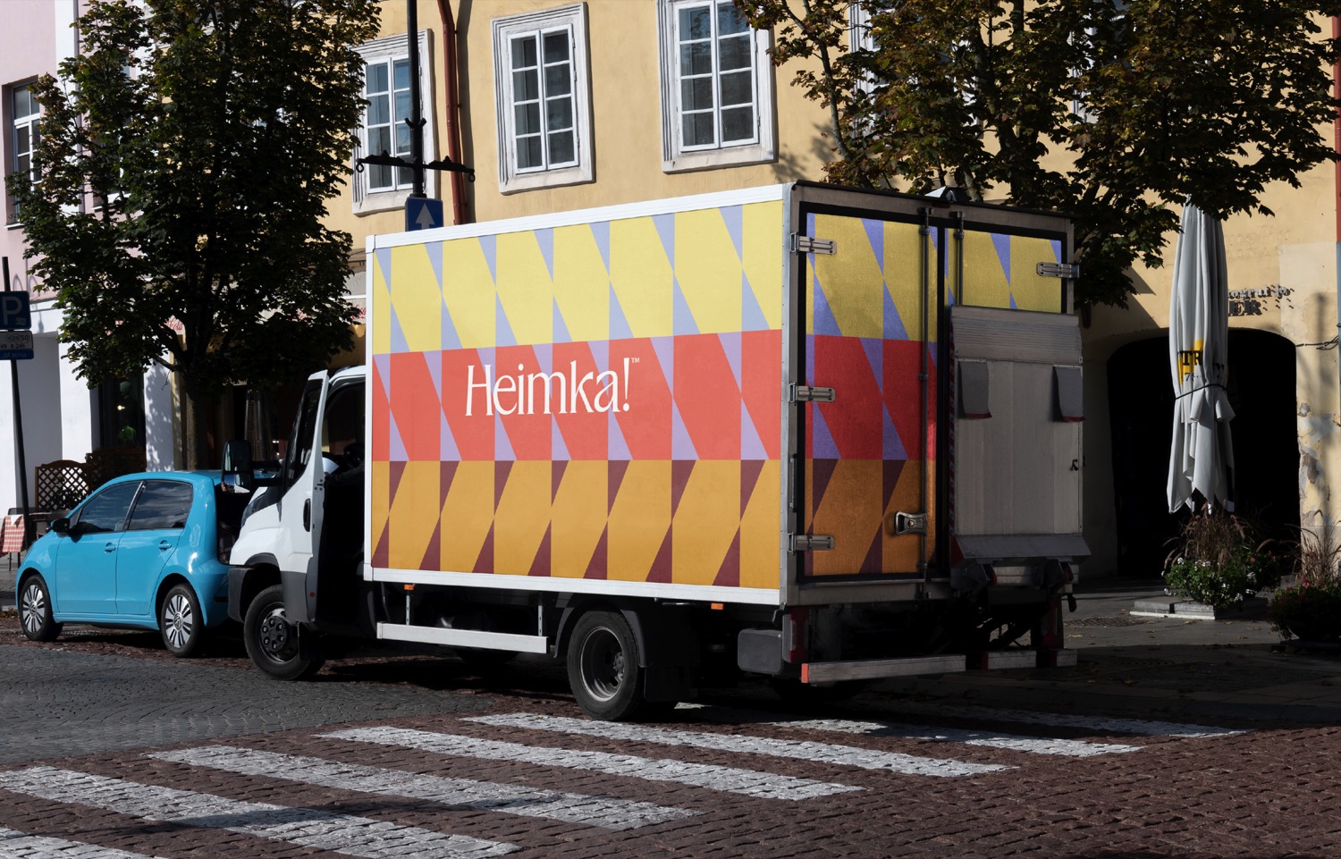
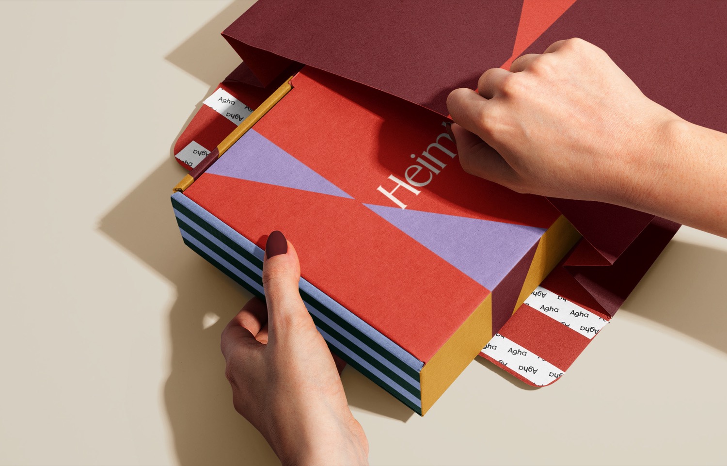
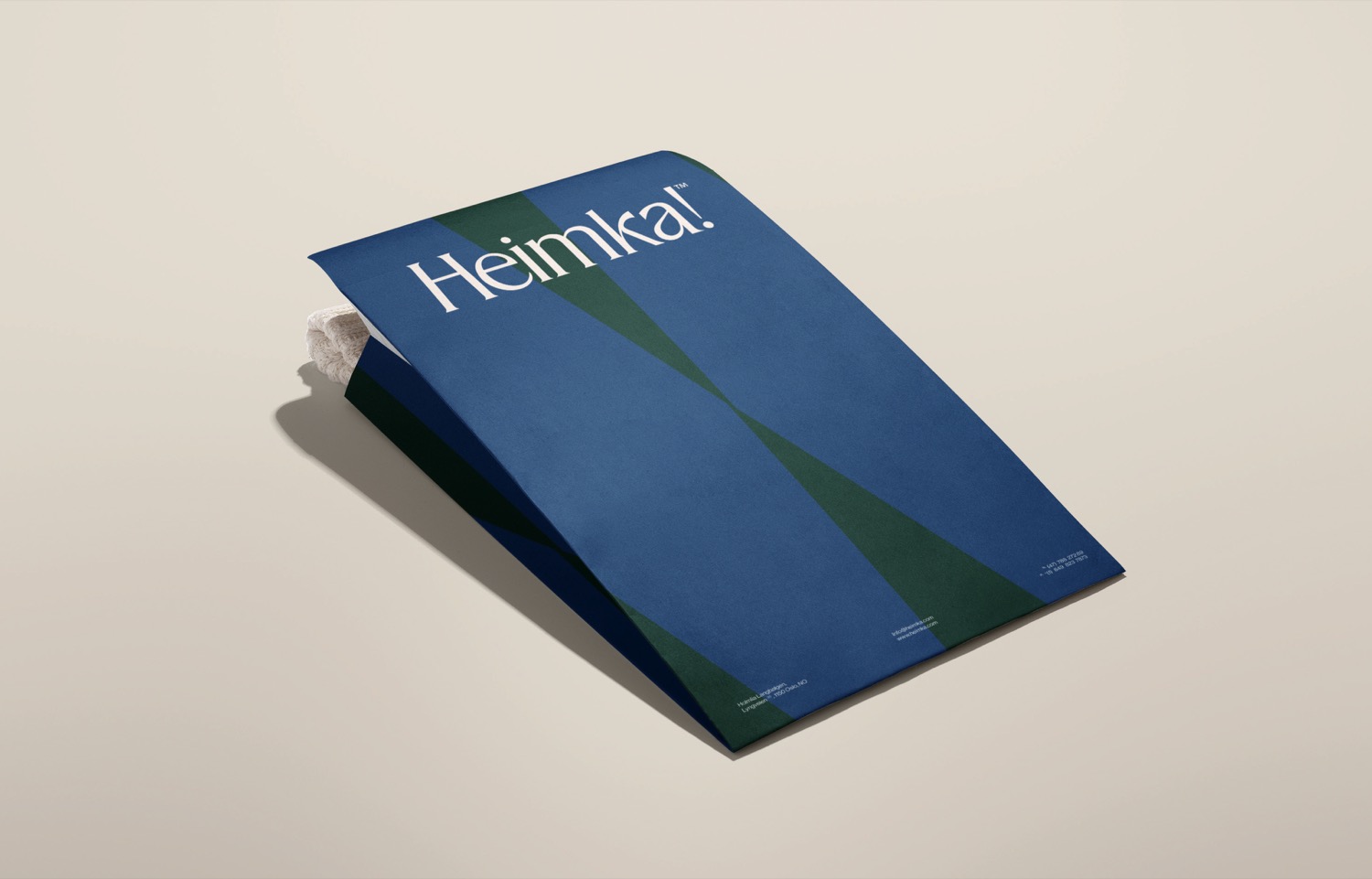
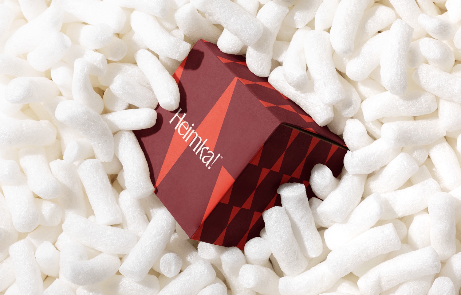
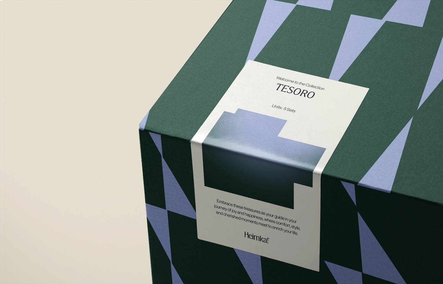
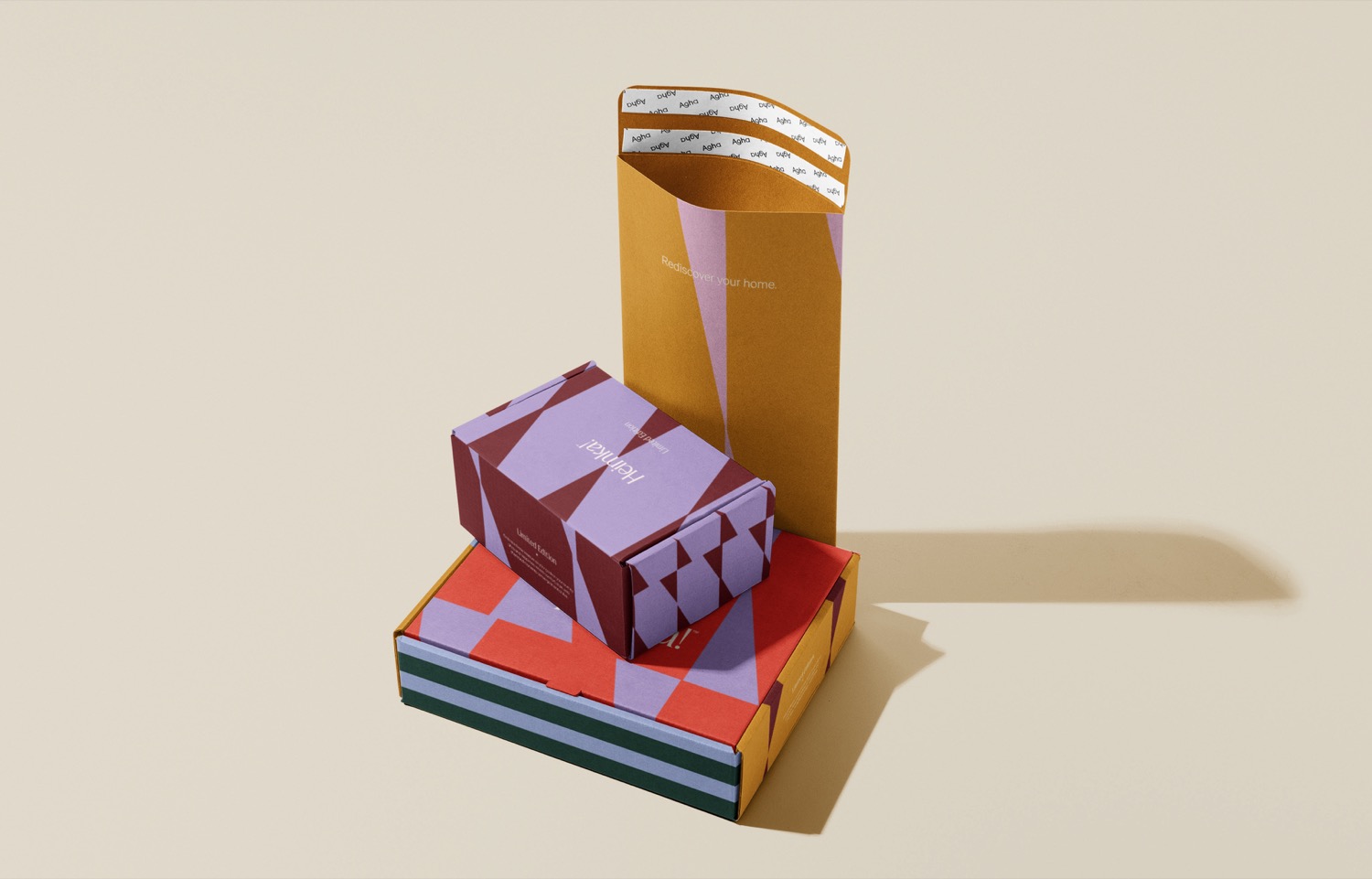
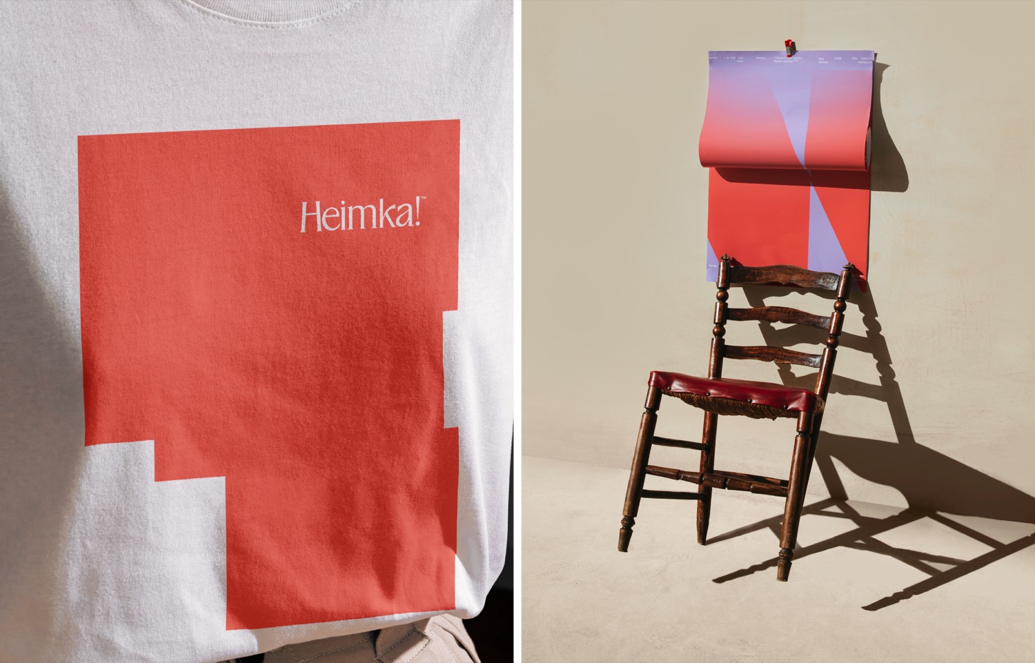
To translate the concept into a striking visual story; The brandmark, a hybrid of the H and X is consistently used in the products packaging, patterns, and symbols. This design signifies not only a marking spot at the end of a quest but embodies facets of mystery and intrigue, imbuing the brand narrative with direction and purpose.
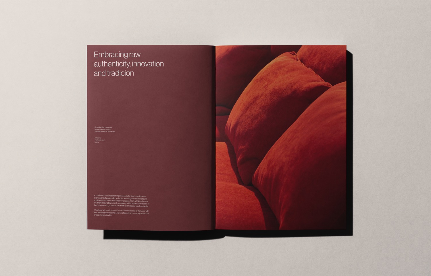
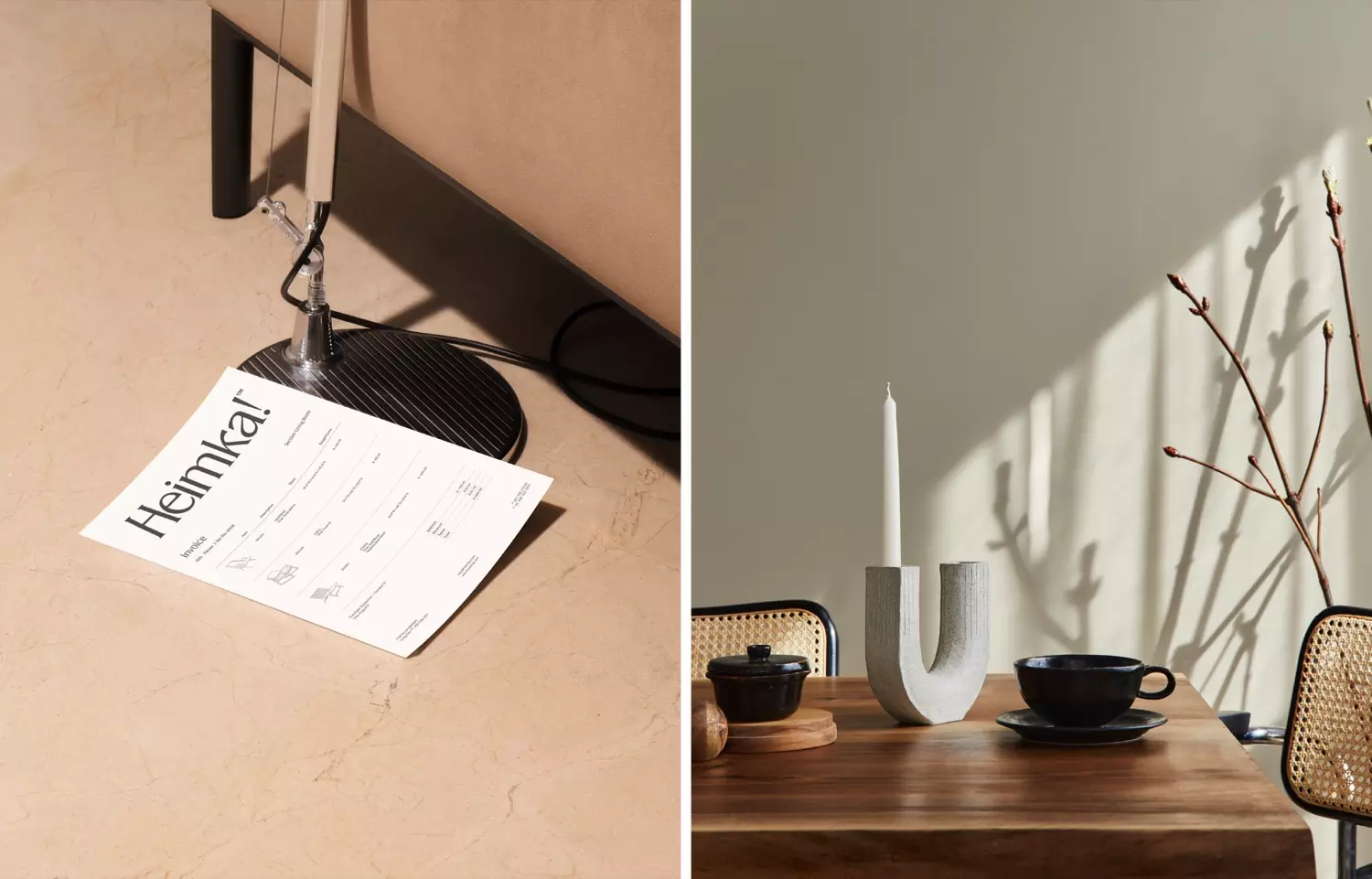
In the packaging, the information is concrete with vibrant hues, built with a color palette reminiscent of the eclectic colorful fabrics of Hispanic culture. All of these elements blend to create a brand where not just beauty meets functionality but people feel they belong, as they find a rediscovered sense of harmony in their surroundings.
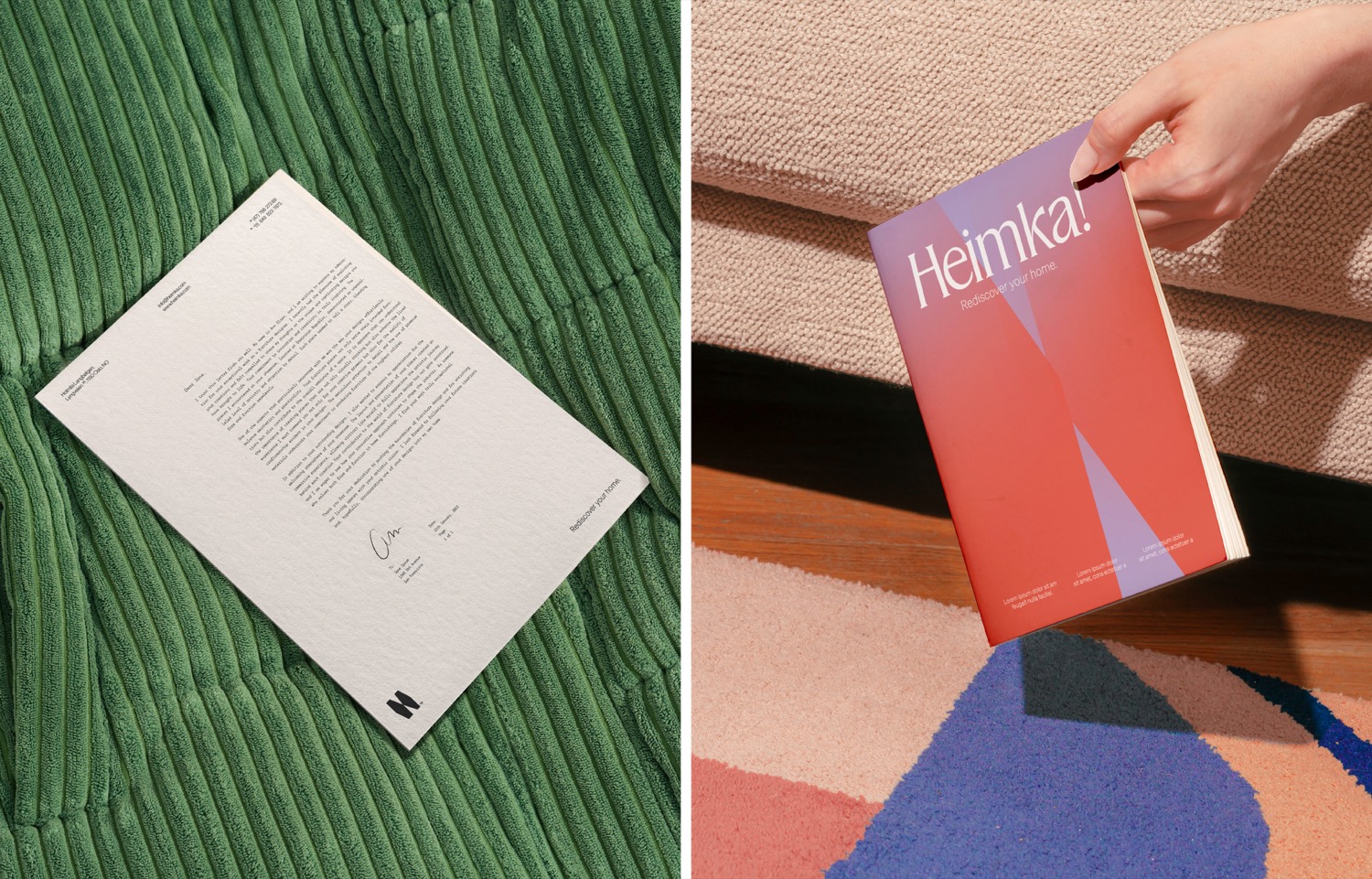
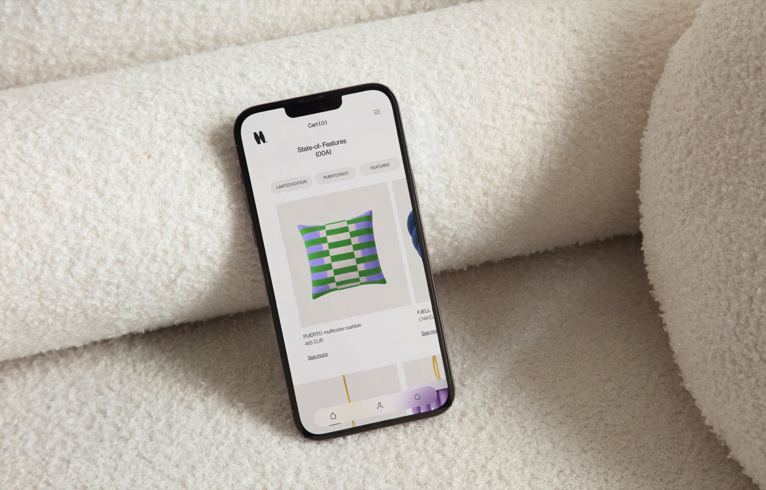
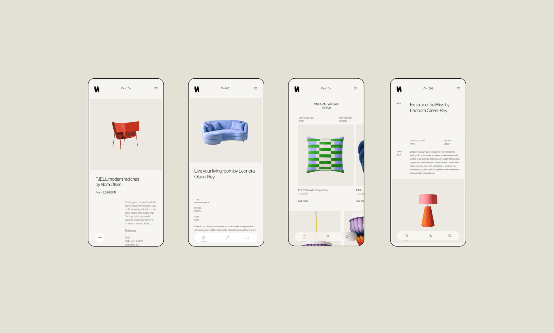
The name became the starting point for the brand, derived from the combination of Old Norse words: Heima and Elska, which can be translated to At home and Love respectively. To build this design style, the graphic element of minimalist floor plans was integrated, serving as an evolving expression of a map that guides through unexplored territories.
Ultimately, the brands align with Heimkas mission to create extraordinary lives full of ordinary moments through their handmade products. Their vision is to foster a sense of ownership, embodying the spirit of mi casa es mi casa.
Creator: Tiare Payano


.webp)


