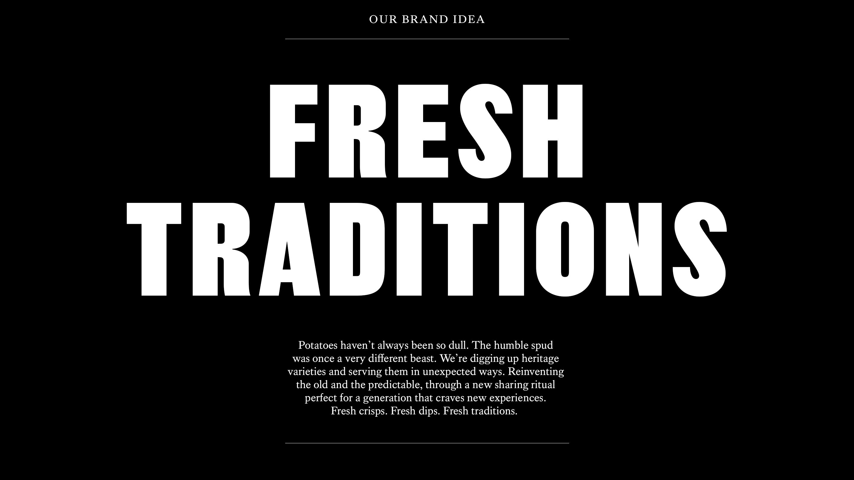
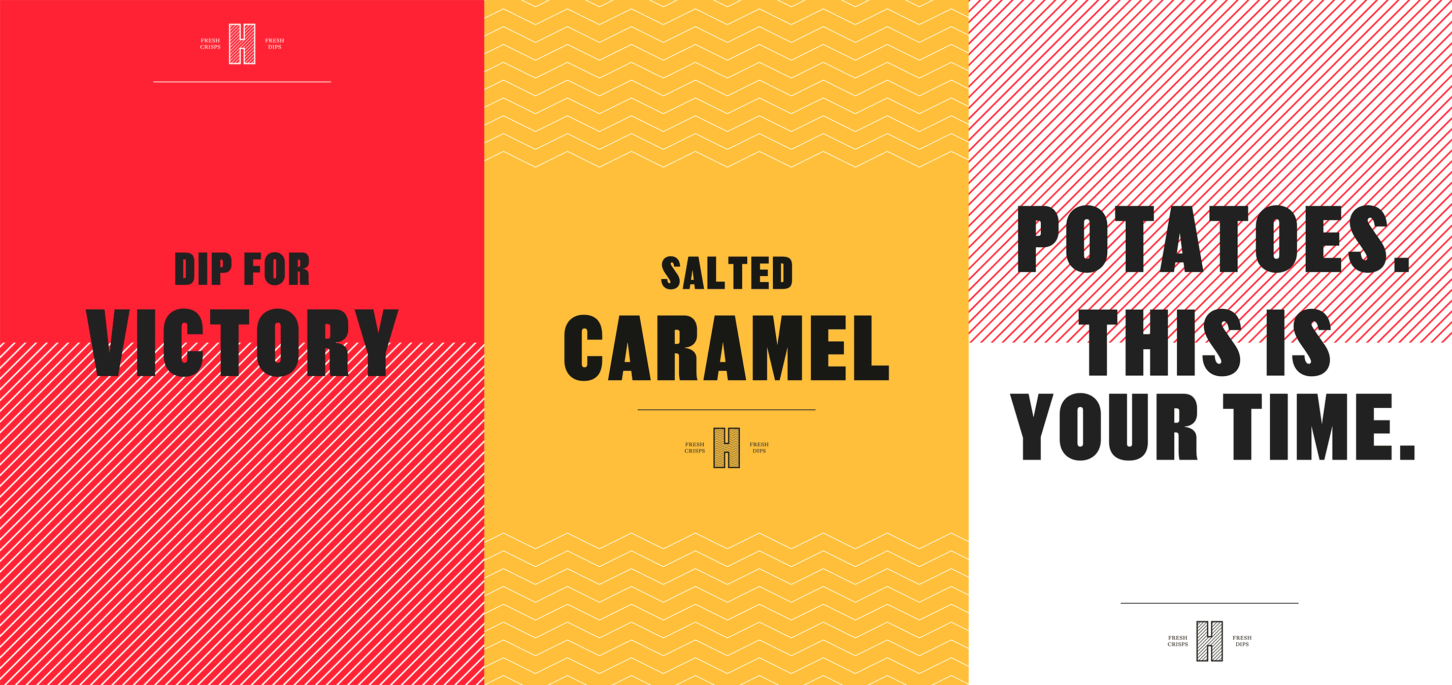

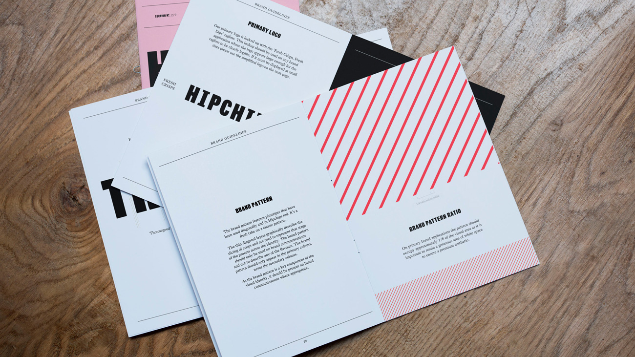
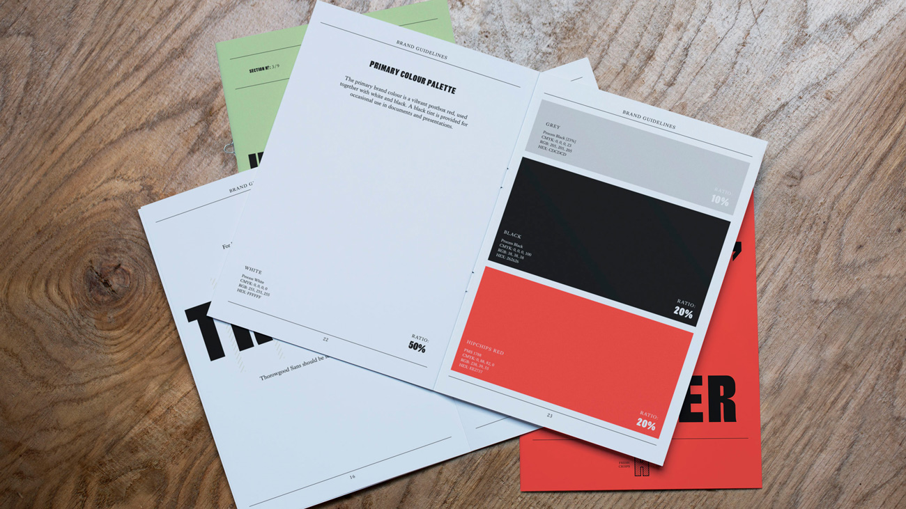
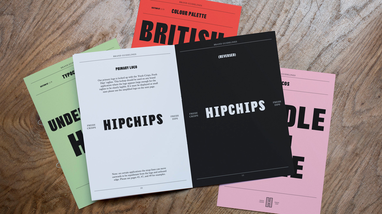
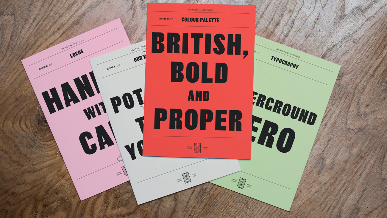
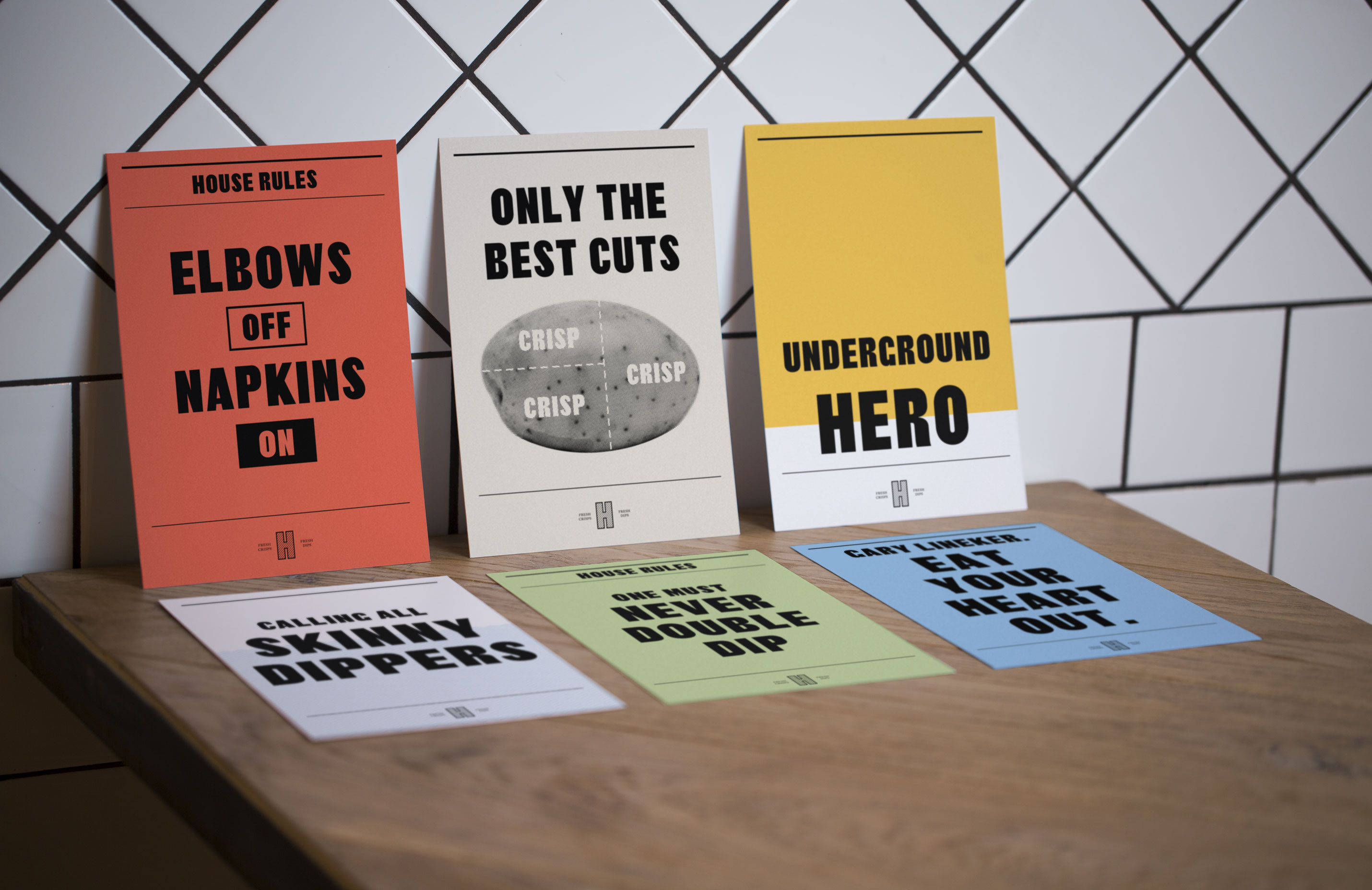
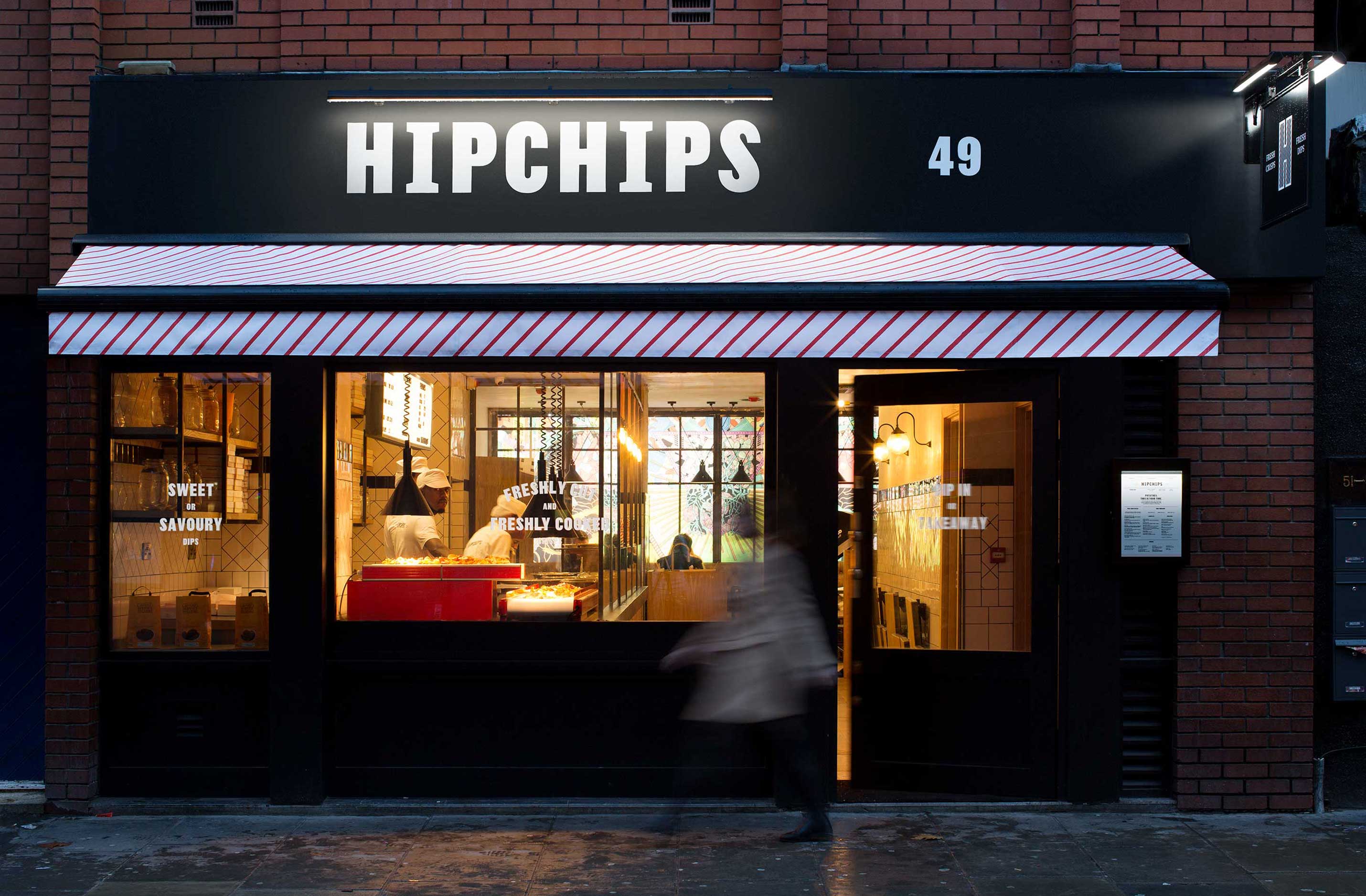
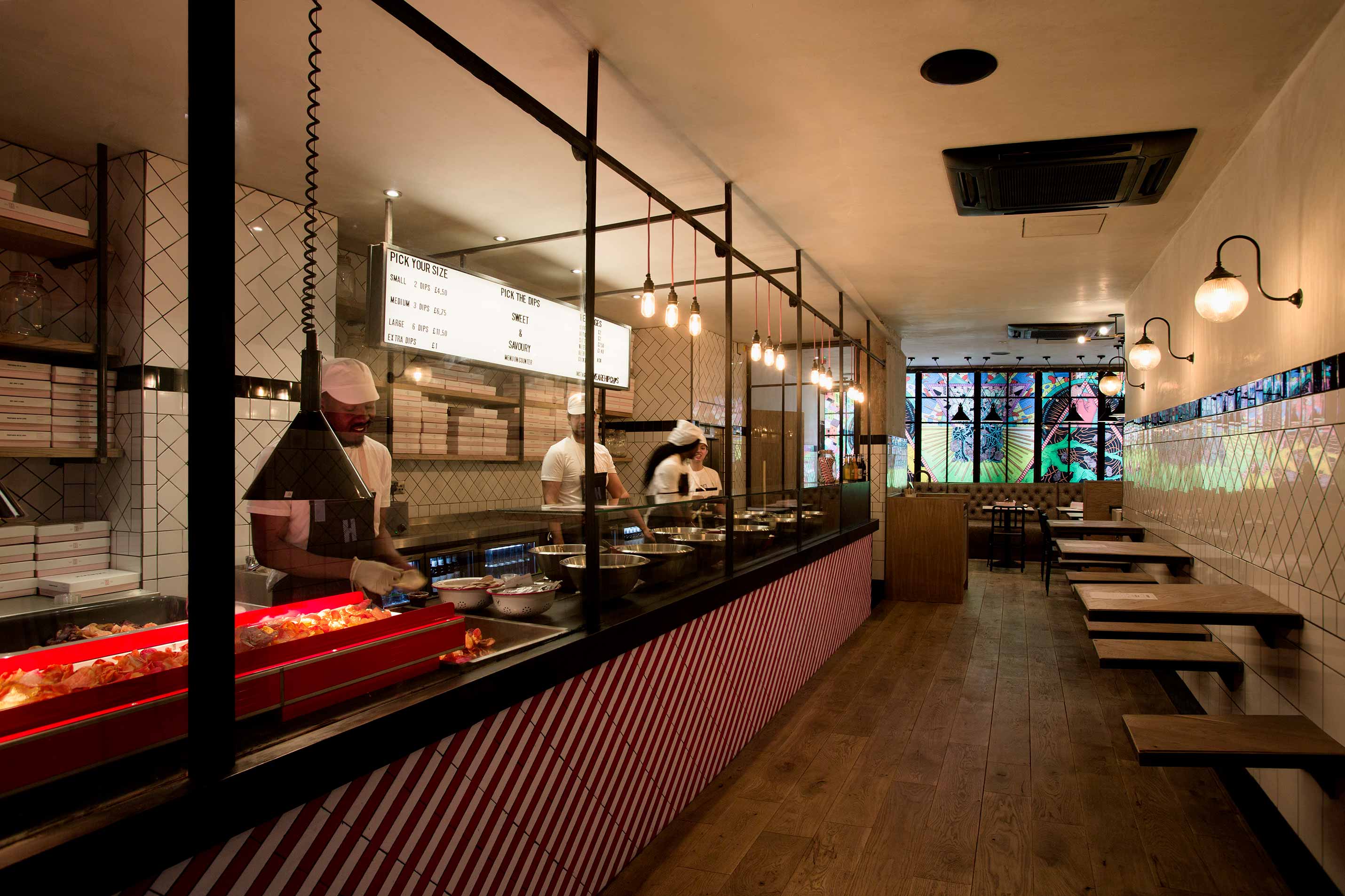
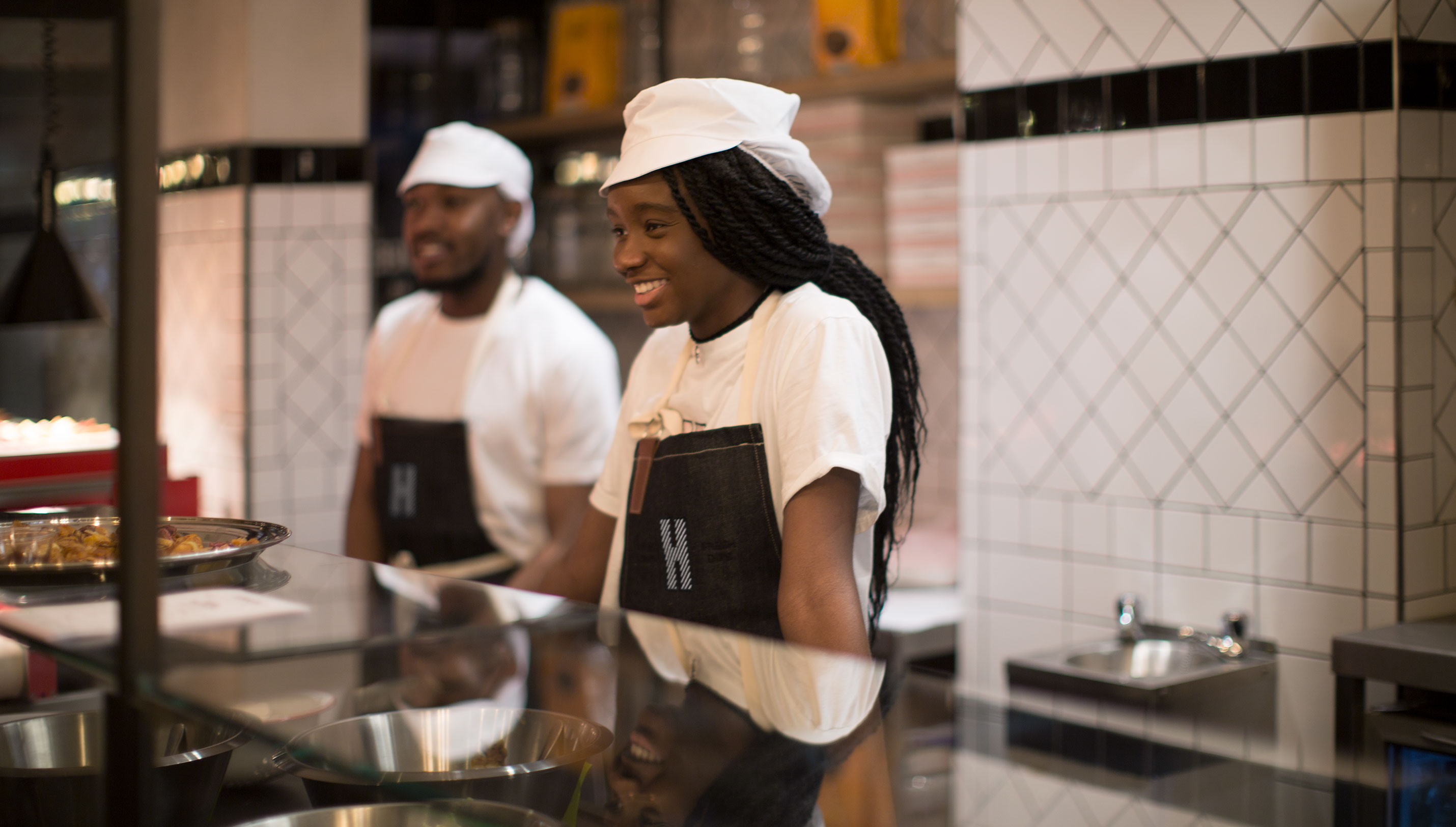
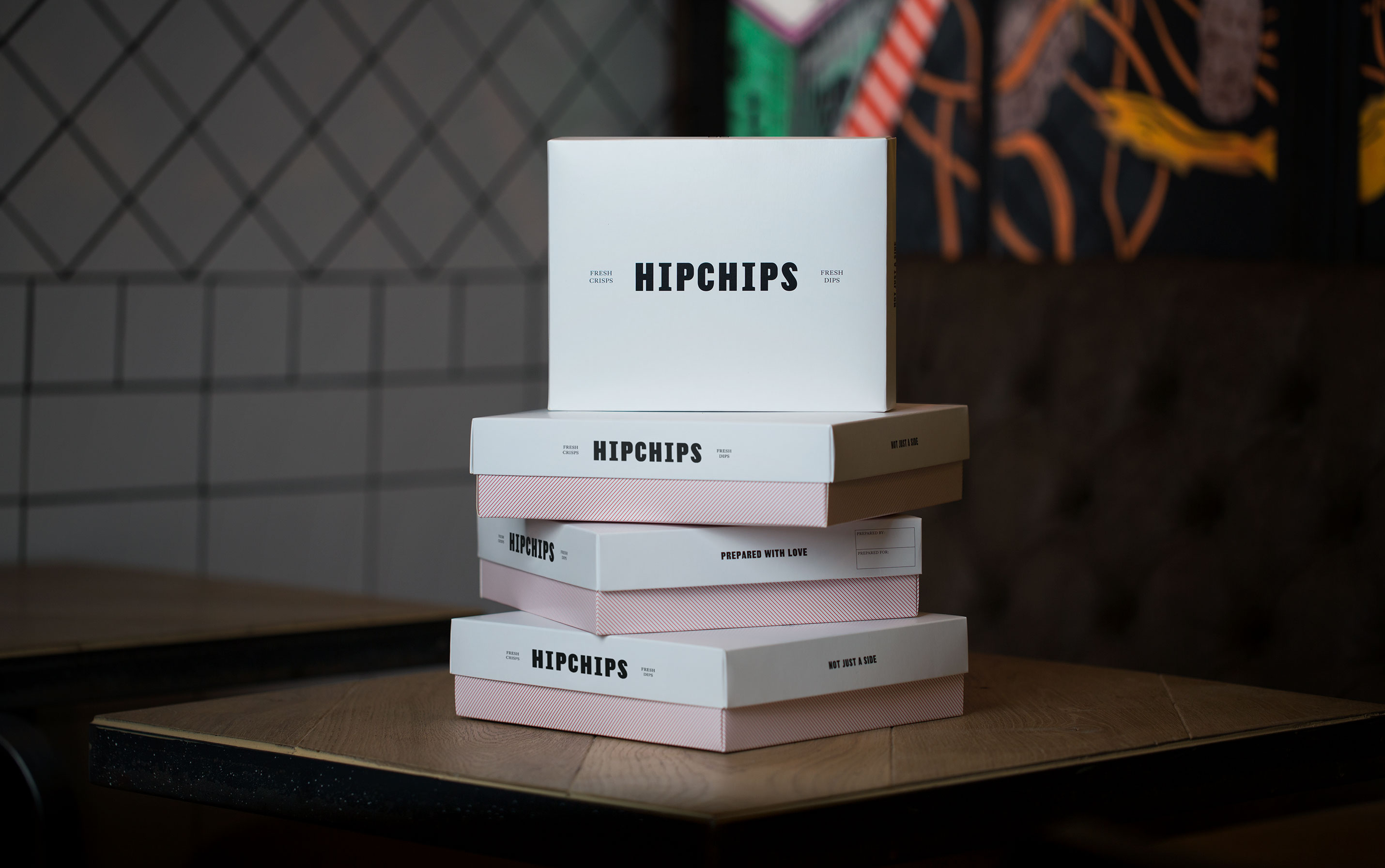
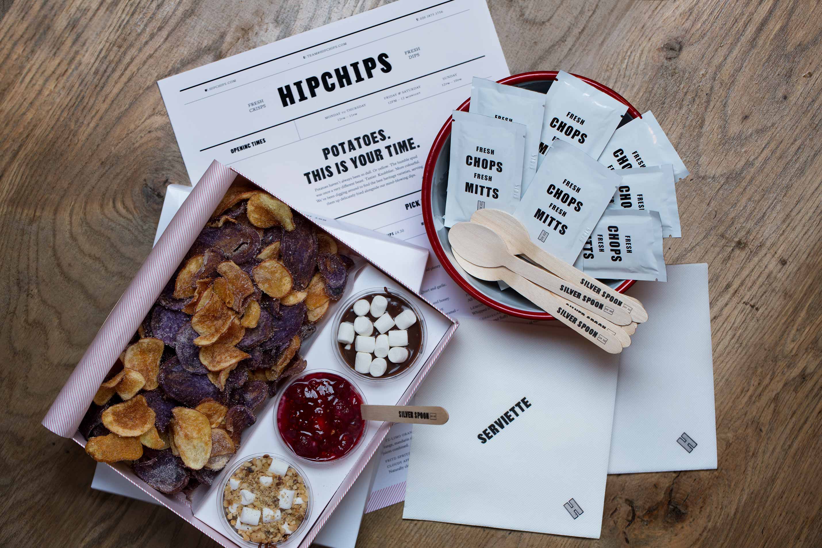
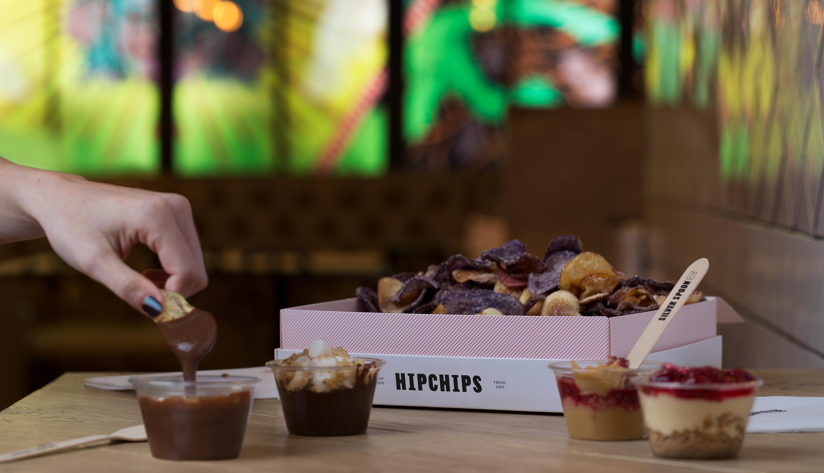
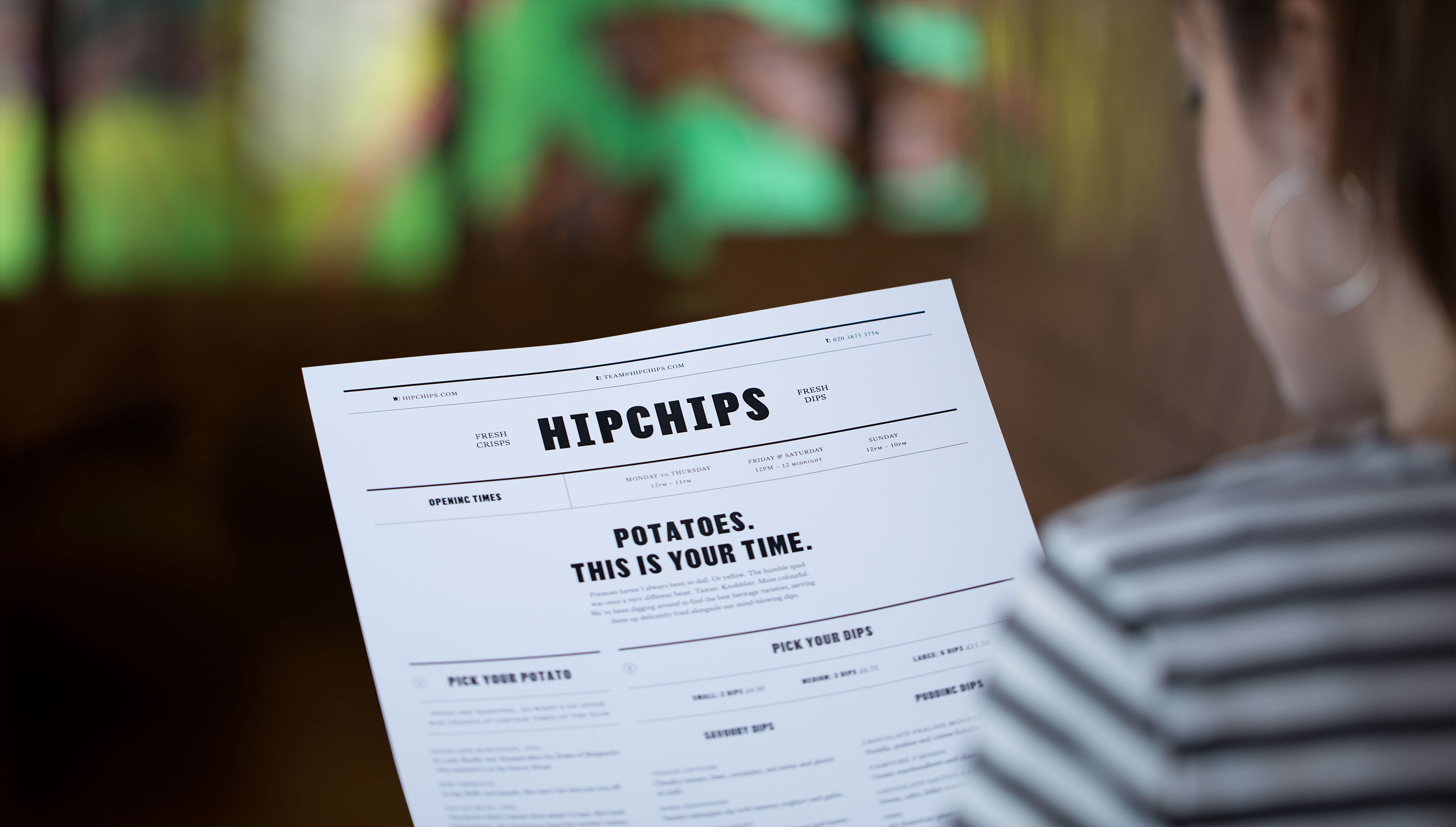
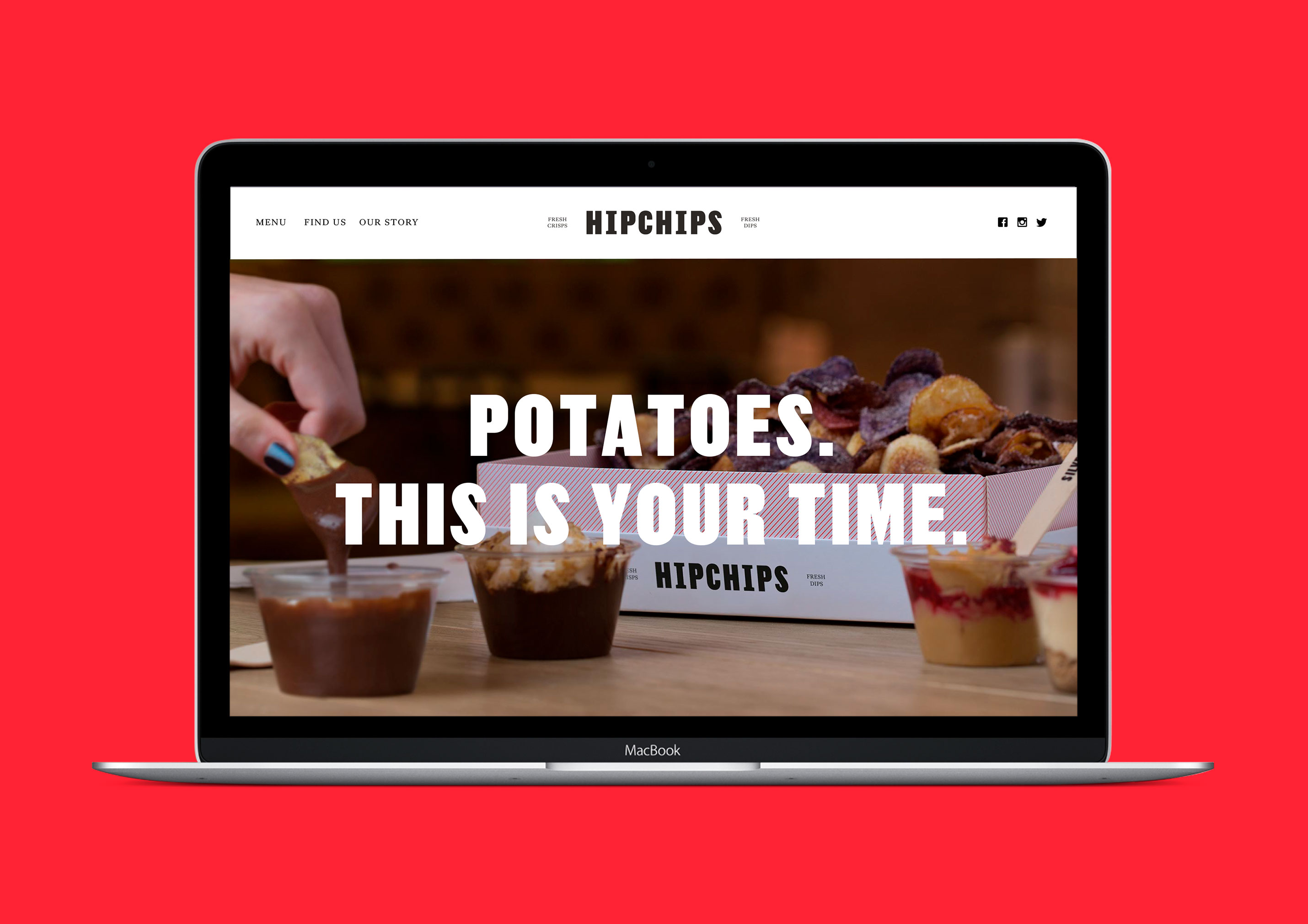


Hipchips is a brand for London’s first crisp restaurant. Brand positioning & strategy, visual & verbal identity, interiors consultation. Hipchips is the first of its kind: a crisp restaurant in London’s Soho. It cooks crisps on site using heritage potato varieties and pairs them with experimental dips, both savoury and sweet. Ragged Edge created a brand to get it noticed as the latest disruptor in the capital’s ultra-competitive food scene. The studio took a set of British staples and reimagined them for a new audience. A traditional red, combined with a very modern set of supporting colours. A set of pinstripes given a 45 degree twist. Two classic British typefaces – Thorowgood Sans and Kings Caslon – set in contemporary ways. And a tone of voice that’s unmistakably British, but not afraid to tell it like it is.
Published
23.12.2016


