


We’re not sure about this, but during summer people usually eat more healthily. Perhaps, it’s the warm weather that makes us eat more fruits and vegetables. This being a seasonal issue or not, Care/Of is a brand that gives access to ultra-personalized nutrition. The brand’s visual identity was creatively led by High Tide, a full-service creative agency.
Care/Of partnered with High Tide right after its launch. Creatives came up with a new packaging system fondly based on the user experience.
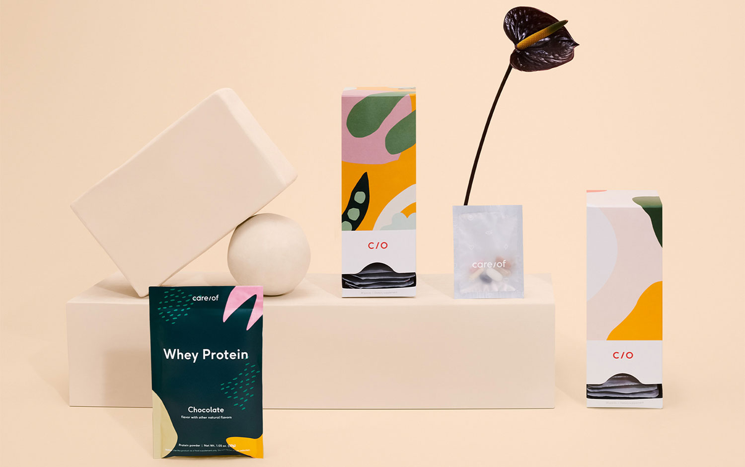
Afterwards, a new line of protein powders and dietary supplements went out. The branding of the products lately incorporated has a powerful visual identity. The designers’ concept was for it to have character and seamlessly be part of Care/Of’s brand ecosystem. Featuring fun and caring feel, the exterior of the plastic bags it’s beautiful. And the organic shapes add a playful imprint.
The presentation of these products is just stunning. The minimal and clean approach it has and the packaging design immediately draw our attention. It’s a well-executed project, and the team knows what to focus on when selling a product and making it look desirable. An overall stunning and collaborative work, the communication between parts has been exceptional, just by looking at their result.
High Tide specializes in branding, creative direction, packaging and print design, and UX/website design. They believe in distilling the essence of a brand into thoughtful, considered, and multi-layered brand experiences that stand the test of time. And they help their clients evoke, engage, and inspire through creative content, experiences, and communication.
Photography: Kevin Kunstadt
Published
22.08.2021


