 Plus
Plus

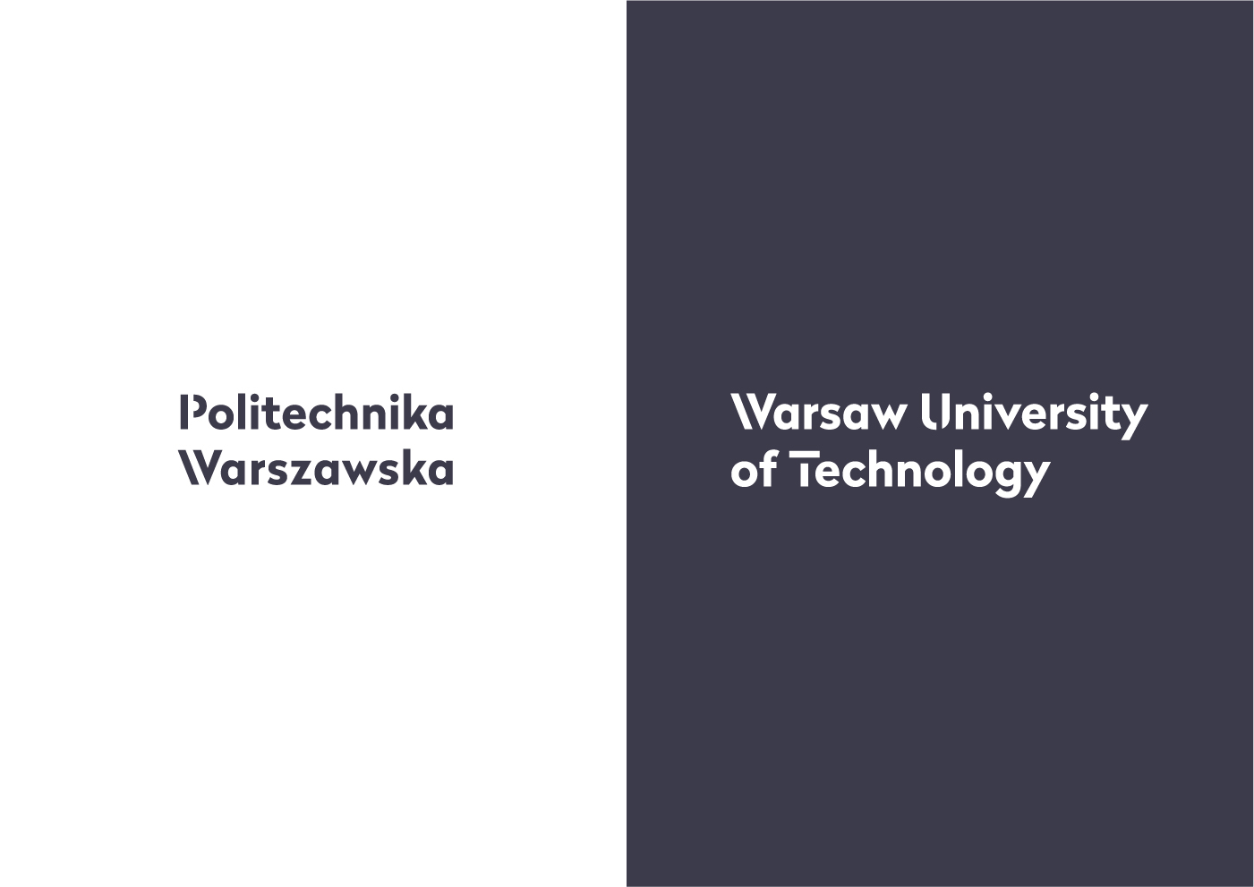
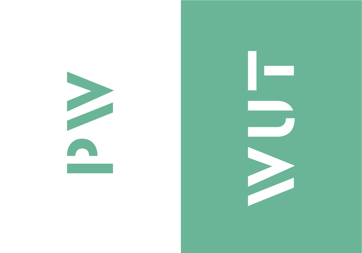
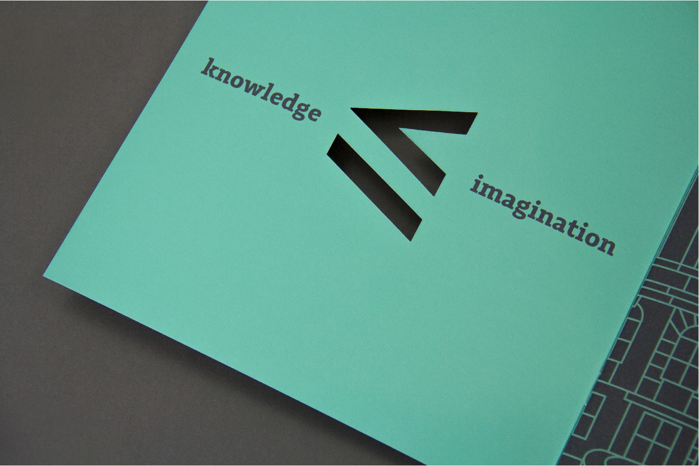
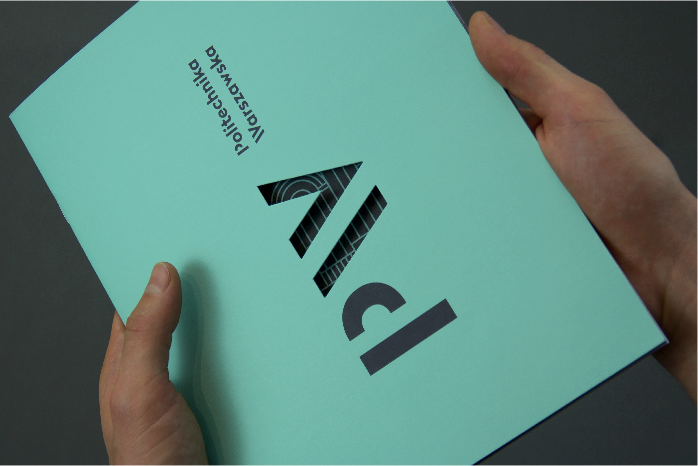
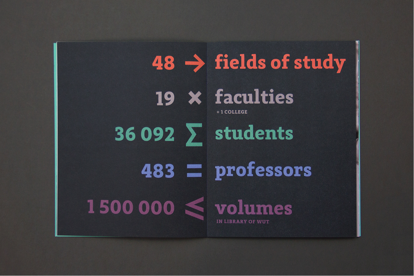
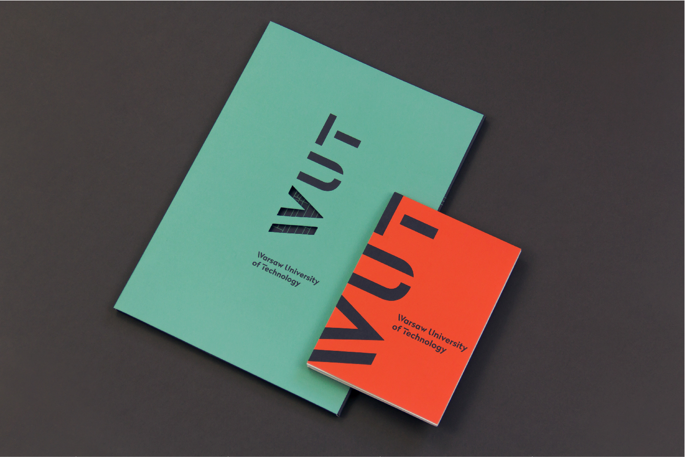
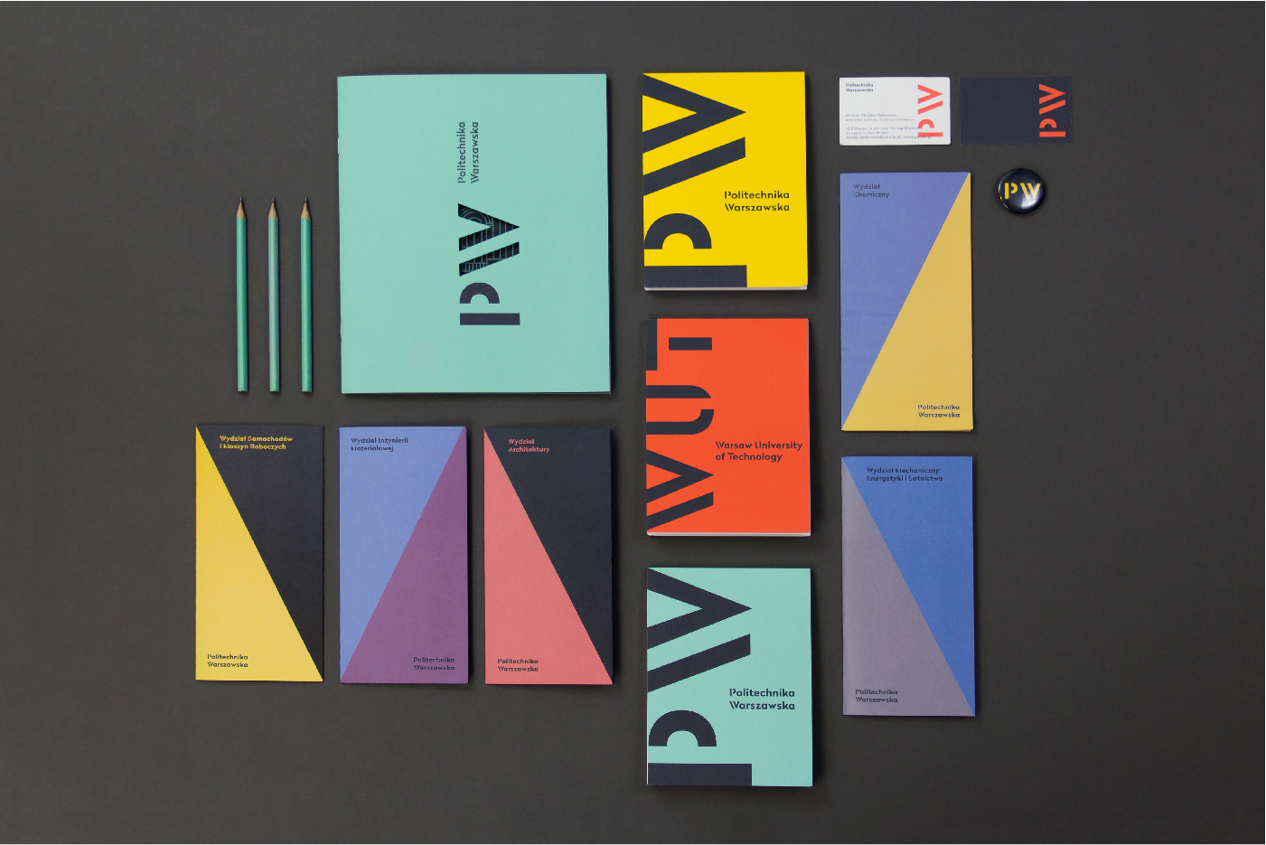
The new logo of the Warsaw University of Technologyis is based on typography. The idea/u2014transforming the /u201cW/u201d into /u201c/u2265/u201d underlines the scientific character of the school but also reflects/u00a0its position as one of the best universities in Poland./u00a0The /u201cPW/u201d or /u201cWUT/u201d symbol, when rotated by 90 degrees, becomes part of the school/u2019s motto /u201cimagination is greater(/equal) than knowledge/u201d. Within the scope of the identity other symbols have also been created to express WUT values in a visual, consistent way./u00a0A custom typeface has been created in cooperation with Nico Inosanto of/u00a0
/u00a0to serve as the basis for the lock-up and the Faculty names. The typeface/u00a0
Radikal WUT
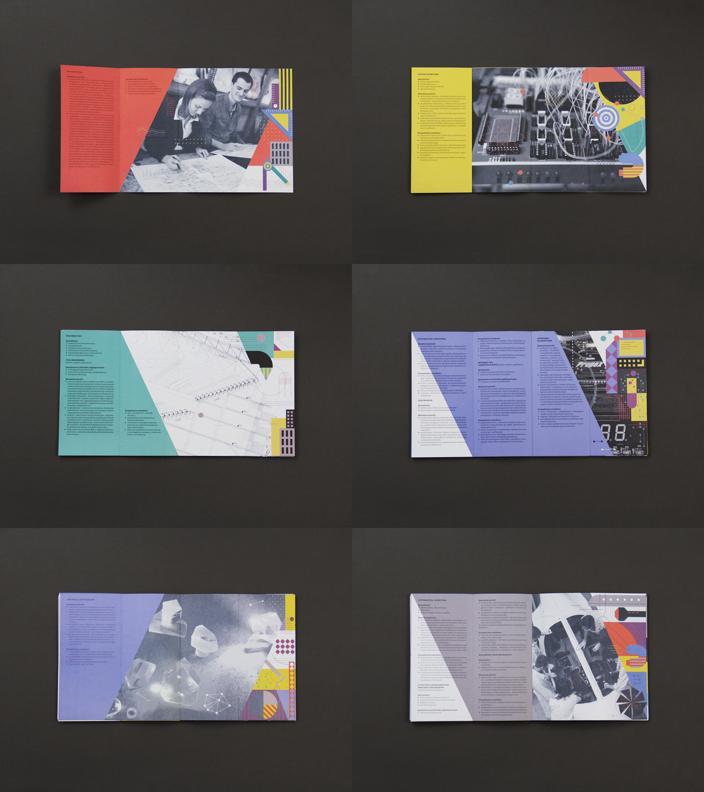
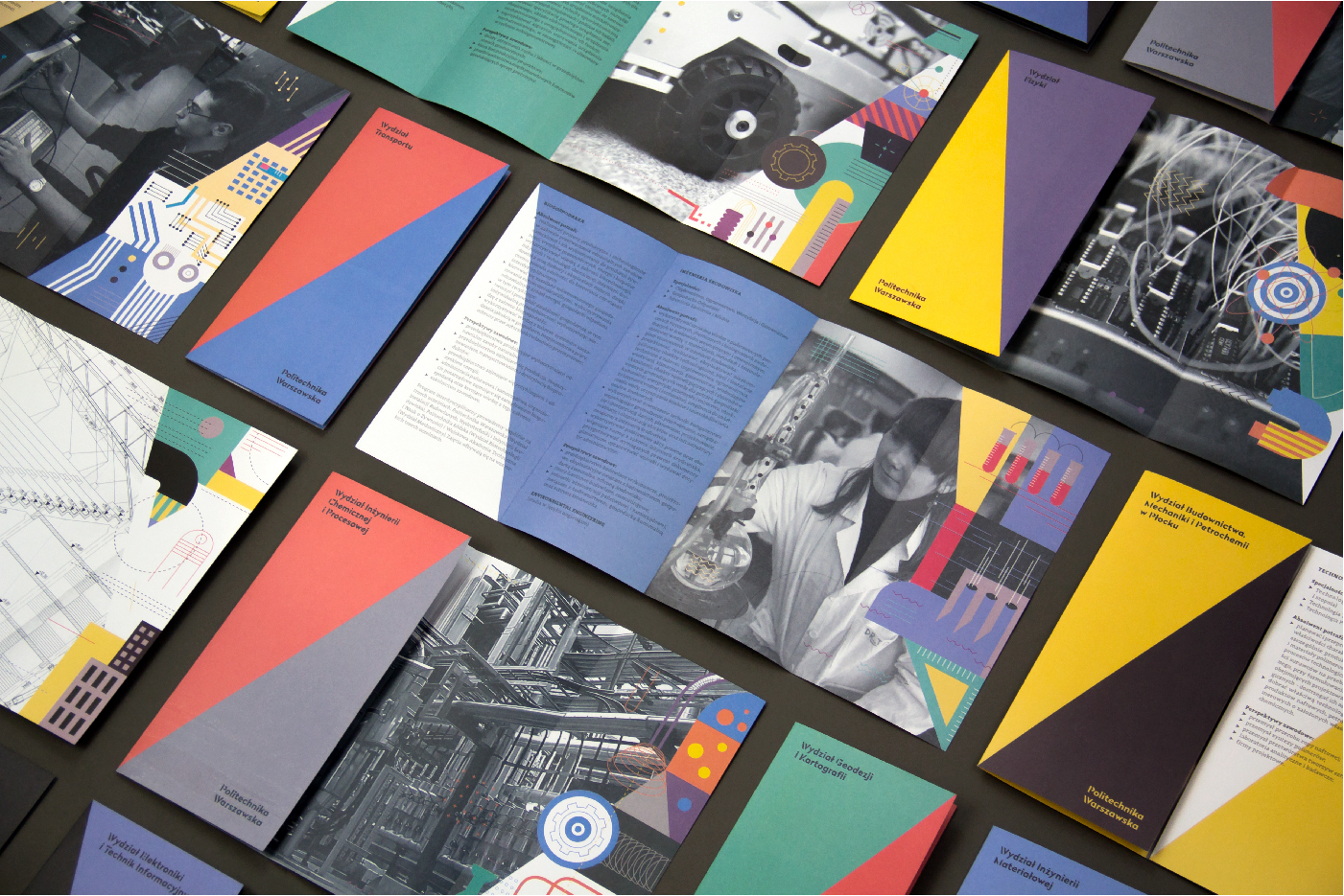
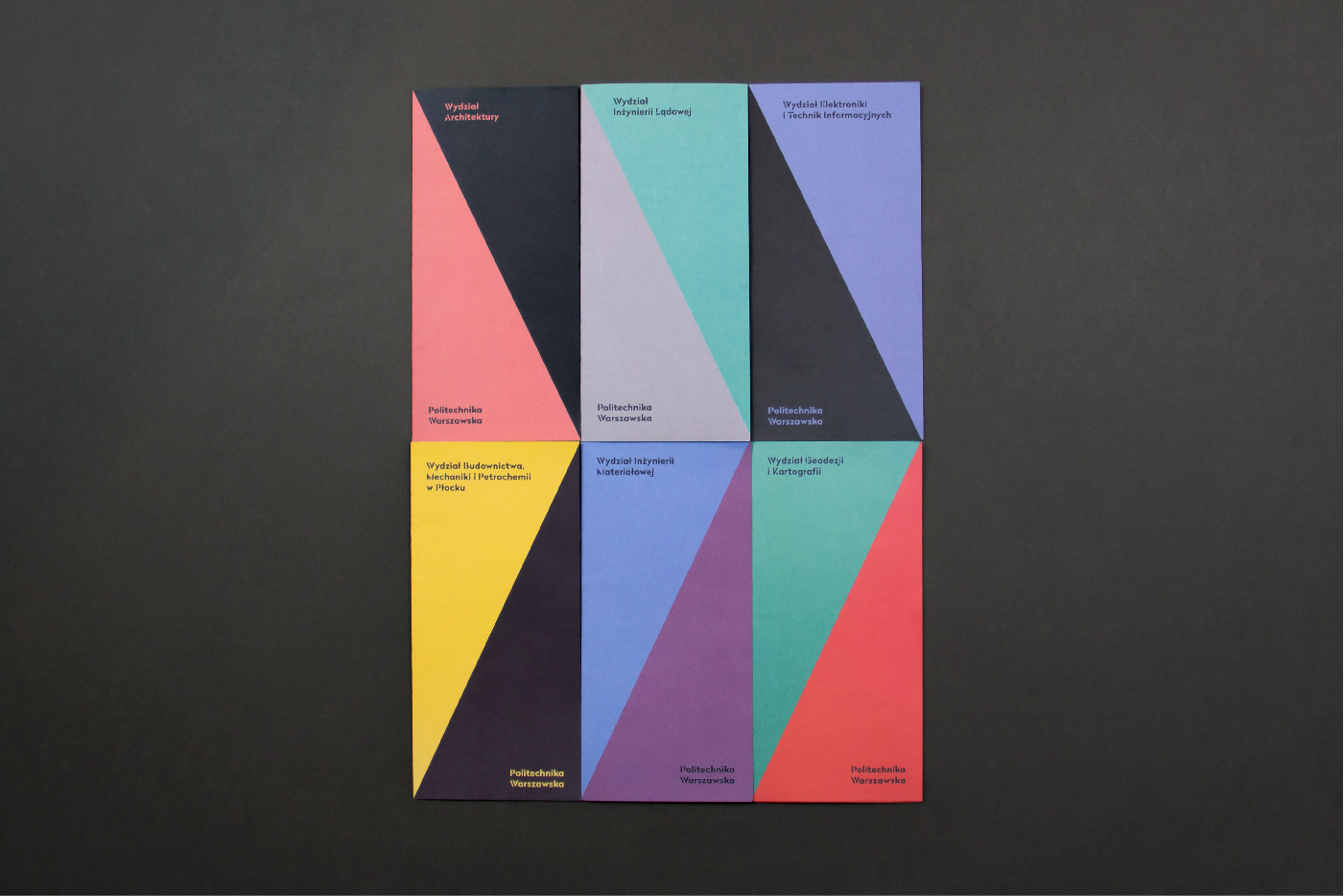
, with its distinctive stencil capitals and numerals, creates a unique visual system./u00a0An palette of eight colours has been chosen to meet the needs all the units within the University. Thanks to this each faculty has had a chance to choose two colours which best fit its needs, and the school has a wide range of possibilities./u00a0Warsaw University of Technology next to the new sign uses also in official materials historical mark /u2013/u00a0an emblem. To unify the traditional graphic element with the new identification emblem has been redesigned in a linear way./u00a0The new identity is a system of building blocks rather than a set of rules set in stone. This approach allows the identity to evolve and become a living visual tool for expressing the Universities message.
Creator: Emilka Bojańczyk / Podpunkt
