 Plus
Plus

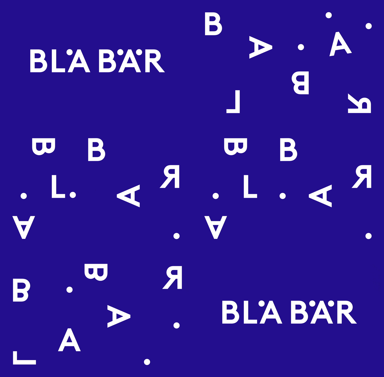
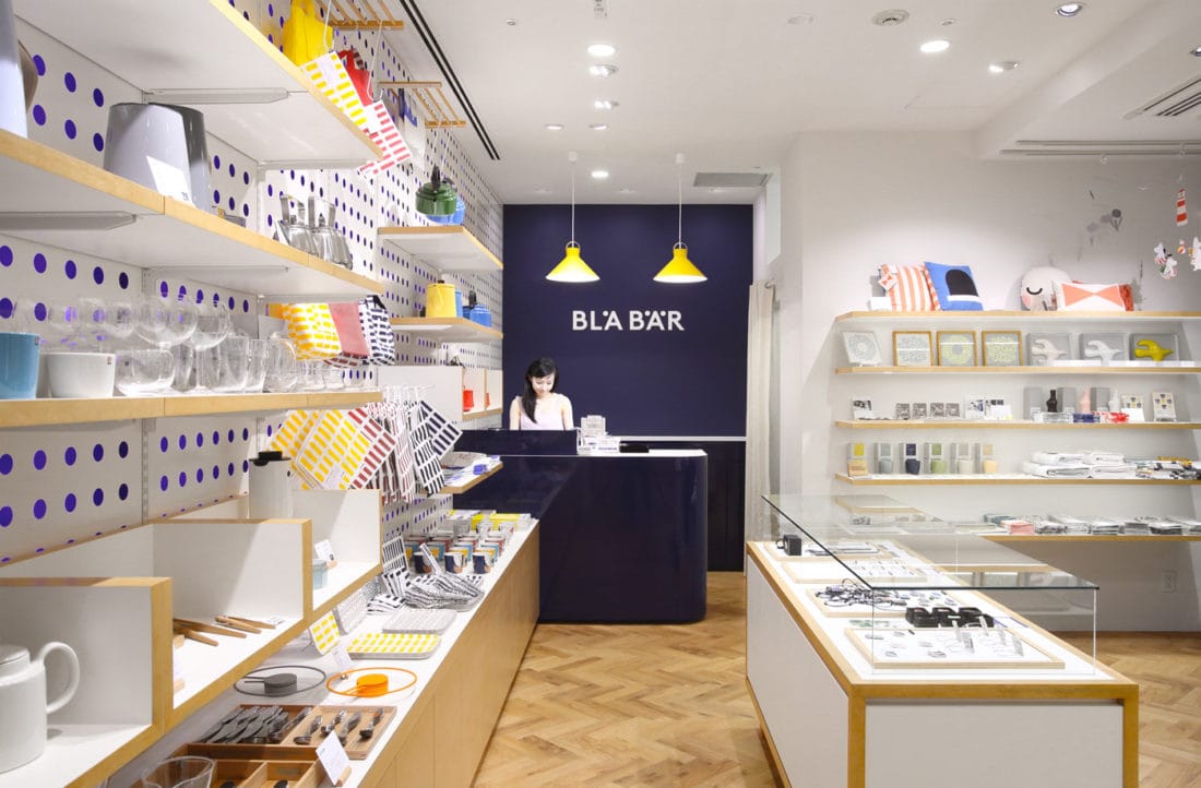
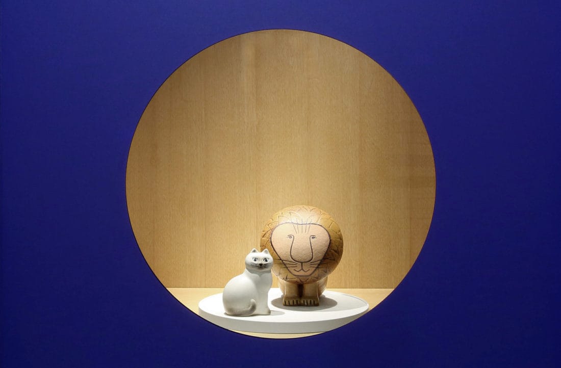
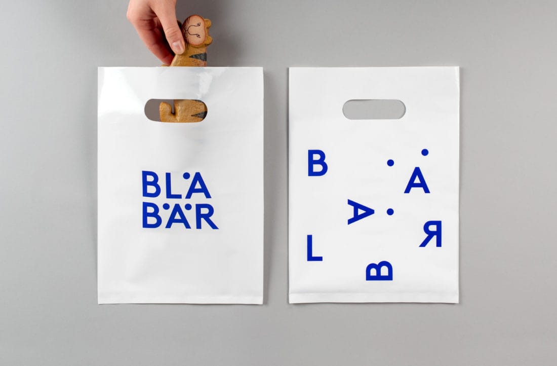
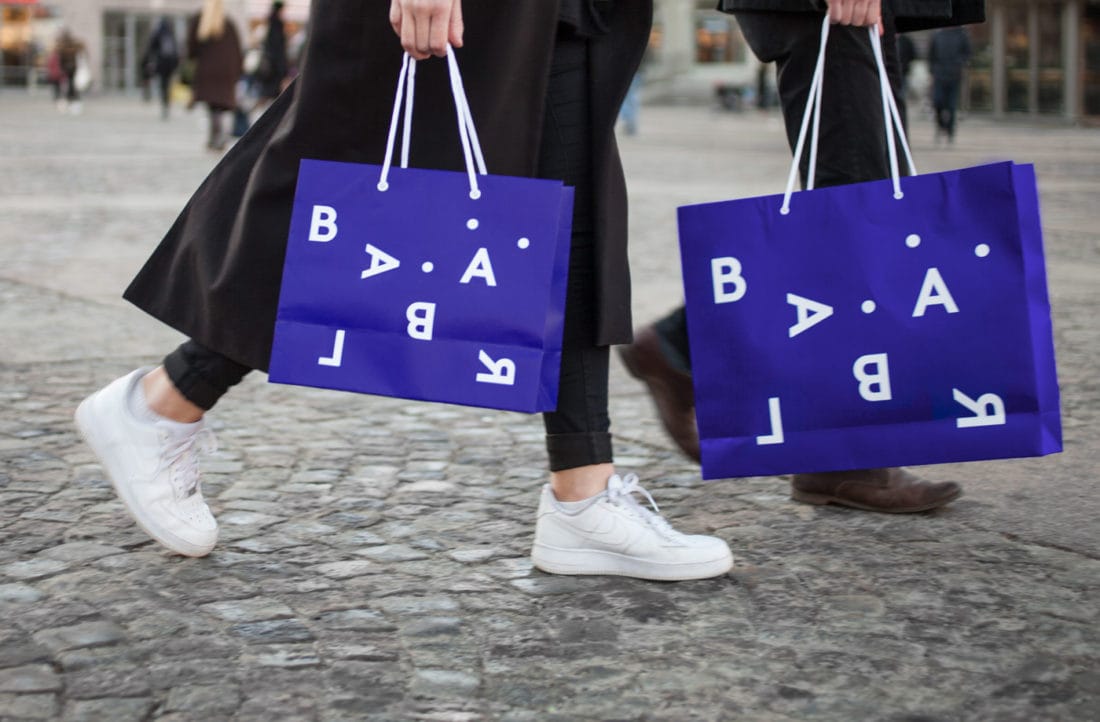
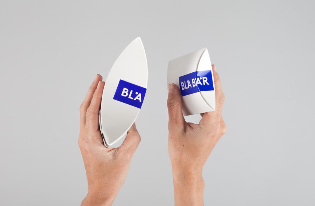
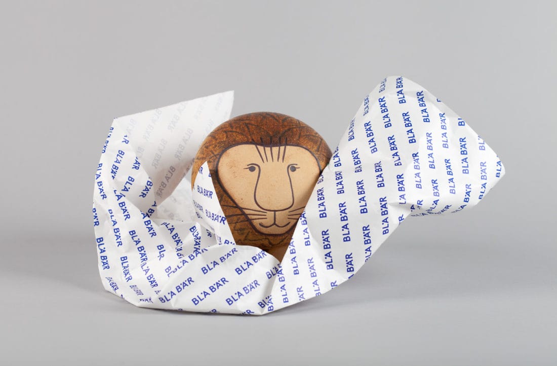
The design agency from Stockholm called/u00a0BVD/u00a0created this simple, yet scalable and dynamic new visual identity for the concept store in Osaka, Japan, offering miscellaneous goods from Scandinavia. Bl/u00e5 B/u00e4r means blue berries, a typical Swedish and Scandinavian kind, symbolized by the three dots in the Swedish letters /u00c5 and /u00c4. Make sure to stop by if you are in the neighborhood. Letters and dots are used as a bold and clear graphic tool to emphasize the great variety of/u00a0high quality design items in the store. A playful layout attitude with few graphic elements builds a clear and strong brand identity that is scalable and dynamic to meet future opportunities and challenges.
Creator: BVD
